View review
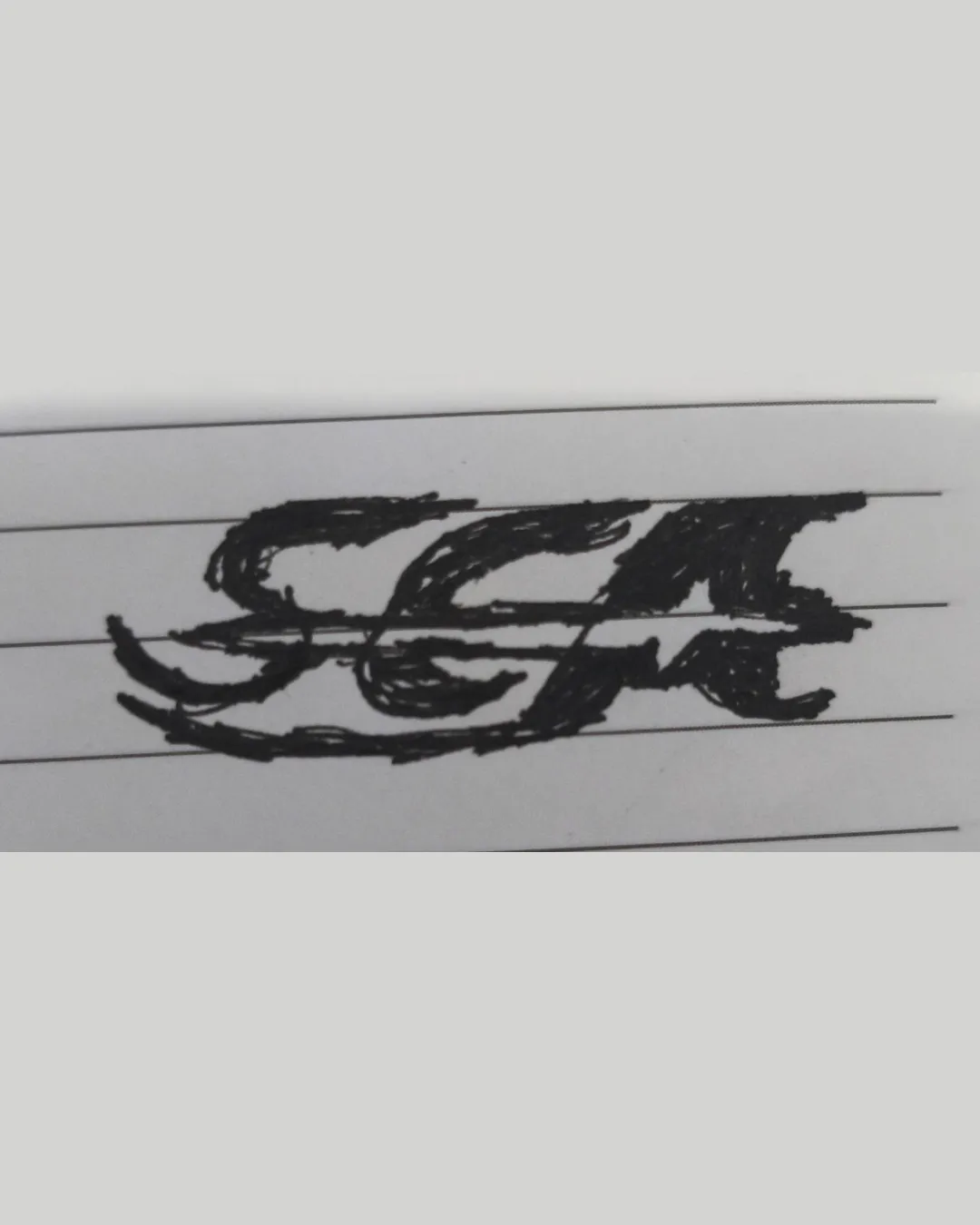
Logo review ofSea
Review the detailed scores below to see what is working and what should be refined first.
Logo performance breakdown
Legibility
Unique, attention-grabbing letterforms.
Letterforms are cramped and difficult to distinguish, especially between the 'S' and 'E'.
Heavy use of black ink and swirling strokes obscure clarity.
Lines blend together, reducing immediate readability.

Originality
Integrates waves into the letterforms for a unique, thematic effect.
Distinctive hand-drawn style separates it from generic digital logos.
Overall idea of 'waves in letters' is common within aquatic, surf, or sea-related branding.
Letter shapes are not easily memorable due to visual clutter.
Color harmony
Consistent monochrome palette, no distracting color choices.
Good contrast between black ink and white background.
Black
#000000
White (Paper)
#FFFFFF
Light Gray (Background)
#EAEAEA
Balance alignment
Logo attempts horizontal alignment between letters.
Wave elements create visual imbalance beneath the text.
Thickness of strokes varies unpredictably, making the design feel heavy on one side.
Letter spacing is inconsistent, leading to an unbalanced composition.
Scalability
Fine, textured hand-drawn lines will not reproduce well at small sizes.
Complex details will be lost in embroidery, favicons, or small digital/print uses.
Logo would lose clarity in social media profiles, merchandise tags, and business cards.
200x250 px
100×125 px
50×62 px
Misinterpretations
No inappropriate or accidental imagery detected.
Wondering how your logo performs?
Get a clear logo score, key risks, and priority fix ideas before your client or audience sees it.