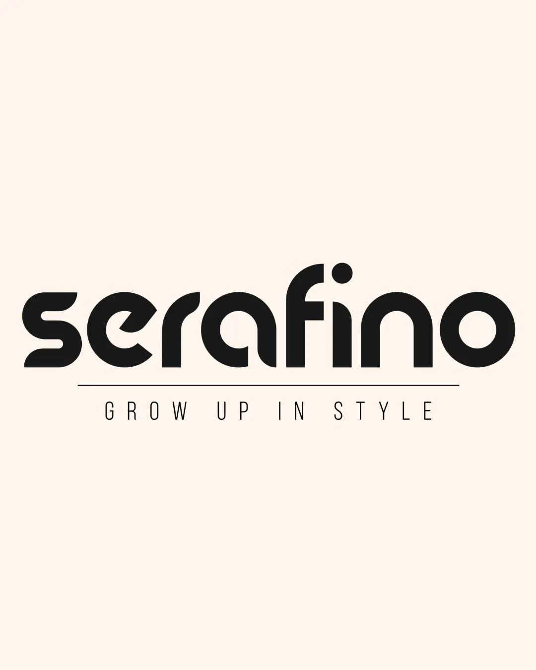
serafino and tagline logo logo review
3.5/5
Logo score Wordmark with tagline category

serafino and tagline logo

creative235068 Essential logo review

Legible and approachable for a children's clothing brand, but integration of the tagline with the main wordmark should be refined for improved visual harmony.

This logo lockup shows solid execution, supported by text readability and text hierarchy; improving distinctiveness is the clearest next step.

Wordmark With Tagline Monolinear Geometric Sans-serif Children's Apparel
4.7/5
Legibility
3/5
Originality
3/5
Balance
3/5
Scale
3/5
Style consistency
Your next steps

What to fix first

Focus on the changes that matter. Keep what makes the logo work.

1

wordmark/tagline spacing and weight

Reduce tagline spacing and/or increase tagline line weight for better visual integration with the wordmark.

High priority Visible issue Low effort

The tagline and separating line are very thin and widely spaced in relation to the dense, bold wordmark, creating a noticeable imbalance and reduced unity between components.

See the category review

Detailed review

Logo performance breakdown

4/5

Brief & logo match

The playful, geometric wordmark reflects a modern kids’ clothing aesthetic, but the tagline’s separation limits visual unity.

5/5

Misinterpretations

  • No inappropriate or confusing alternative readings.
4.7/5

Legibility

Wordmark 5/5 · Layout 4/5

  • Excellent wordmark and tagline readability at standard size; no confusing letterforms.
3/5

Originality

This review includes a score but no supporting explanation for this category.

3/5

Balance alignment

Wordmark 3/5 · Layout 3/5

Available in Advanced logo reviews
3/5

Scalability

Wordmark 3/5 · Layout 3/5

Available in Advanced logo reviews
3/5

Style consistency

This review includes a score but no supporting explanation for this category.

Try your own review

Wondering how your logo performs?

Get a clear logo score, key risks, and priority fix ideas before your client or audience sees it.

Review my logo