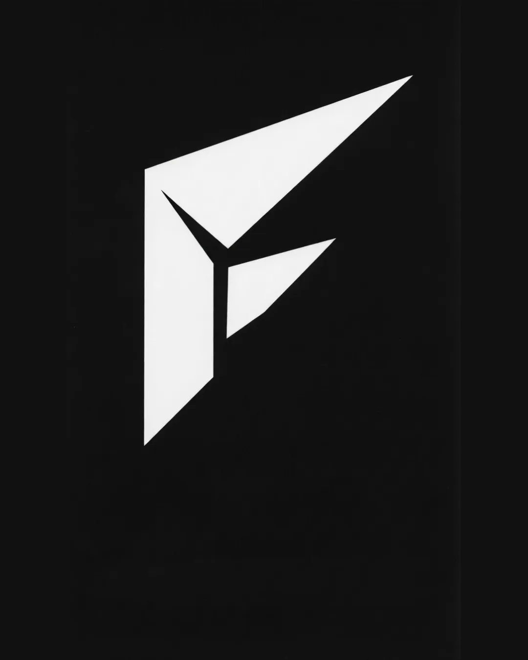
Abstract geometric mark resembling a stylized 'F' .. logo review
4/5
Logo score
Logo review of

Abstract Geometric Mark Resembling A Stylized 'f' ..

This logo mark has a bold, modern look and strong visual presence, but could benefit from further testing at small sizes and consideration of distinctiveness within its field.

Standalone Mark Sharp Geometric, Minimalist, Monochrome Design/architecture/tech
3/5
Originality
5/5
Misread
4/5
Balance
3/5
Scale
Your next steps

What to fix first

Focus on the changes that matter. Keep what makes the logo work.

1

entire mark

Test the mark at small print and screen sizes for clarity and potential loss of detail.

Worth testing High priority Low effort
Area to inspectApproximate location

Some of the angles and points are extremely sharp, which can lose definition or blur at very small sizes or in poor print conditions.

How to check

Print and display the logo at favicon and business card size to confirm sharp points and interior spaces remain distinct.

See the category review
2

entire mark

Consider subtle adjustments, context, or pairing with a wordmark to strengthen distinctiveness.

Optional refinement Medium priority Medium effort
Area to inspectApproximate location

The mark uses a common formula of sharp, origami-like forms, which may not be strongly differentiated without additional brand context or a unique twist.

How to check

Review similar marks in the intended industry to confirm recognizability and avoid generic feel.

See the category review
Detailed review

Logo performance breakdown

4/5

Brief & logo match

Based on your brief
Compared with

Brand context references 'Génère moi une maquette,' implying creativity, design, or model-making.

The design aligns well with a creative/model-making focus, using sharp modern geometry but could stand out more with unique detailing or word integration.

  • Contemporary Style

    The sharp, minimal mark fits a modern, creative direction suitable for a design or architecture brand.

  • Suggests Construction Or Creation

    The geometric, folding form effectively references making or assembling, resonating with the 'maquette' (model) theme.

3/5

Originality

  • Contemporary feel and dynamic silhouette
  • The mark uses a common formula of sharp, origami-like forms, which may not be strongly differentiated without additional brand context or a unique twist.

    Optional refinement entire mark

    Try: Consider subtle adjustments, context, or pairing with a wordmark to strengthen distinctiveness.

    Check: Review similar marks in the intended industry to confirm recognizability and avoid generic feel.

    Area to inspectApproximate location
4/5

Balance alignment

  • Strong geometric balance
  • Visually stable with good negative space use
Uploaded logoAlignment guide overlay

Inspect spacing with the guide. Optical balance may differ from geometric centering.

3/5

Scalability

  • Simple form enables easy reproduction
  • Interior spaces are well defined at large sizes
  • Some of the angles and points are extremely sharp, which can lose definition or blur at very small sizes or in poor print conditions.

    Worth testing entire mark

    Try: Test the mark at small print and screen sizes for clarity and potential loss of detail.

    Check: Print and display the logo at favicon and business card size to confirm sharp points and interior spaces remain distinct.

    Area to inspectApproximate location
Uploaded logo at 200 pixels wide
200 × 250 px
Uploaded logo at 100 pixels wide
100 × 125 px
Uploaded logo at 50 pixels wide
50 × 63 px

Compare the detail at different sizes. Labels show the full image dimensions.

5/5

Misinterpretations

  • No unintended or confusing double meanings visible

Black & white

Does the shape still work without color?

These tests are available only for logos uploaded in vector (SVG) format.

Background contrast

Find the surfaces where your logo stays clear.

These tests are available only for logos uploaded in vector (SVG) format.

Blur & silhouette

A 3px blur softens fine details so you can check whether the overall shape stays recognizable. If key gaps close or elements merge, the logo may rely too heavily on detail.

These tests are available only for logos uploaded in vector (SVG) format.

Try your own review

Wondering how your logo performs?

Get a clear logo score, key risks, and priority fix ideas before your client or audience sees it.

Review my logo