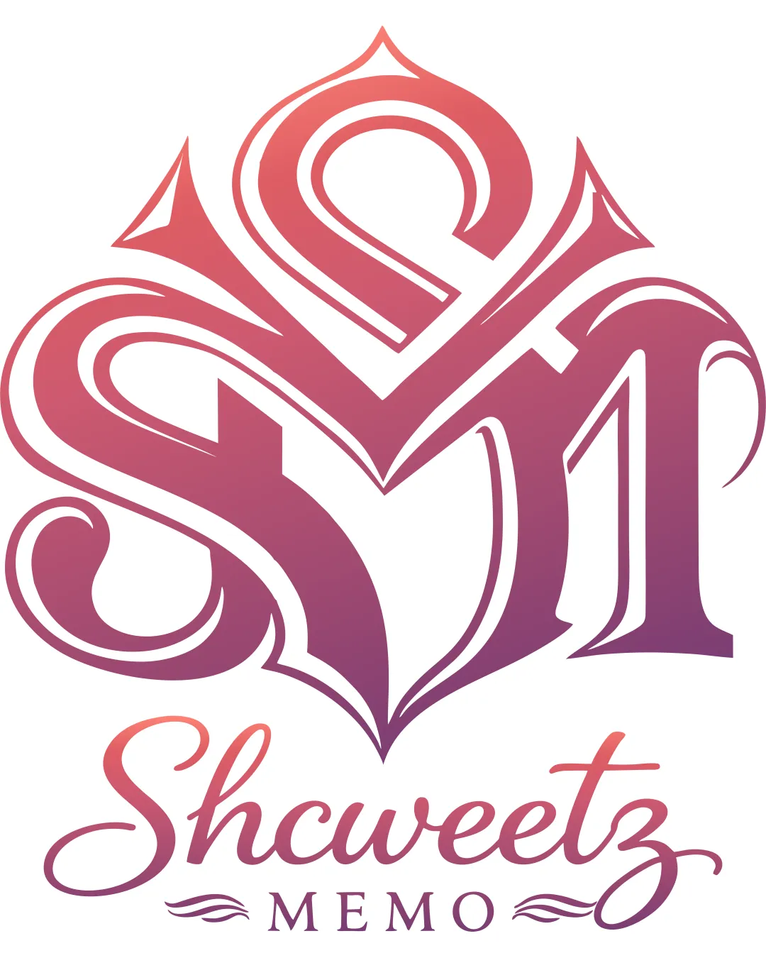
Shcweetz MEMO logo review
3.0 / 5
Logo score
Logo review of

Shcweetz Memo

Distinctive concept but the crest is too complex for practical, professional use without revision.

Combination Mark Ornate Calligraphic Photography & Multimedia
2/5
Legibility
4/5
Originality
4/5
Misread
4/5
Balance
2/5
Scale
Action plan

What to fix first

The most important fixes to handle before polishing the full presentation.

1

Fix possible misinterpretation

High priority

Complex shape may confuse viewers about which letters are intended
Impact: High · Effort: Medium

2

Simplify the monogram S and M so each letter is immediately recognizable without reducing elegance.

High priority

Current monogram is hard to decipher, limiting brand clarity.

Impact: Improves Legibility And Instant Brand Recall. · Effort: Medium

3

Test the logo at small sizes and in full black to check for line loss or merging.

Medium priority

Fine lines and dense areas may blur in small or single-color formats.

Impact: Ensures Utility Across All Real-world Applications. · Effort: Low

Detailed review

Logo performance breakdown

2/5

Legibility

Checkmark icon 'Shcweetz MEMO' text at bottom is readable

Warning icon Monogram letters (S and M) are difficult to distinguish; overly decorative styling reduces clarity

4/5

Originality

Checkmark icon Unique combination of script and monogram; bold crest shape

Warning icon Letter-based monograms are common in this style, limiting distinctiveness

5/5

Color harmony

Checkmark icon Gradient color is harmonious and professional; smooth transition from pinks to purples

Orchid
#D77CBF

Purple
#A0357F

4/5

Balance alignment

Checkmark icon Crest symmetry and overall shape are visually balanced

Warning icon Wordmark and crest could feel slightly disconnected in visual hierarchy

logo 200x250 pixels scalability test alignment grid overlay
2/5

Scalability

Checkmark icon Works at moderate sizes; smooth vector forms

Warning icon Fine lines and dense detailing risk loss of clarity at small sizes or in one color

logo 200x250 pixels scalability test

200x250 px

logo 100x125 pixels scalability test

100×125 px

logo 50x62 pixels scalability test

50×62 px

4/5

Misinterpretations

Checkmark icon No obvious offensive or embarrassing misreads

Warning icon Complex shape may confuse viewers about which letters are intended

3 / 5

Logo structure & brief match

Checkmark icon Matching calligraphic style between elements

Warning icon Separation between crest and wordmark can feel abrupt

Checkmark icon Fotografi, Editing, Printing, And Multimedia Purpose: Ornate visual style suggests creativity; monogram crest supports personal or branded photography/multimedia business.

Try your own review

Wondering how your logo performs?

Get a clear logo score, key risks, and priority fix ideas before your client or audience sees it.

Review my logo