Silver MCon logo review
4.4 / 5
Logo score
Logo review of

Silver Mcon

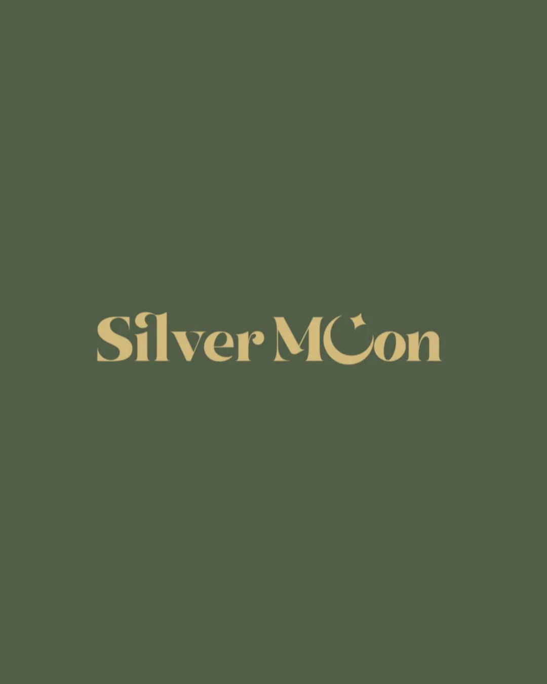
A strong, stylish wordmark with distinctive character and industry fit. Minor tweaks to the moon detail would make it fully professional.

Wordmark With Typographic Symbol Modern Serif, Slightly Whimsical Handmade Accessories And Silverware
4/5
Legibility
4/5
Originality
5/5
Misread
5/5
Balance
4/5
Scale
Action plan

What to fix first

The most important fixes to handle before polishing the full presentation.

1

Slightly refine the crescent moon shape to further clarify the letter 'o' for improved instant readability without losing visual interest.

Medium priority

Legibility is slightly impacted by the moon-shaped 'o', so a small adjustment could enhance usability.

Impact: Clearer Brand Recall And Smoother Recognition, Especially In Digital/quick-glance Environments. · Effort: Low

Detailed review

Logo performance breakdown

4/5

Legibility

Checkmark icon Text is mostly clear and readable
Checkmark icon Sufficient spacing between letters

Warning icon The crescent moon as 'o' slightly reduces immediate readability of 'Moon'

4/5

Originality

Checkmark icon Crescent moon as 'o' adds a unique visual twist

Warning icon Serif typeface and moon symbolism are somewhat common in branding

5/5

Color harmony

Checkmark icon Muted palette fits handmade/luxury positioning
Checkmark icon Good contrast between text and background

Straw
#DCCA8E

Fern Green
#495A3C

5/5

Balance alignment

Checkmark icon Consistent spacing and alignment across the wordmark
Checkmark icon Visually centered and optically balanced

logo 200x250 pixels scalability test alignment grid overlay
4/5

Scalability

Checkmark icon Bold font retains clarity at smaller sizes
Checkmark icon Simple color palette scales well

Warning icon Fine details on the crescent moon may lose definition at very small sizes

logo 200x250 pixels scalability test

200x250 px

logo 100x125 pixels scalability test

100×125 px

logo 50x62 pixels scalability test

50×62 px

5/5

Misinterpretations

Checkmark icon No inappropriate or embarrassing visual misreadings present

Brief match

Checkmark icon Handmade Accessories And Silverware: The moon element and serif type evoke craftsmanship and elegance, supporting the handmade luxury positioning. Font and color feel appropriate for a premium accessories brand.

Try your own review

Wondering how your logo performs?

Get a clear logo score, key risks, and priority fix ideas before your client or audience sees it.

Review my logo