P.C. FORMS & STATIONERY logo logo review
3.4/5
Logo score Combination mark category

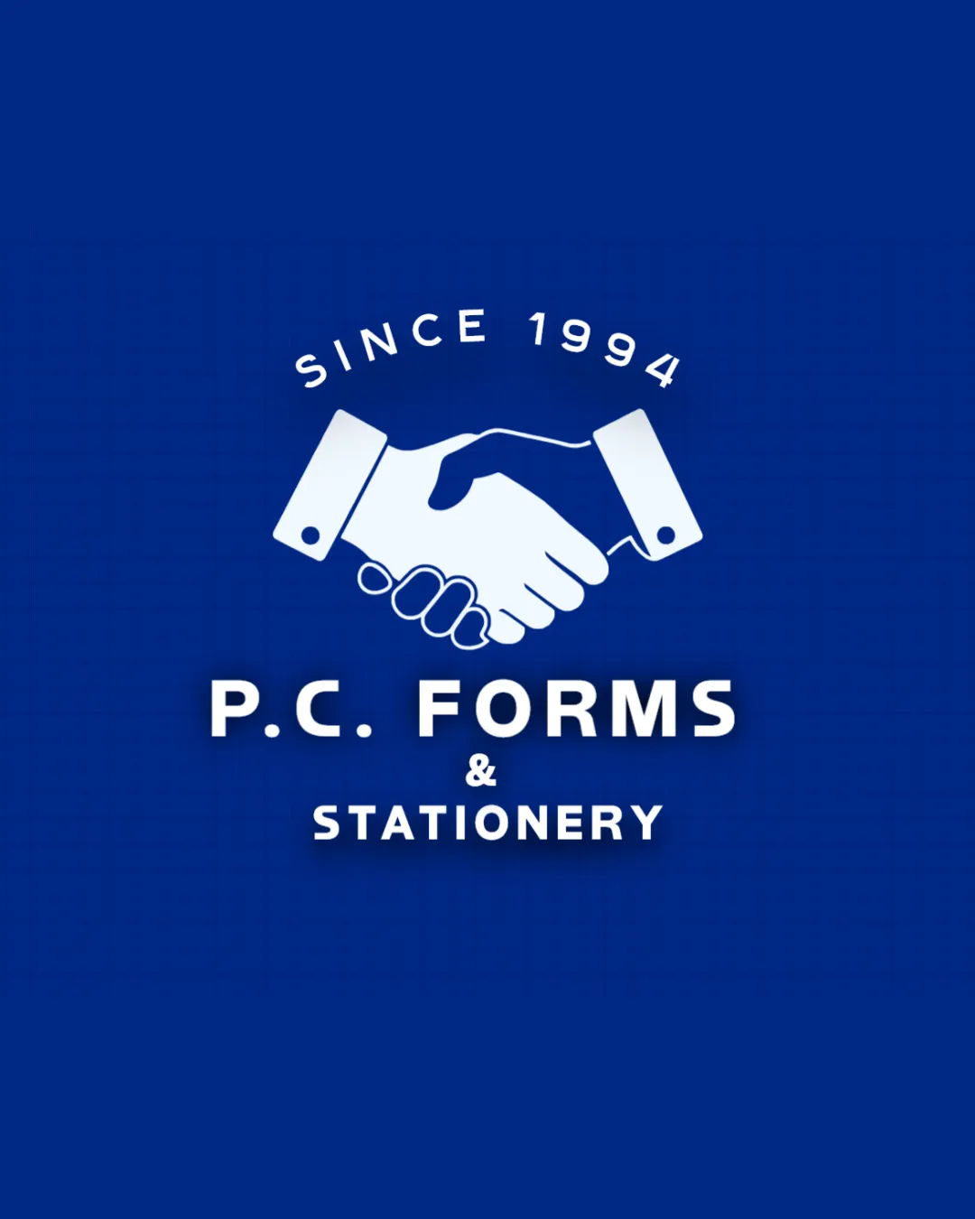
P.C. FORMS & STATIONERY logo

creative656716 Essential logo review

The logo is competent and trustworthy for broad business, but too generic for strong IT hardware positioning.

This logo lockup needs more distinctive construction to stand out.

Combination Mark Flat Solid Business/trading
4.6/5
Legibility
2/5
Originality
4/5
Balance
3.4/5
Scale
4/5
Color
3/5
Style consistency
Your next steps

What to fix first

Focus on the changes that matter. Keep what makes the logo work.

1

Standalone mark

Consider evolving the symbol or adding IT-relevant elements to increase category distinctiveness.

High priority Visible issue Medium effort

The handshake imagery is widely used in business logos and feels generic, not directly reflecting IT hardware trading or stationery.

How to check

Check for opportunities to integrate more specific industry cues into the symbol.

See the category review
Detailed review

Logo performance breakdown

3/5

Brief & logo match

The handshake and established date communicate trust and business longevity, but the lack of direct IT hardware cues leads to only a partial fit for an IT hardware trading firm.

5/5

Misinterpretations

  • No evidence of misreading or unintended associations.
4.6/5

Legibility

Wordmark 5/5 · Layout 4/5

  • Clear sans-serif type and high contrast ensure excellent readability.
4/5

Color harmony

Symbol 4/5 · Wordmark 4/5

  • The blue and white palette is professional and appealing.
  • Strong contrast between white and deep blue ensures good visibility, but heavy blue may reduce vibrancy when printed in black and white.

    Worth testing Standalone mark and wordmark
Dark Blue#003399
White#FFFFFF

Estimated colors. Use the original design file for exact values.

Create a full color palette using these colors

Create new palette
4/5

Balance alignment

Symbol 4/5 · Wordmark 4/5 · Layout 4/5

  • Elements are well-centered and visually balanced.
Uploaded logoAlignment guide overlay

Inspect spacing with the guide. Optical balance may differ from geometric centering.

3.4/5

Scalability

Symbol 3/5 · Wordmark 4/5 · Layout 3/5

  • Text scales well; detailed handshake mark may need simplification for very small sizes.
  • Detailed handshake graphic may lose clarity at small sizes, particularly in the fingers and cuffs.

    Worth testing Standalone mark (handshake)
3/5

Style consistency

Available in Advanced logo reviews
2/5

Originality

Symbol 2/5 · Wordmark 2/5

Available in Advanced logo reviews
Try your own review

Wondering how your logo performs?

Get a clear logo score, key risks, and priority fix ideas before your client or audience sees it.

Review my logo