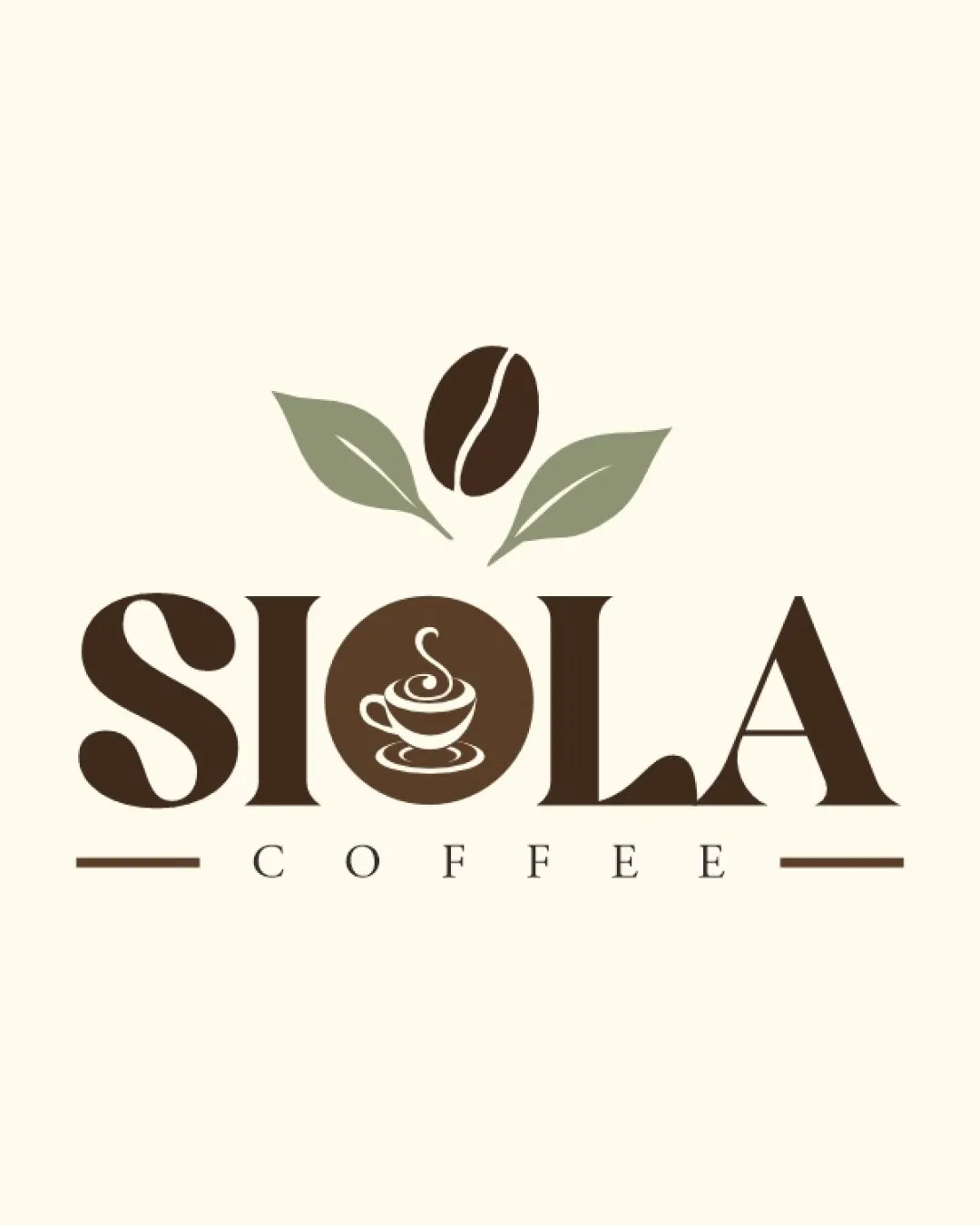
SIOLA COFFEE logo review
4/5
Logo score
Logo review of

Siola Coffee

A well-executed coffee shop logo that is readable, appealing, and brand-appropriate, with minor improvements in detail clarity and distinctiveness suggested.

Combination Mark Minimal, Vintage-inspired, Cafe Brand Coffee Shop
4.5/5
Legibility
3.5/5
Originality
5/5
Misread
4.5/5
Balance
4/5
Scale
Action plan

What to fix first

The most important fixes to handle before polishing the full presentation.

1

Increase clarity of the coffee cup illustration inside the 'O', particularly for smaller scales.

Medium priority

Prevents loss of detail and preserves theme in all usage sizes.

Impact: Improves Small-size Usage And Sharpens Identity Element. · Effort: Medium

2

Explore a distinctive twist on the coffee bean or integrate a subtle accent color to improve originality.

Low priority

Small tweaks could help stand out in a saturated market.

Impact: Can Help Differentiate From Typical Coffee Shop Marks. · Effort: Low

Detailed review

Logo performance breakdown

4.5/5

Legibility

Checkmark icon Large, spaced font is highly readable
Checkmark icon 'COFFEE' is clearly legible as tagline

Warning icon Coffee cup illustration inside 'O' may slightly distract at a small size

3.5/5

Originality

Checkmark icon Coffee cup-in-letter trick is relevant and integrated
Checkmark icon Stylized composition lessens generic feel

Warning icon Bean and leaves is a common coffee motif
Warning icon General layout feels familiar for cafes

4/5

Color harmony

Checkmark icon Natural browns and greens match coffee theme
Checkmark icon Palette is pleasant and appropriate

Warning icon Lack of strong accent color may reduce stand-out factor

Dark Brown
#4C3729

Muted Green
#848B6B

Beige
#F2EFE6

Your palette is close. Refine the color roles and combinations before updating the logo.

Build brand colors
4.5/5

Balance alignment

Checkmark icon Strong horizontal alignment and symmetry
Checkmark icon Bean and leaves are well-centered above the logo

Warning icon Slight heaviness on left due to bold 'S' vs lighter 'A' tail

logo 200x250 pixels scalability test alignment grid overlay
4/5

Scalability

Checkmark icon Main forms remain distinct at small scale
Checkmark icon Simple lines aid in reproduction

Warning icon Details (steam from cup, 'COFFEE' tagline) may lose definition when minimized

logo 200x250 pixels scalability test

200x250 px

logo 100x125 pixels scalability test

100×125 px

logo 50x62 pixels scalability test

50×62 px

5/5

Misinterpretations

Checkmark icon No inappropriate or confusing shapes observed

4.5/5

Logo structure & brief match

Checkmark icon Bean and leaves integrate visually with wordmark
Checkmark icon Cup graphic aligns theme and typography

Warning icon 'O' coffee cup could be mistaken for generic icon if used solo

Checkmark icon Industry Relevance: Bean, leaves, and cup iconography match coffee shop identity well.
Checkmark icon Atmosphere: Vintage yet clean style matches typical cafe branding trends.

Try your own review

Wondering how your logo performs?

Get a clear logo score, key risks, and priority fix ideas before your client or audience sees it.

Review my logo