Wondering how your logo performs? 🧐
Get professional logo reviews in seconds and catch design issues in time.
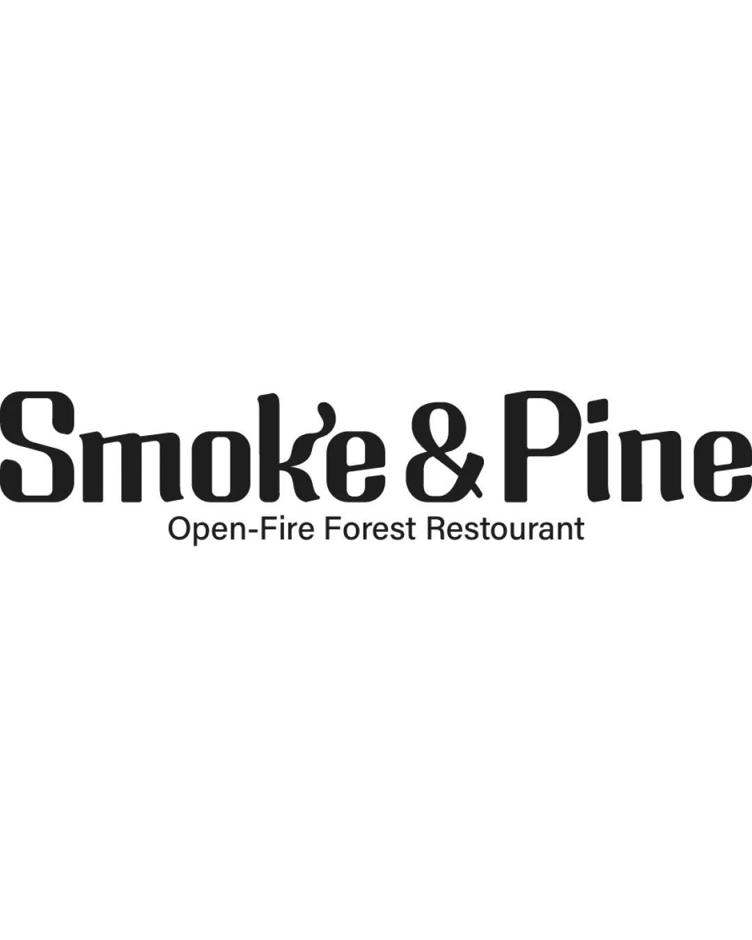
Try it Now!Logo review of Smoke & Pine Open-Fire Forest Restaurant
 Logo analysis by AI
Logo type:
Style:
Detected symbol:
Negative space:
Detected text:
Business industry:
Review requested by Nathan
**If AI can recognize or misinterpret it, so can people.
Structured logo review
Legibility
![]() The main name 'Smoke & Pine' is highly readable with strong, clear letterforms.
The main name 'Smoke & Pine' is highly readable with strong, clear letterforms.![]() Subtext is decently sized and easy to interpret against a plain background.
Subtext is decently sized and easy to interpret against a plain background.
![]() The custom edit on the letter 'k' slightly compromises legibility for certain viewers, especially at small sizes or quick glances.
The custom edit on the letter 'k' slightly compromises legibility for certain viewers, especially at small sizes or quick glances.
Scalability versatility
![]() The bold, sans-serif type makes it adaptable for signage, menus, and web use.
The bold, sans-serif type makes it adaptable for signage, menus, and web use.![]() It retains clarity in black and white.
It retains clarity in black and white.
![]() The flame-like extension on the 'k' may lose detail at very small scales, particularly in embroidery, small merchandise, or favicon applications.
The flame-like extension on the 'k' may lose detail at very small scales, particularly in embroidery, small merchandise, or favicon applications.![]() Subtext may be too thin/tiny for reduced-format presentations.
Subtext may be too thin/tiny for reduced-format presentations.
200x250 px
100×125 px
50×62 px
Balance alignment
![]() Text elements are well aligned and spaced.
Text elements are well aligned and spaced.![]() The wordmark feels balanced with the ampersand centrally placed.
The wordmark feels balanced with the ampersand centrally placed.

Originality
![]() Custom integration of a flame motif into the wordmark provides some intrigue.
Custom integration of a flame motif into the wordmark provides some intrigue.
![]() Other than the 'k' flame, most elements are generic sans-serif forms with little unique typographic treatment.
Other than the 'k' flame, most elements are generic sans-serif forms with little unique typographic treatment.![]() Wordmark-style logos are common in the restaurant industry.
Wordmark-style logos are common in the restaurant industry.
Aesthetic look
![]() Clean, modern, straightforward look with a subtle playful twist.
Clean, modern, straightforward look with a subtle playful twist.![]() Simple black and white color scheme keeps the design professional.
Simple black and white color scheme keeps the design professional.
![]() Could be seen as too minimalist for a brand wanting strong visual impact.
Could be seen as too minimalist for a brand wanting strong visual impact.![]() Unique flair is quite subtle and may not immediately stand out.
Unique flair is quite subtle and may not immediately stand out.
Dual meaning and misinterpretations
![]() No obvious misinterpretations or inappropriate dual meanings detected.
No obvious misinterpretations or inappropriate dual meanings detected.![]() Flame integration is contextually relevant.
Flame integration is contextually relevant.
Color harmony
![]() Monochromatic palette ensures perfect harmony.
Monochromatic palette ensures perfect harmony.![]() High contrast for maximum readability.
High contrast for maximum readability.
Black
#000000
White
#FFFFFF


