Wondering how your logo performs? 🧐
Get professional logo reviews in seconds and catch design issues in time.
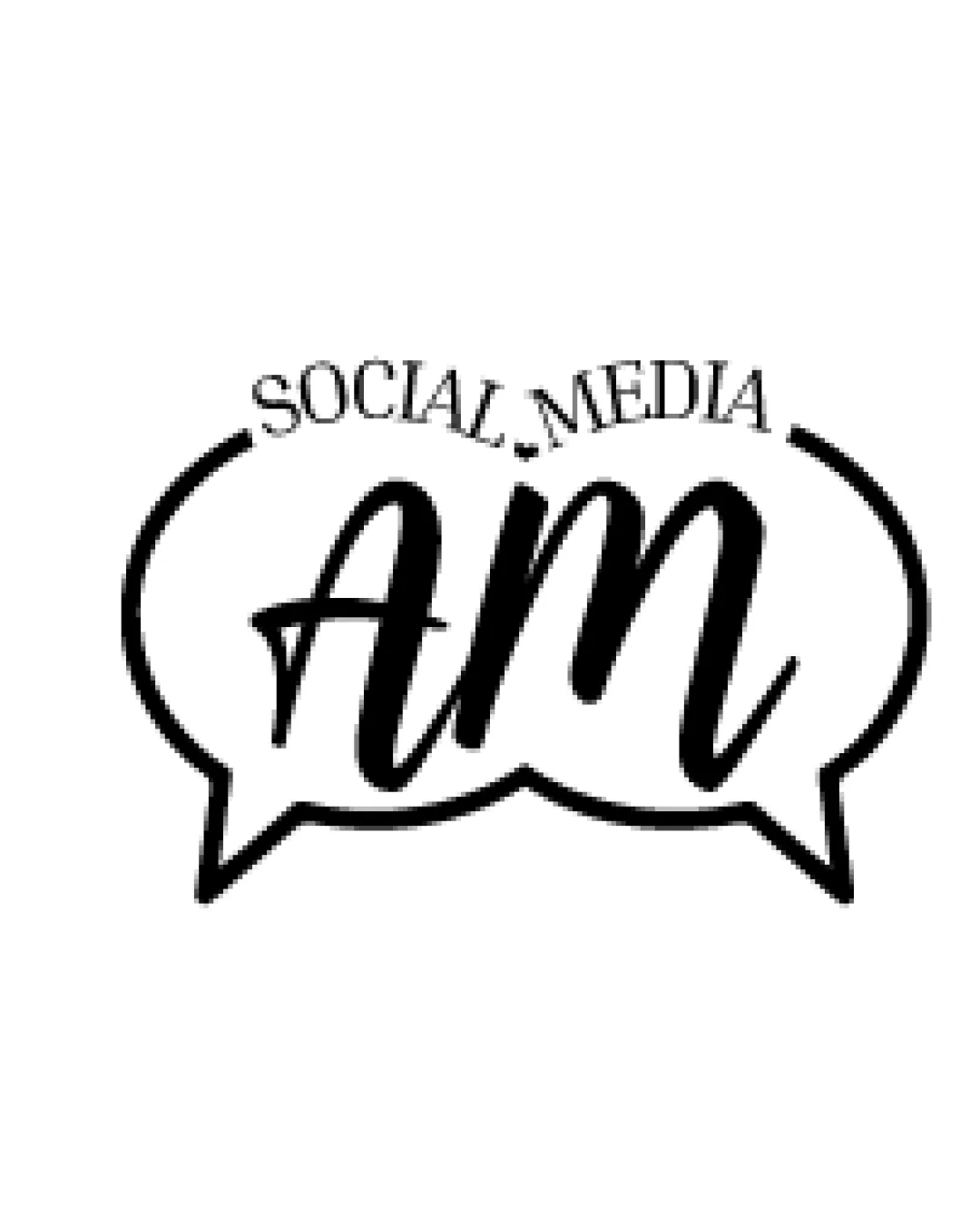
Try it Now!Logo review of SOCIAL MEDIA AM
 Logo analysis by AI
Logo type:
Style:
Detected symbol:
Detected text:
Business industry:
Review requested by AlexandraCardoso
**If AI can recognize or misinterpret it, so can people.
Structured logo review
Legibility
![]() The main initials 'AM' are legible and prominent.
The main initials 'AM' are legible and prominent.![]() The overall color contrast is strong, ensuring visibility.
The overall color contrast is strong, ensuring visibility.
![]() The 'SOCIAL MEDIA' text is small, curved, and could become illegible at smaller sizes.
The 'SOCIAL MEDIA' text is small, curved, and could become illegible at smaller sizes.![]() Text styles clash, resulting in reduced readability for the business name.
Text styles clash, resulting in reduced readability for the business name.
Scalability versatility
![]() Simple use of black and white allows for easy reproduction in most mediums.
Simple use of black and white allows for easy reproduction in most mediums.
![]() The thin font on 'SOCIAL MEDIA' and overall line weight of the speech bubble could vanish or blur at small sizes (such as business cards or social media avatars).
The thin font on 'SOCIAL MEDIA' and overall line weight of the speech bubble could vanish or blur at small sizes (such as business cards or social media avatars).![]() Handwritten 'AM' may lose definition in embroidery or favicons.
Handwritten 'AM' may lose definition in embroidery or favicons.
200x250 px
100×125 px
50×62 px
Balance alignment
![]() The speech bubble provides a central frame, offering some visual containment.
The speech bubble provides a central frame, offering some visual containment.
![]() The top 'SOCIAL MEDIA' text feels awkwardly placed and disrupts the logo's vertical balance.
The top 'SOCIAL MEDIA' text feels awkwardly placed and disrupts the logo's vertical balance.![]() The 'AM' lettering overlaps and nearly touches the boundaries, lacking comfortable breathing space.
The 'AM' lettering overlaps and nearly touches the boundaries, lacking comfortable breathing space.![]() Curved top text and flat baseline 'AM' result in misaligned visual flow.
Curved top text and flat baseline 'AM' result in misaligned visual flow.

Originality
![]() Handwritten script gives a casual and human touch.
Handwritten script gives a casual and human touch.
![]() Speech bubble icons are clichéd choices for social media and communication brands.
Speech bubble icons are clichéd choices for social media and communication brands.![]() There is no unique twist or hidden meaning, making the logo generic.
There is no unique twist or hidden meaning, making the logo generic.
Logomark wordmark fit
![]() Both wordmark and logomark are integrated inside the speech bubble, creating a single composition.
Both wordmark and logomark are integrated inside the speech bubble, creating a single composition.
![]() The styles of 'SOCIAL MEDIA' (serif, all-caps, arched) and 'AM' (bold handwritten) conflict, resulting in a mismatch.
The styles of 'SOCIAL MEDIA' (serif, all-caps, arched) and 'AM' (bold handwritten) conflict, resulting in a mismatch.![]() Size difference and placement feel forced rather than naturally integrated.
Size difference and placement feel forced rather than naturally integrated.
Aesthetic look
![]() Clean, monochrome look avoids visual clutter.
Clean, monochrome look avoids visual clutter.
![]() Clashing text styles and awkward spacing detract from the overall aesthetic.
Clashing text styles and awkward spacing detract from the overall aesthetic.![]() The design feels busy inside the limited bubble space.
The design feels busy inside the limited bubble space.![]() Generic use of industry clichés (speech bubble).
Generic use of industry clichés (speech bubble).
Dual meaning and misinterpretations
![]() No inappropriate or accidental imagery detected.
No inappropriate or accidental imagery detected.
Color harmony
![]() Monochrome color palette ensures effortless harmony and maximum contrast.
Monochrome color palette ensures effortless harmony and maximum contrast.![]() Easy to use on various backgrounds.
Easy to use on various backgrounds.
Black
#000000
White
#FFFFFF


