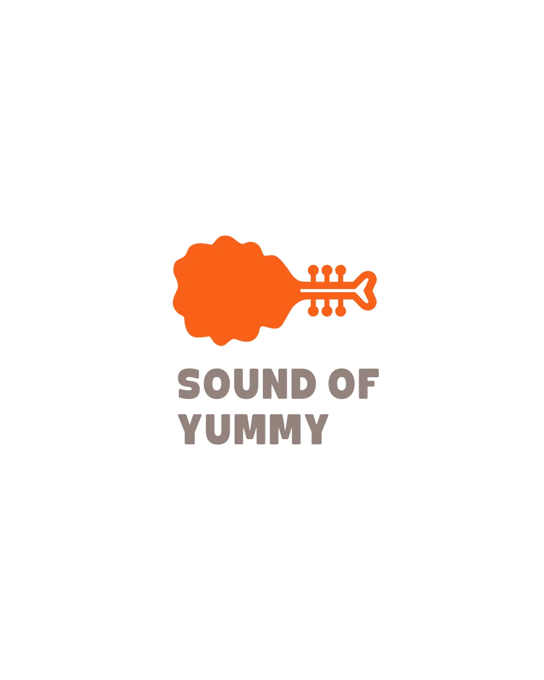
SOUND OF YUMMY logo review
4.3 / 5
Logo score

Logo review ofSound Of Yummy

Creative and memorable; ready for use with adjustments to symbol clarity and balance.

Combination Mark Playful Minimalist Food & Music
5/5
Legibility
5/5
Originality
4/5
Misread
4/5
Balance
4/5
Scale
Review next
Action plan

What to fix first

The most important fixes to handle before polishing the full presentation.

1

Fix possible misinterpretation

High priority

Quick glance could cause momentary confusion about the symbol's meaning
Impact: High · Effort: Medium

2

Refine the outline of the drumstick-guitar hybrid to improve immediate recognizability and symbol clarity.

High priority

Currently, quick recognizability suffers due to the abstract hybrid shape.

Impact: Makes The Logo's Concept Instantly Understandable, Reducing Confusion And Improving Brand Recall. · Effort: Medium

3

Adjust the balance between the drumstick (bulky left side) and the guitar neck (thin right side) for better visual equilibrium.

Medium priority

Minor shift in proportions or thickness will produce a more harmonious look.

Impact: Improves Overall Balance And Professionalism. · Effort: Low

Detailed review

Logo performance breakdown

5/5

Legibility

Checkmark icon Text is bold and highly readable

5/5

Originality

Checkmark icon Imaginative fusion of food and music elements

4/5

Color harmony

Checkmark icon Fun, coherent palette; orange draws attention

Warning icon Palette could benefit from a third accent/support color for flexibility

Orange
#FF6900

Cement
#A39A92

Your palette is close. Explore sharper color combinations with Colorfly.design before updating the logo.

Explore palettes
4/5

Balance alignment

Checkmark icon Symbol and text are centered and aligned well

Warning icon Minor optical weight difference between bulky drumstick and lighter neck

logo 200x250 pixels scalability test alignment grid overlay
4/5

Scalability

Checkmark icon Simple shapes suitable for small sizes

Warning icon Fine details of guitar tuners may be less distinct at extra-small scale

logo 200x250 pixels scalability test

200x250 px

logo 100x125 pixels scalability test

100×125 px

logo 50x62 pixels scalability test

50×62 px

4/5

Misinterpretations

Checkmark icon No offensive or inappropriate misreadings

Warning icon Quick glance could cause momentary confusion about the symbol's meaning

5 / 5

Logo structure & brief match

Checkmark icon Mark conceptually fits brand name and supports the playful tone

Checkmark icon Food & Music Crossover: Logo strongly fuses these concepts and is visually on-brief.

Try your own review

Wondering how your logo performs?

Get a clear logo score, key risks, and priority fix ideas before your client or audience sees it.

Review my logo