Wondering how your logo performs? 🧐
Get professional logo reviews in seconds and catch design issues in time.
Try it Now!Logo review of Starey.Wonder
 Logo analysis by AI
Logo type:
Style:
Detected symbol:
Negative space:
Detected text:
Business industry:
Review requested by Starey.wonder
**If AI can recognize or misinterpret it, so can people.
Structured logo review
Legibility
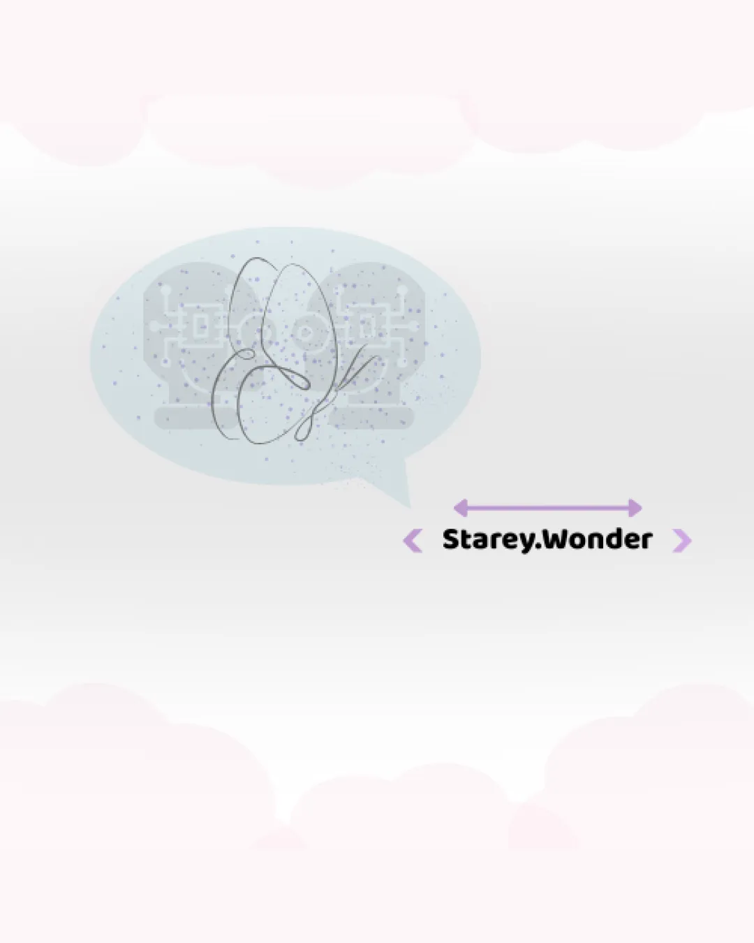
 The brand name 'Starey.Wonder' is readable with clear, bold, sans-serif font. Black text contrasts reasonably with the light background.
 Text spacing is uneven due to purple arrows/brackets that distract from wordmark. Speech bubble and abstract shapes draw more attention than the text.
Scalability versatility
The relatively simple color palette permits versatile use across light backgrounds.
Fine line art and circuit details will be completely lost or illegible at small sizes (e.g., social favicons, pens, embroidery). Logo becomes indistinct and busy in small-scale applications, such as app icons or small packaging. Complexity reduces recognizability on billboards or monochrome mockups.
200x250 px
100×125 px
50×62 px
Balance alignment
Logo elements are approximately centered relative to each other.
Wordmark and logomark lack cohesive alignment—the symbol is offset inside a large speech bubble, which is not visually anchored to the text. Relative size between the text and speech bubble graphic feels mismatched.

Originality
Use of digital faces, circuit motifs inside a speech bubble, and abstract line art is original. Creative combination of storytelling (speech bubble) and wonder (abstract form).
Overall layout is visually busy; the combination risks feeling overcomplicated. Abstract nature can feel unfocused if the brand direction isn’t clear.
Logomark wordmark fit
Both the logomark and wordmark are modern; purple accent establishes some visual continuity.
Speech bubble logomark overshadows wordmark and is much larger, causing imbalance. Wordmark does not harmonize stylistically with the complexity of the logomark. Arrows/flanking marks introduce another visual element unnecessary to either part.
Aesthetic look
Soft colors create a whimsical, dreamy mood. Abstract art and digital motifs have a storytelling vibe.
Logo is visually cluttered, with too many focal points (circuit faces, line art, large bubble, accent marks, bold text). Gradient dots and gradient background distract from the central identity. Arrows/brackets feel arbitrary and don’t enhance the message.
Dual meaning and misinterpretations
No inappropriate or potentially harmful symbolism detected in the logomark or wordmark.
Color harmony
Muted lavender, soft blues, and black text work harmoniously and avoid jarring clashes. Color use is cohesive and supports the brand tone.
Gradient dots add visual noise and could be reduced for a cleaner appearance. Arrows in purple may distract from the primary color palette.
Pale Lavender
#e5e4eb
Pale Blue Gray
#bdbec7
Light Purple
#bea3de
Black
#1a161b