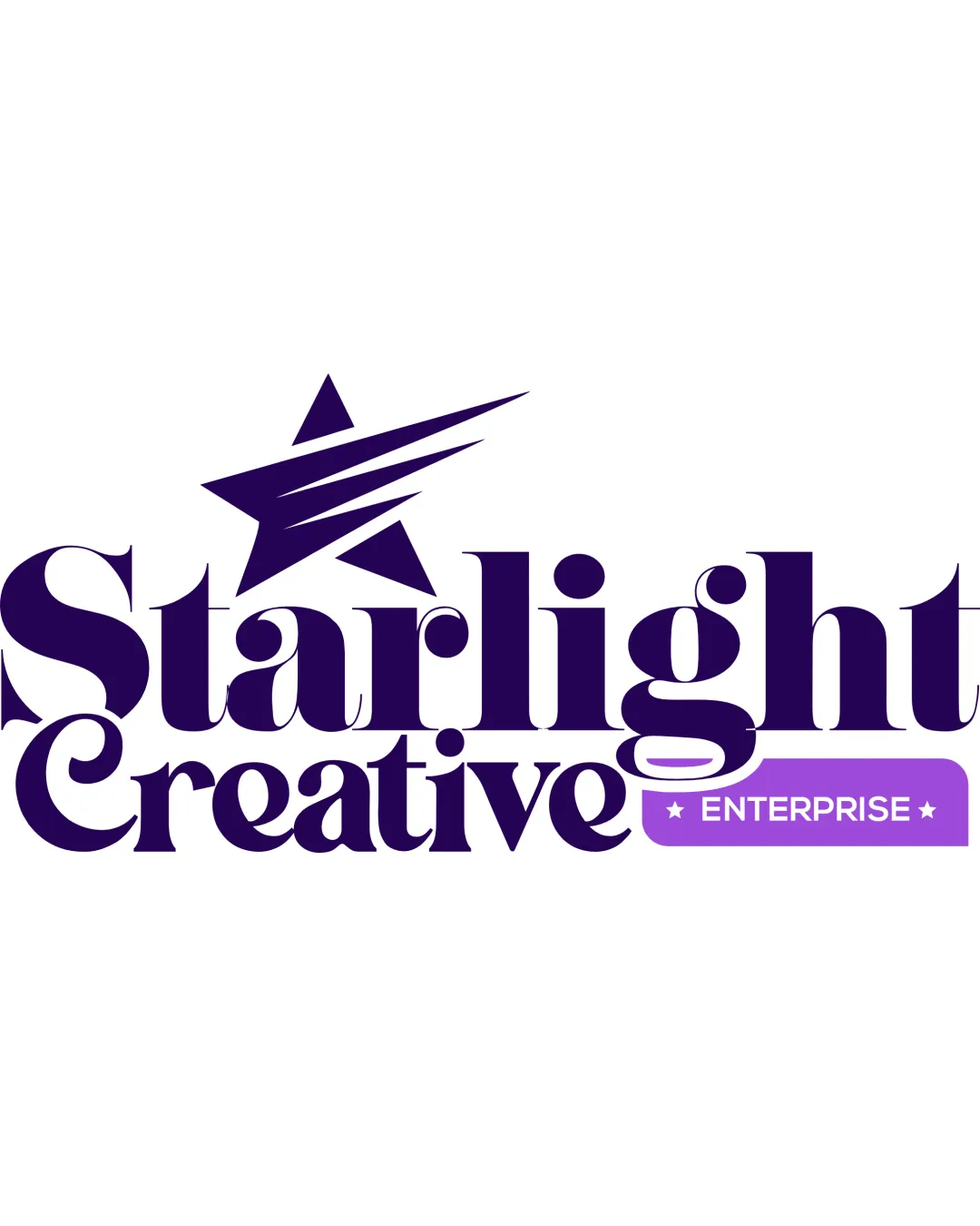
Starlight Creative ENTERPRISE logo review
3.7 / 5
Logo score
Logo review of

Starlight Creative Enterprise

Solid creative mark with clear concept; polish integration and details before final client delivery.

Combination Mark Bold Modern Serif With Graphic Accent Creative Services
4/5
Legibility
3/5
Originality
5/5
Misread
3/5
Balance
3/5
Scale
Action plan

What to fix first

The most important fixes to handle before polishing the full presentation.

1

Unify the style of the 'ENTERPRISE' badge with the rest of the logo to reinforce visual cohesion.

High priority

Currently, the badge feels separate and less integrated with the bold serif style.

Impact: Medium · Effort: Low

2

Slightly increase tracking (letter-spacing) and reduce detail in 'Creative' and star icon for better small-size legibility.

Medium priority

Improves clarity, especially for print and small-scale applications.

Impact: Medium · Effort: Medium

Detailed review

Logo performance breakdown

4/5

Legibility

Checkmark icon Primary words are bold and readable
Checkmark icon Contrasting color used for 'ENTERPRISE' highlights sub-brand

Warning icon Thick serifs and close spacing create minor crowding in 'Creative' at small sizes

3/5

Originality

Checkmark icon Star integrated into type is a creative nod to the name

Warning icon Shooting star motif is commonly used in creative branding

4/5

Color harmony

Checkmark icon Consistent purple palette; pop of lavender for highlight

Warning icon Differing background for 'ENTERPRISE' slightly breaks harmony

Purple
#4B2563

Lavender
#B08CFC

White
#FFFFFF

Your palette is close. Refine the color roles and combinations before updating the logo.

Build brand colors
3/5

Balance alignment

Checkmark icon Main mark is horizontally balanced
Checkmark icon Star placement gives upward movement

Warning icon 'ENTERPRISE' tag disrupts baseline and feels tacked on, affecting overall unity

logo 200x250 pixels scalability test alignment grid overlay
3/5

Scalability

Checkmark icon Strong, high-contrast elements

Warning icon Fine details in star and thin counterforms in letters may collapse at small sizes

logo 200x250 pixels scalability test

200x250 px

logo 100x125 pixels scalability test

100×125 px

logo 50x62 pixels scalability test

50×62 px

5/5

Misinterpretations

Checkmark icon No inappropriate or confusing misreads detected

4 / 5

Logo structure & brief match

Checkmark icon Star integrates visually with 'Starlight', echoing the name

Warning icon The graphic style of 'ENTERPRISE' panel is more utilitarian than the rest

Checkmark icon Industry: Star motif and creative typography are a strong fit for creative services, providing a sense of imagination and aspiration.

Try your own review

Wondering how your logo performs?

Get a clear logo score, key risks, and priority fix ideas before your client or audience sees it.

Review my logo