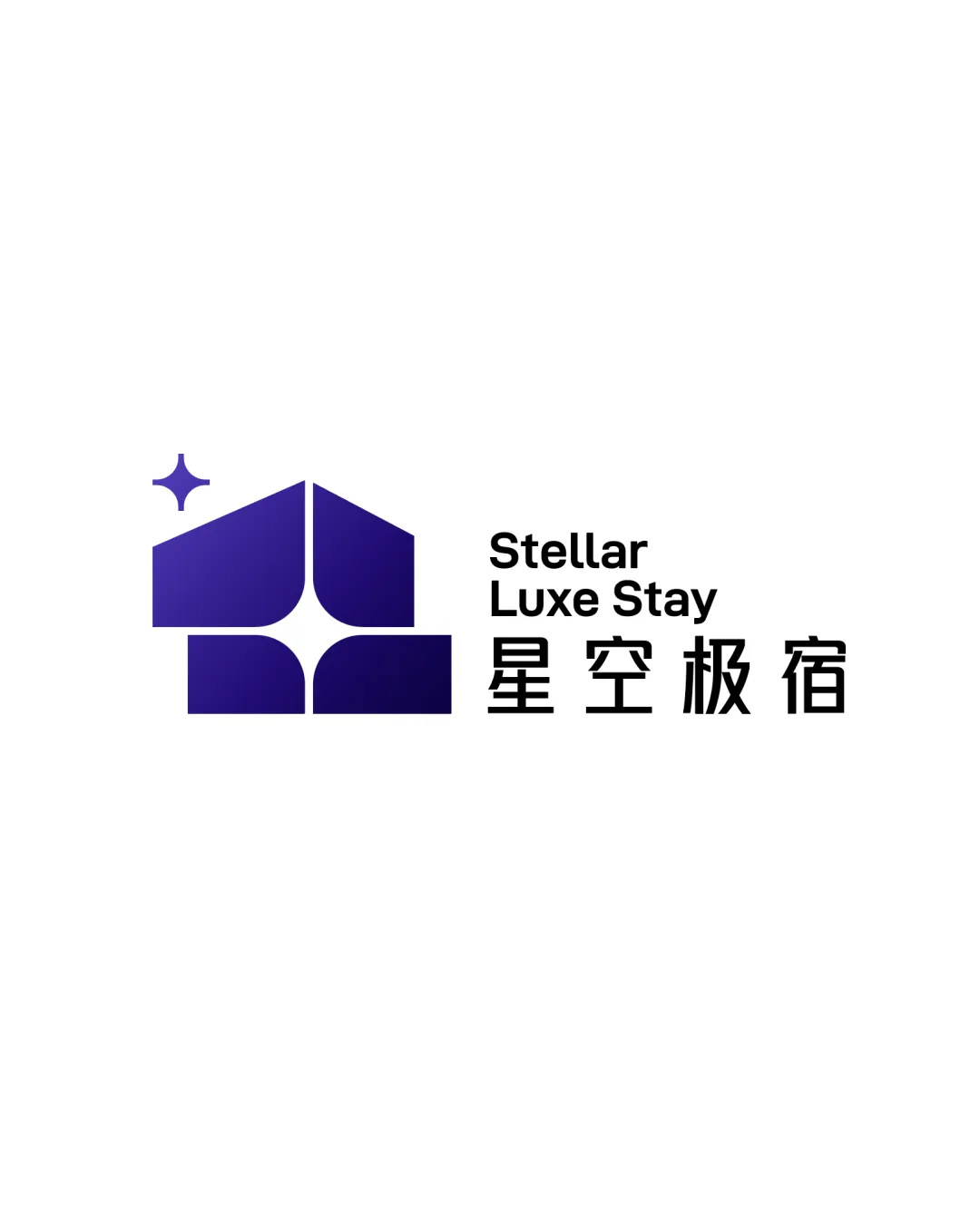
Stellar Luxe Stay 星空极宿 logo review
4.0 / 5
Logo score
Logo review of

Stellar Luxe Stay 星空极宿

Distinctive, visually strong logo that clearly communicates night-sky luxury stays. Highly functional with minor spacing fixes.

Combination Mark Modern Geometric Hospitality
4.5/5
Legibility
4/5
Originality
5/5
Misread
4/5
Balance
4/5
Scale
Action plan

What to fix first

The most important fixes to handle before polishing the full presentation.

1

Adjust spacing between the symbol’s star motif and main house form for better unity at small sizes.

Medium priority

Minor spacing tweak, visually impactful.

Impact: Enhances Overall Coherence And Small-scale Clarity. · Effort: Low

2

Slightly increase tracking of the English wordmark for clarity at smaller sizes.

Medium priority

Simple text adjustment improves usability.

Impact: Improves Cross-language Readability And Polish. · Effort: Low

Detailed review

Logo performance breakdown

4.5/5

Legibility

Checkmark icon Text is clean and highly readable in both languages.
Checkmark icon Hierarchy is clear.

Warning icon English wordmark spacing slightly tight.

4/5

Originality

Checkmark icon House/stargazing mark is visually uncommon and memorable.
Checkmark icon Clear reflection of brand’s experiential focus.

Warning icon Symbol uses basic geometric language seen in some hospitality brands; moderate uniqueness.

4/5

Color harmony

Checkmark icon Gradient blue-purple evokes night sky and luxury.
Checkmark icon Good contrast with black and white text.

Warning icon Dual palette (blue gradient vs. black type) slightly splits brand character.

Navy Blue
#301978

Indigo
#561CAB

Black
#000000

White
#FFFFFF

Your palette is close. Refine the color roles and combinations before updating the logo.

Build brand colors
4/5

Balance alignment

Checkmark icon Good alignment between symbol and wordmark.
Checkmark icon Consistent modular proportions.

Warning icon Star motif is slightly isolated at small scale; could be closer to main mark.

logo 200x250 pixels scalability test alignment grid overlay
4/5

Scalability

Checkmark icon Mark and wordmark remain distinct at smaller sizes.
Checkmark icon Simple geometric forms scale well.

Warning icon Thin lines in English text could be fragile in very small use.

logo 200x250 pixels scalability test

200x250 px

logo 100x125 pixels scalability test

100×125 px

logo 50x62 pixels scalability test

50×62 px

5/5

Misinterpretations

Checkmark icon No confusing shapes or misreadings.

4 / 5

Logo structure & brief match

Checkmark icon Symbol and wordmark are visually cohesive in weight and alignment.

Warning icon The connection between modular mark and text could be strengthened.

Checkmark icon Immersive Forest And Starry-sky Accommodation: The symbol and palette clearly reference stargazing and modular cabins, fitting the brief well.

Try your own review

Wondering how your logo performs?

Get a clear logo score, key risks, and priority fix ideas before your client or audience sees it.

Review my logo