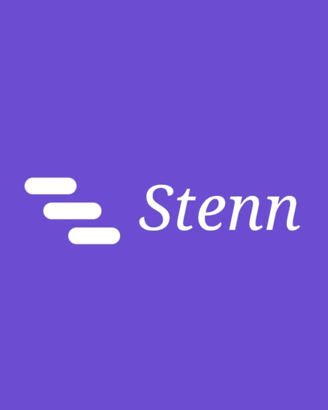
Stenn logo review
4.2 / 5
Logo score
Logo review of

Stenn

Strong legibility and decent modern style, but visual metaphor should be made more distinctive and relevant for premium market positioning.

Combination Mark Modern Minimalist Software
5/5
Legibility
3/5
Originality
5/5
Misread
4/5
Balance
4/5
Scale
Action plan

What to fix first

The most important fixes to handle before polishing the full presentation.

1

Strengthen the visual connection between the symbol and the product's core concept (text snippets or expansion)

High priority

The current symbol could better communicate the unique product value instead of generic tech/steps imagery.

Impact: Increases Memorability And Brand Clarity · Effort: Medium

2

Refine symbol spacing for greater balance at smaller sizes

Medium priority

Minor spacing tweaks will help the mark remain crisp and centered when reduced.

Impact: Improves Scalability And Optical Weight · Effort: Low

Detailed review

Logo performance breakdown

5/5

Legibility

Checkmark icon Text is highly readable with good contrast against the background

3/5

Originality

Checkmark icon Custom stacked bar motif is distinctive

Warning icon Abstract bar stack is a somewhat common tech motif

5/5

Color harmony

Checkmark icon Purple and white combo is harmonious and modern

Purple
#7B5EF4

White
#FFFFFF

4/5

Balance alignment

Checkmark icon Mark and word are well-aligned horizontally

Warning icon Visual weight is slightly left-heavy due to bar grouping

logo 200x250 pixels scalability test alignment grid overlay
4/5

Scalability

Checkmark icon Simple shapes remain clear at small sizes
Checkmark icon Works in one color scheme

Warning icon Spacing between bars might blur if scaled down too far

logo 200x250 pixels scalability test

200x250 px

logo 100x125 pixels scalability test

100×125 px

logo 50x62 pixels scalability test

50×62 px

5/5

Misinterpretations

Checkmark icon No unintended or offensive visual readings

4 / 5

Logo structure & brief match

Checkmark icon Mark direction aligns with the flow of the wordmark

Warning icon Minimal conceptual link between symbol and brand name

Checkmark icon Suggests Tech And Automation, Aligning With Text Expansion Product: Stacked bars hint at progression or steps, which fits automation and productivity themes

Try your own review

Wondering how your logo performs?

Get a clear logo score, key risks, and priority fix ideas before your client or audience sees it.

Review my logo