What to preserve
A playful, bold wordmark combined with a lively food vendor figure successfully captures the energy of a street food festival.
Spelling & grammar
No obvious issue foundAll words are clear and spelled correctly.
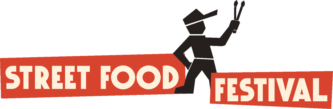
A bold, engaging logo for a food festival with only minor alignment refinements advisable.
Focus on the changes that matter. Keep what makes the logo work.
A playful, bold wordmark combined with a lively food vendor figure successfully captures the energy of a street food festival.
All words are clear and spelled correctly.
wordmark and symbol interaction
The symbol overlaps the red text band creating a slight visual disconnect between 'FOOD' and 'FESTIVAL.'
See the category reviewcolor palette
The bright red bar stands out but could be jarring on some backgrounds or print applications.
Mock up logo on varied media and materials for compatibility.
Logo visually embodies a vibrant, accessible festival with clear food cues and festive energy.
The symbol overlaps the red text band creating a slight visual disconnect between 'FOOD' and 'FESTIVAL.'
Try: Slightly adjust composition for smoother mark-wordmark integration.
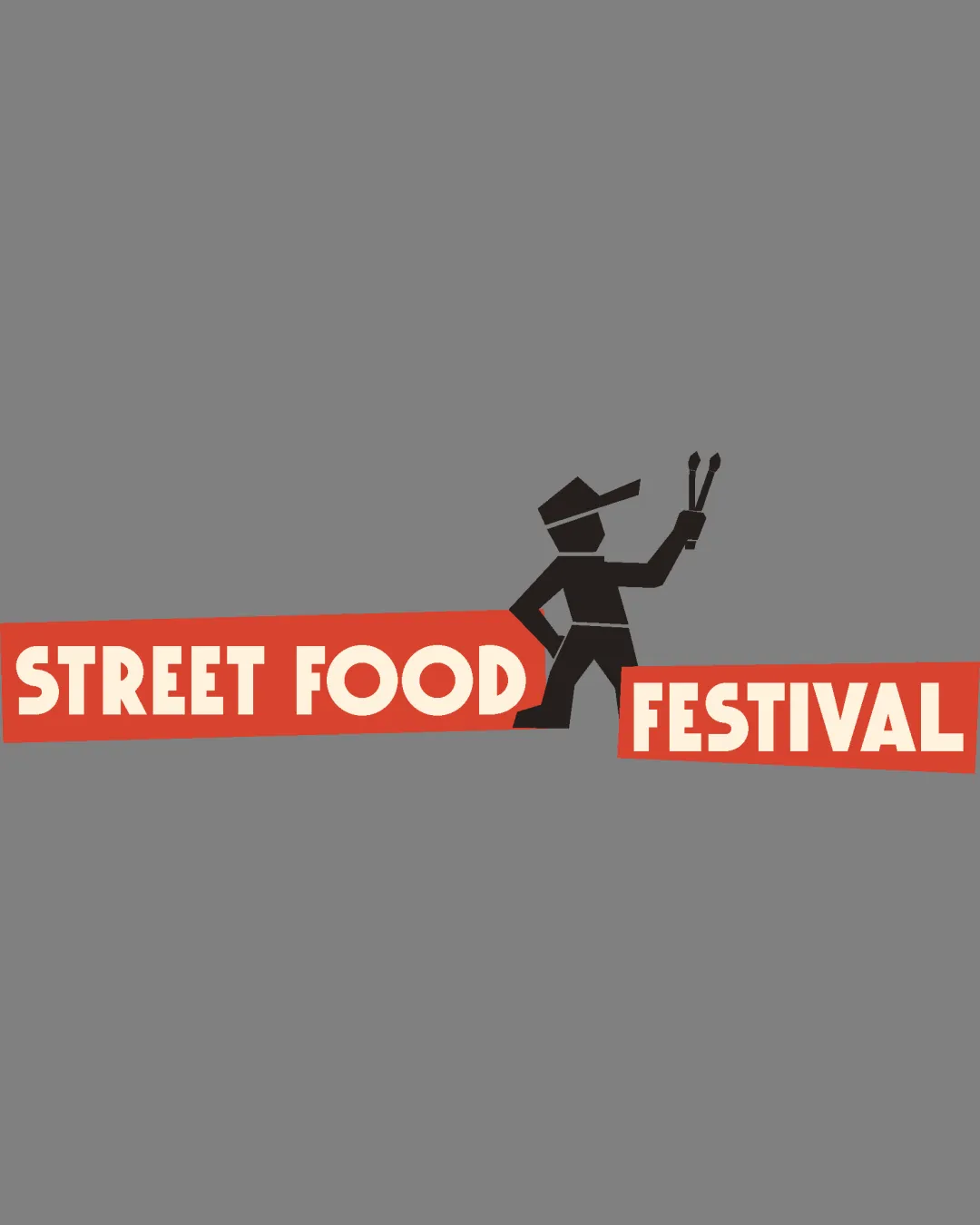

Inspect spacing with the guide. Optical balance may differ from geometric centering.
The bright red bar stands out but could be jarring on some backgrounds or print applications.
Try: Consider testing a more muted or gradient red for broader adaptability.
Check: Mock up logo on varied media and materials for compatibility.
Estimated colors. Use the original design file for exact values.
Create a full color palette using these colors
Create new paletteGet a clear logo score, key risks, and priority fix ideas before your client or audience sees it.
More credits needed
Add credits to continue without losing your work.
Then $7/month. Cancel anytime.
Essential logo review
Usually takes under a minute