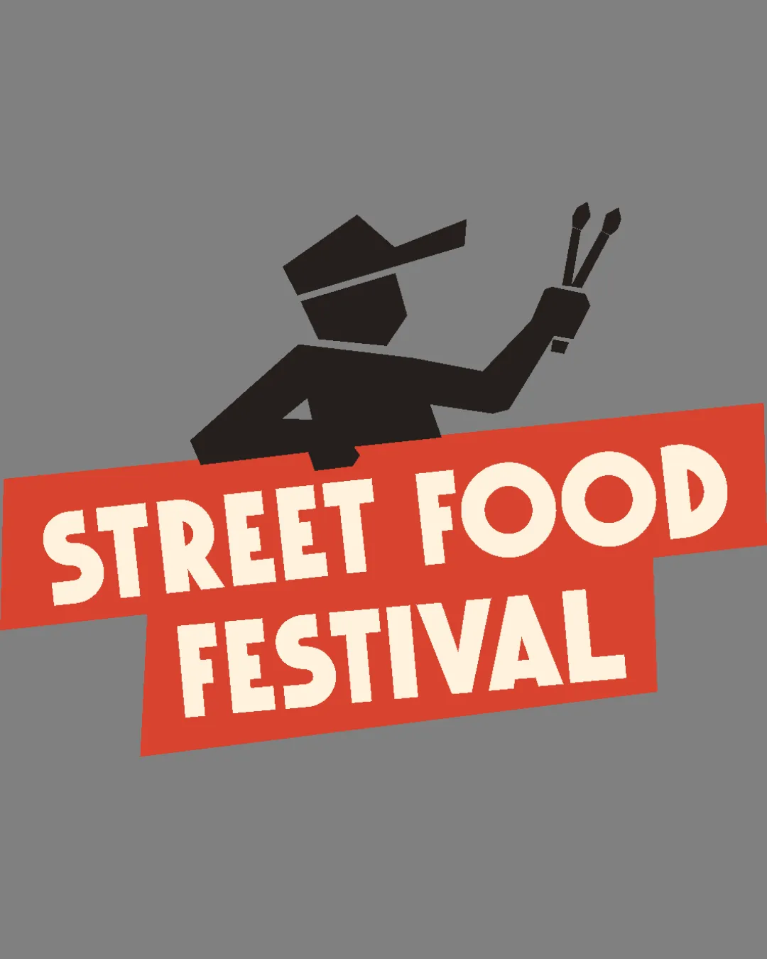
STREET FOOD FESTIVAL logo review
4/5
Logo score
Logo review of

Street Food Festival

A lively and effective food event logo with just minor tweaks needed for scale and balance.

Combination Bold, Geometric, Playful, Retro-inspired Food/events
5/5
Legibility
4/5
Originality
5/5
Misread
4/5
Balance
4/5
Scale
Your next steps

What to fix first

Focus on the changes that matter. Keep what makes the logo work.

1

Standalone mark

Test the logo at smaller sizes; consider simplifying fine elements if needed.

Worth testing Medium priority Low effort
Area to inspectApproximate location

The figure's detail level and narrow tongs may lose clarity at very small reproduction sizes.

How to check

Visually inspect below 2cm height.
See the category review
2

wordmark

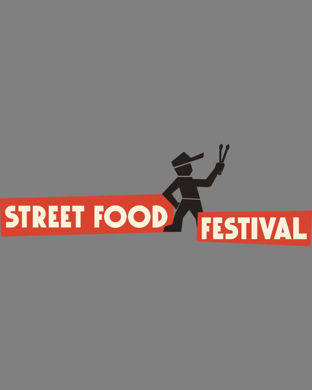
Test variants with adjusted block heights/alignment or tighter vertical spacing.

Optional refinement Low priority Low effort
Area to inspectApproximate location

The staggered red blocks behind the text create a lively feel but introduce slight visual imbalance between the two lines.

How to check

Compare perceived balance in alternate lockups.

See the category review
Detailed review

Logo performance breakdown

4/5

Brief & logo match

Based on an inferred industry
Compared with

Logo appears to represent a 'Street Food Festival'—an event centered on casual, accessible cuisine.

The logo convincingly matches the street food event concept with bold graphics and thematic elements.

  • Event Type

    The energetic mascot and informal block letter style clearly convey a casual, fun street food event.

  • Industry Symbol Integration

    Chef figure with cooking utensil is on-theme for food festivals, used in a playful way.

5/5

Legibility

  • Bold, readable text at all sizes.
  • Clear separation between words.
4/5

Originality

  • Distinctive mascot pose and geometric style.
4/5

Color harmony

  • Warm palette signals food and festivity.
Gray#807D7A
Red Orange#E0523C
Beige#F6E8CD
Black#181411

Estimated colors. Use the original design file for exact values.

Create a full color palette using these colors

Create new palette
4/5

Balance alignment

  • Dynamic placement matches event spirit.
  • The staggered red blocks behind the text create a lively feel but introduce slight visual imbalance between the two lines.

    Optional refinement wordmark

    Try: Test variants with adjusted block heights/alignment or tighter vertical spacing.

    Check: Compare perceived balance in alternate lockups.

    Area to inspectApproximate location
Uploaded logoAlignment guide overlay

Inspect spacing with the guide. Optical balance may differ from geometric centering.

4/5

Scalability

  • Strong silhouette and simple color palette.
  • The figure's detail level and narrow tongs may lose clarity at very small reproduction sizes.

    Worth testing Standalone mark

    Try: Test the logo at smaller sizes; consider simplifying fine elements if needed.

    Check: Visually inspect below 2cm height.

    Area to inspectApproximate location
Uploaded logo at 200 pixels wide
200 × 250 px
Uploaded logo at 100 pixels wide
100 × 125 px
Uploaded logo at 50 pixels wide
50 × 63 px

Compare the detail at different sizes. Labels show the full image dimensions.

5/5

Misinterpretations

  • No unintended negative shapes or meanings.
4/5

Symbol & text fit

  • Mascot and wordmark integrate well in overall composition.

Black & white

Does the shape still work without color?

These tests are available only for logos uploaded in vector (SVG) format.

Background contrast

Find the surfaces where your logo stays clear.

These tests are available only for logos uploaded in vector (SVG) format.

Blur & silhouette

A 3px blur softens fine details so you can check whether the overall shape stays recognizable. If key gaps close or elements merge, the logo may rely too heavily on detail.

These tests are available only for logos uploaded in vector (SVG) format.

Try your own review

Wondering how your logo performs?

Get a clear logo score, key risks, and priority fix ideas before your client or audience sees it.

Review my logo