Wondering how your logo performs? 🧐
Get professional logo reviews in seconds and catch design issues in time.
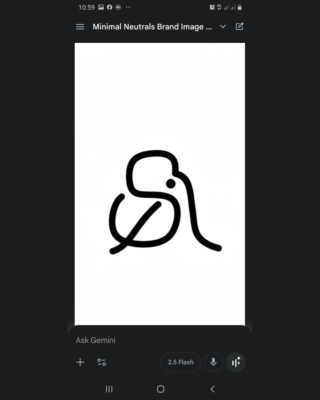
Try it Now!Logo review of Stylized line illustration resembling a bird or pe..
 Logo analysis by AI
Logo type:
Style:
Detected symbol:
Negative space:
Business industry:
Review requested by Safiwaz
**If AI can recognize or misinterpret it, so can people.
Structured logo review
Scalability versatility
![]() Simple monoline weight keeps the logo intact at smaller sizes
Simple monoline weight keeps the logo intact at smaller sizes![]() Minimalist construction ensures legibility across digital and print formats
Minimalist construction ensures legibility across digital and print formats
![]() Very thin lines may lose clarity when embroidered or in extremely small applications like favicons
Very thin lines may lose clarity when embroidered or in extremely small applications like favicons![]() Absence of color/inverted reversal might lack visibility on dark backgrounds unless accompanied by a filled version
Absence of color/inverted reversal might lack visibility on dark backgrounds unless accompanied by a filled version
200x250 px
100×125 px
50×62 px
Balance alignment
![]() Overall form is visually balanced and harmonious
Overall form is visually balanced and harmonious![]() The central dot anchors the design
The central dot anchors the design
![]() Right-facing long line creates slight asymmetry, which may be visually heavy on one side
Right-facing long line creates slight asymmetry, which may be visually heavy on one side

Originality
![]() Unique hand-drawn continuous line concept stands out among industry competitors
Unique hand-drawn continuous line concept stands out among industry competitors![]() Clever minimal abstraction of a bird that isn’t immediately obvious, avoiding clichés
Clever minimal abstraction of a bird that isn’t immediately obvious, avoiding clichés
Aesthetic look
![]() Minimalist aesthetic fits modern design preferences
Minimalist aesthetic fits modern design preferences![]() Clean and refined linework
Clean and refined linework
![]() Some viewers may struggle to immediately interpret the visual, especially without brand context
Some viewers may struggle to immediately interpret the visual, especially without brand context
Dual meaning and misinterpretations
![]() No inappropriate or problematic symbolism detected
No inappropriate or problematic symbolism detected![]() Abstract form remains playful and safe
Abstract form remains playful and safe
Color harmony
![]() Simple black and white palette is versatile and timeless
Simple black and white palette is versatile and timeless![]() No clashing or overwhelming color schemes
No clashing or overwhelming color schemes
Black
#000000
White
#FFFFFF


