 View review
Logo score
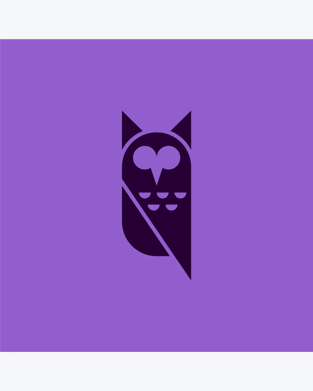
Logo review ofStylized Owl With Geometric Shapes And Strong Diag..
Review the detailed scores below to see what is working and what should be refined first.
Originality
Misread
Balance
Scale
Detailed review
Logo performance breakdown
Originality
![]() Unique approach to representing an owl with abstract geometry and creative negative space.
Unique approach to representing an owl with abstract geometry and creative negative space.![]() Clever use of a heart shape for the facial disc, which adds personality.
Clever use of a heart shape for the facial disc, which adds personality.
Color harmony
![]() Only two well-coordinated colors, strong contrast, and high clarity.
Only two well-coordinated colors, strong contrast, and high clarity.![]() Purple tones are harmonious and modern.
Purple tones are harmonious and modern.
lavender
#A259CF
deep purple
#28043D
Balance alignment
![]() Excellent visual balance between left and right halves, unified by diagonal split.
Excellent visual balance between left and right halves, unified by diagonal split.![]() Central alignment of elements enhances stability.
Central alignment of elements enhances stability.

Scalability
![]() Very simple, bold geometric forms ensure legibility in small and large formats.
Very simple, bold geometric forms ensure legibility in small and large formats.![]() Minimal detail makes it suitable for embroidery, mobile icons, business cards, and digital use.
Minimal detail makes it suitable for embroidery, mobile icons, business cards, and digital use.
200x250 px
100×125 px
50×62 px
Misinterpretations
![]() Does not resemble inappropriate or confusing imagery.
Does not resemble inappropriate or confusing imagery.![]() Owl is instantly recognizable as the intended symbol.
Owl is instantly recognizable as the intended symbol.
Try your own review
Review my logo
Wondering how your logo performs?
Get a clear logo score, key risks, and priority fix ideas before your client or audience sees it.
Keep exploring


