 View review
Logo score
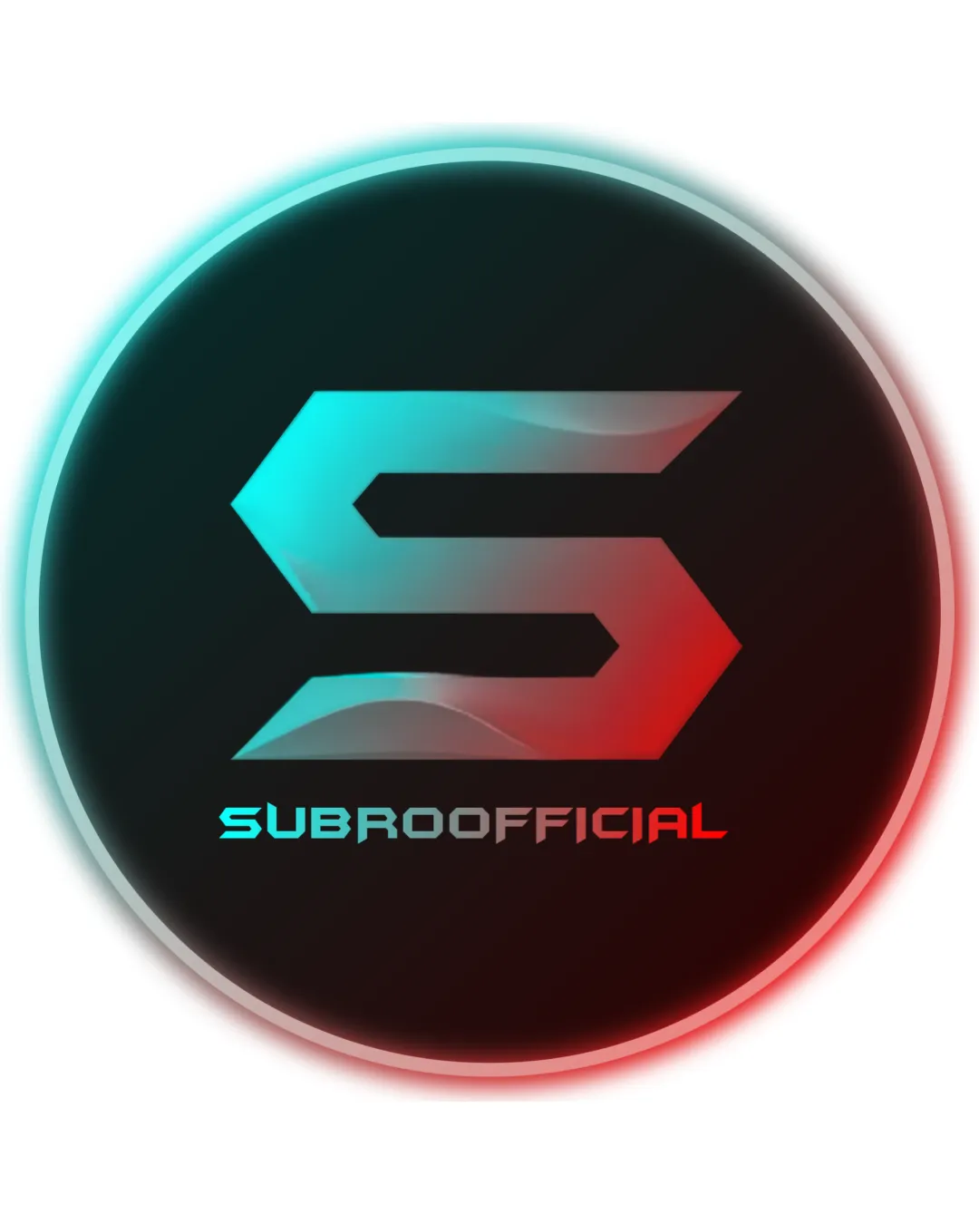
Logo review ofSubroofficial
Client-facing in digital spaces but needs simplification and polish to reach full professional standard.
Legibility
Originality
Misread
Balance
Scale
Action plan
What to fix first
The most important fixes to handle before polishing the full presentation.
1
Redesign gradients and reduce glow for improved scalability and print versatility.
High priorityCurrent effects limit reproduction; simplifying colors and removing glows enhances utility without losing impact.
Impact: Improves Usability In All Brand Settings, Especially At Small Sizes Or In One-color Applications. · Effort: Medium
2
Refine gradient transitions and color polish to increase perceived quality.
Medium prioritySmoother blends and minor color adjustments make the logo look more premium and intentional.
Impact: Elevates Aesthetic And Differentiates From Generic Gaming Marks. · Effort: Low
Detailed review
Logo performance breakdown
Legibility
![]() Text is readable with a futuristic font.
Text is readable with a futuristic font.![]() Strong color contrast between 'SUBROOFFICIAL' and the background.
Strong color contrast between 'SUBROOFFICIAL' and the background.
![]() Gradient color on 'OFFICIAL' portion could slightly reduce clarity at small sizes.
Gradient color on 'OFFICIAL' portion could slightly reduce clarity at small sizes.
Originality
![]() Stylized S is dynamic and slightly unique.
Stylized S is dynamic and slightly unique.
![]() Sharp-angled letterforms and gradient effects are commonly seen in gaming logos.
Sharp-angled letterforms and gradient effects are commonly seen in gaming logos.
Color harmony
![]() Cyan and red are complementary and evoke a tech/gaming vibe.
Cyan and red are complementary and evoke a tech/gaming vibe.
![]() Gradient transition is abrupt and could be smoother for a more polished look.
Gradient transition is abrupt and could be smoother for a more polished look.
Turquoise
#45DFE9
Red
#EE4848
DarkGray
#24262D
Your palette is close. Explore sharper color combinations with Colorfly.design before updating the logo.
Explore palettesBalance alignment
![]() Mark and wordmark are well centered and aligned.
Mark and wordmark are well centered and aligned.![]() Circular containing shape creates strong focus.
Circular containing shape creates strong focus.
![]() Glowing edge adds visual weight that might unbalance the mark in certain applications.
Glowing edge adds visual weight that might unbalance the mark in certain applications.

Scalability
![]() Icon is simple and bold, should scale well.
Icon is simple and bold, should scale well.
![]() Gradients and glow effect may not reproduce well in one-color or small-scale applications.
Gradients and glow effect may not reproduce well in one-color or small-scale applications.
200x250 px
100×125 px
50×62 px
Misinterpretations
![]() No inappropriate or unintended shapes detected.
No inappropriate or unintended shapes detected.
Logo structure & brief match
![]() Font style and color palette match the design of the icon.
Font style and color palette match the design of the icon.
![]() Minor disconnect in sharpness between logomark and slightly softer text.
Minor disconnect in sharpness between logomark and slightly softer text.
![]() Detected Industry: Style, color, and symbol fit a gaming or eSports context well. Modern and energetic approach works for digital brands.
Detected Industry: Style, color, and symbol fit a gaming or eSports context well. Modern and energetic approach works for digital brands.
Try your own review
Review my logo
Wondering how your logo performs?
Get a clear logo score, key risks, and priority fix ideas before your client or audience sees it.
Keep exploring


