Wondering how your logo performs? 🧐
Get professional logo reviews in seconds and catch design issues in time.
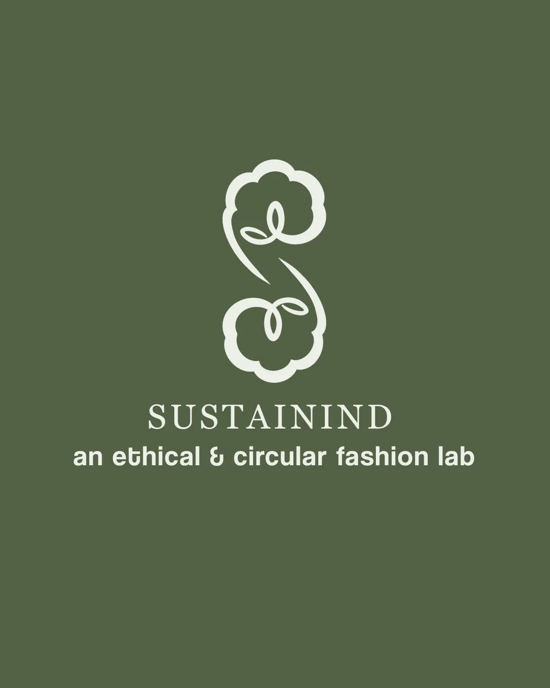
Try it Now!Logo review of SUSTAININD, an ethical & circular fashion lab
 Logo analysis by AI
Logo type:
Style:
Detected symbol:
Negative space:
Detected text:
Business industry:
Review requested by Nurlela
**If AI can recognize or misinterpret it, so can people.
Structured logo review
Legibility
 Primary wordmark (‘SUSTAININD’) is highly legible with clear serif typeface. Subheading (‘an ethical & circular fashion lab’) is clean and easy to read.
Scalability versatility
Logomark is simple and will scale well across most applications such as clothing tags and business cards. No unnecessary intricate details which preserves integrity in small sizes.
 Very thin linework in the symbol may lose visibility at very small sizes (e.g., favicons, tiny embroidery).
200x250 px
100×125 px
50×62 px
Balance alignment
Logomark, wordmark, and tagline are perfectly centered, offering visual stability. Hierarchical gap between logo elements provides room for visual breathing.

Originality
Creative integration of the S with a stylized cotton plant refers directly to the textile/fashion field. Organic curves in the mark set it apart from generic icons.
Use of a cotton motif for sustainability/fashion is a common trope; lacks a disruptive twist.
Logomark wordmark fit
Organic, flowing curves of the logomark harmonize well with the understated elegance of the wordmark. Proportions between logomark and wordmark create cohesive branding.
Aesthetic look
Overall appearance is clean, modern, and appealing. Color palette and serif font choice reinforce brand’s ethical/sustainable positioning.
Might feel slightly generic within the ethical fashion niche due to familiar symbols.
Dual meaning and misinterpretations
No inappropriate secondary symbolism or incorrect interpretations detected.
Color harmony
Natural and calming green and off-white pairing suits the industry and concept. High contrast between the background and text/symbol ensures readability.
Olive Green
#61694C
Pale Sage
#E4E8D1