Wondering how your logo performs? 🧐
Get professional logo reviews in seconds and catch design issues in time.
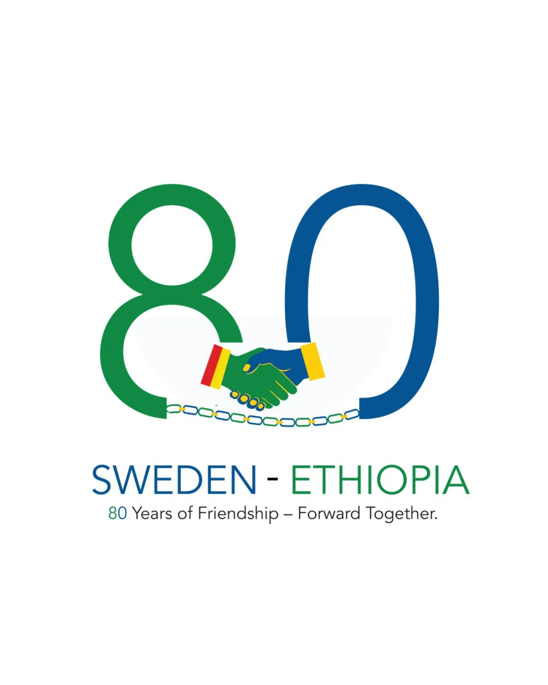
Try it Now!Logo review of SWEDEN - ETHIOPIA, 80 Years of Friendship – Forw..
 Logo analysis by AI
Logo type:
Style:
Detected symbol:
Detected text:
Business industry:
Review requested by Amde
**If AI can recognize or misinterpret it, so can people.
Structured logo review
Legibility
![]() Text is clear and highly readable.
Text is clear and highly readable.![]() Good contrast between text and background.
Good contrast between text and background.![]() Font selection is simple and professional.
Font selection is simple and professional.
Scalability versatility
![]() Symbol and large numbers are clean and bold which helps in scaling up for posters or banners.
Symbol and large numbers are clean and bold which helps in scaling up for posters or banners.![]() Works well on digital and print platforms.
Works well on digital and print platforms.
![]() Detailed handshake and chain could lose clarity at small sizes.
Detailed handshake and chain could lose clarity at small sizes.![]() Color details may not be reproducible in embroidery or monochrome formats.
Color details may not be reproducible in embroidery or monochrome formats.
200x250 px
100×125 px
50×62 px
Balance alignment
![]() 80 is visually balanced with handshake centered.
80 is visually balanced with handshake centered.![]() Text is properly aligned underneath the main mark.
Text is properly aligned underneath the main mark.
![]() Handshake slightly breaks the flow between the two numbers, making the transition between 8 and 0 a bit visually heavy.
Handshake slightly breaks the flow between the two numbers, making the transition between 8 and 0 a bit visually heavy.

Originality
![]() Creative incorporation of handshake and national flag colors within the numeric figure.
Creative incorporation of handshake and national flag colors within the numeric figure.![]() Breaking chain adds additional symbolic meaning.
Breaking chain adds additional symbolic meaning.
![]() Handshake in logos is a somewhat common motif in diplomacy or friendship contexts.
Handshake in logos is a somewhat common motif in diplomacy or friendship contexts.
Logomark wordmark fit
![]() Styling and colors of the wordmark and logomark are coherent.
Styling and colors of the wordmark and logomark are coherent.![]() Both elements reinforce the message of partnership.
Both elements reinforce the message of partnership.
Aesthetic look
![]() Clean, modern, and professional appearance.
Clean, modern, and professional appearance.![]() Vibrant but harmonious use of national colors.
Vibrant but harmonious use of national colors.
![]() Crowding of handshake and chain in the number could be simplified for a cleaner aesthetic.
Crowding of handshake and chain in the number could be simplified for a cleaner aesthetic.
Dual meaning and misinterpretations
![]() Symbols are direct and unlikely to be misinterpreted.
Symbols are direct and unlikely to be misinterpreted.
Color harmony
![]() Colors are thoughtfully chosen to represent both nations and feel meaningful.
Colors are thoughtfully chosen to represent both nations and feel meaningful.![]() No overwhelming or clashing shades.
No overwhelming or clashing shades.
![]() Use of multiple flag colors might reduce harmony in strictly minimalist applications.
Use of multiple flag colors might reduce harmony in strictly minimalist applications.
Jungle Green
#23824B
Cobalt Blue
#11539D
Sunflower
#FFD600
Red
#F12A2A
White
#FFFFFF


