 View review
Logo score
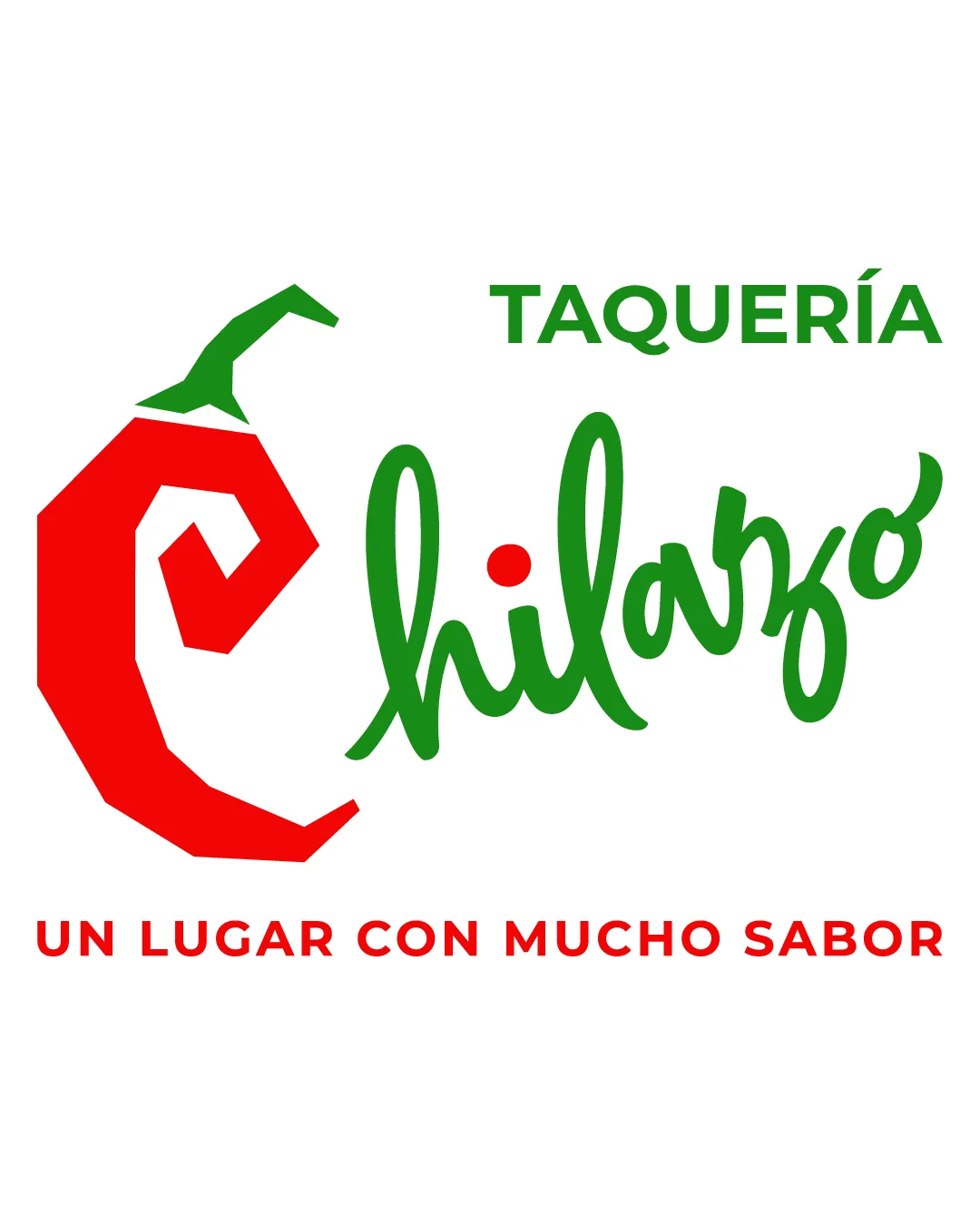
Logo review ofTaquería Chilazo Un Lugar Con Mucho Sabor
Review the detailed scores below to see what is working and what should be refined first.
Legibility
Originality
Misread
Balance
Scale
Detailed review
Logo performance breakdown
Legibility
![]() Main text 'Chilazo' is clear and readable despite the script style.
Main text 'Chilazo' is clear and readable despite the script style.![]() 'TAQUERÍA' and tagline are set in a clean, sans-serif typeface.
'TAQUERÍA' and tagline are set in a clean, sans-serif typeface.
![]() The script font for 'Chilazo' could be difficult to read from a distance or at smaller sizes, especially the 'z'.
The script font for 'Chilazo' could be difficult to read from a distance or at smaller sizes, especially the 'z'.
Originality
![]() Abstract pepper doubling as a letter is creative and relevant for the food industry.
Abstract pepper doubling as a letter is creative and relevant for the food industry.![]() Playful script font adds personality.
Playful script font adds personality.
![]() Chili pepper motifs are common in taqueria branding, slightly reducing uniqueness.
Chili pepper motifs are common in taqueria branding, slightly reducing uniqueness.
Color harmony
![]() Red and green color pairing is appropriate and harmonious for a Mexican restaurant theme.
Red and green color pairing is appropriate and harmonious for a Mexican restaurant theme.![]() Limited to two main colors plus white background, keeping the palette clean.
Limited to two main colors plus white background, keeping the palette clean.
Amaranth
#E5251B
Green
#2AA045
White
#FFFFFF
Balance alignment
![]() Overall composition is centered and fairly distributed.
Overall composition is centered and fairly distributed.![]() Chili pepper visually balances the handwritten wordmark.
Chili pepper visually balances the handwritten wordmark.
![]() The 'TAQUERÍA' text is visually disconnected from the main mark.
The 'TAQUERÍA' text is visually disconnected from the main mark.![]() The tagline at the bottom feels somewhat detached and can reduce cohesiveness.
The tagline at the bottom feels somewhat detached and can reduce cohesiveness.

Scalability
![]() Simple color scheme aids in printing applications.
Simple color scheme aids in printing applications.
![]() Fine details in the script type and complexity of the chili pepper could be lost in small-scale uses, such as business cards, social media favicons, or embroidery.
Fine details in the script type and complexity of the chili pepper could be lost in small-scale uses, such as business cards, social media favicons, or embroidery.![]() The vertical arrangement and multiple font styles may not adapt well to all mockups like glass signage, food packaging, or hats.
The vertical arrangement and multiple font styles may not adapt well to all mockups like glass signage, food packaging, or hats.
200x250 px
100×125 px
50×62 px
Misinterpretations
![]() Chili pepper symbol is universally recognized without inappropriate interpretations.
Chili pepper symbol is universally recognized without inappropriate interpretations.
Symbol & text fit
![]() Pepper shape and script are stylistically complementary and merged with the initial letter.
Pepper shape and script are stylistically complementary and merged with the initial letter.
![]() Pepper logomark is bold and geometric, while script is fluid, leading to a minor style mismatch.
Pepper logomark is bold and geometric, while script is fluid, leading to a minor style mismatch.
![]() Tagline and 'TAQUERÍA' use a different, much more technical sans-serif, breaking style unity.
Tagline and 'TAQUERÍA' use a different, much more technical sans-serif, breaking style unity.
Try your own review
Review my logo
Wondering how your logo performs?
Get a clear logo score, key risks, and priority fix ideas before your client or audience sees it.
Keep exploring


