Concept & direction
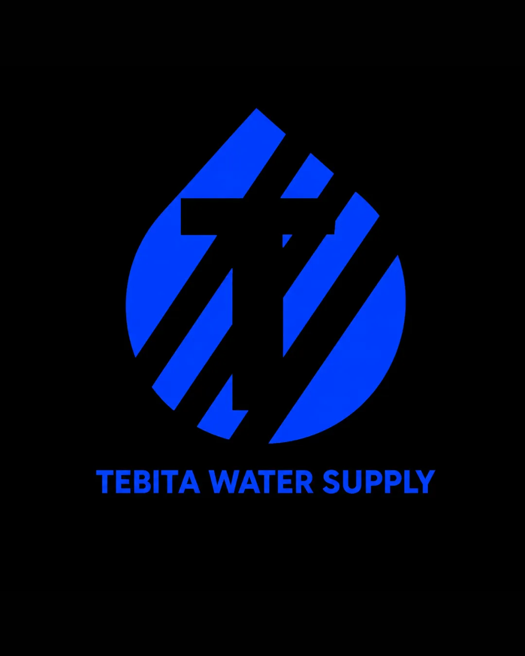
The mark combines a water droplet shape with an abstract 'T', referencing water supply and the initial letter of the business. The blue color reinforces the water theme.
Clear, functional, and appropriate for its field, though the symbol could be pushed for greater uniqueness.
Focus on the changes that matter. Keep what makes the logo work.
The mark combines a water droplet shape with an abstract 'T', referencing water supply and the initial letter of the business. The blue color reinforces the water theme.
The abstract 'T' in a droplet is clear, but a more original graphical twist could set the brand further apart.
Creates stronger brand differentiation
Reducing density or simplifying inner shapes could help at very small sizes, though the current design performs well at most usage scales.
Improves practical use
The droplet shape and blue color effectively communicate water supply. The mark relates to the company’s name and sector.
Estimated colors. Use the original design file for exact values.
Create a full color palette using these colors
Create new palette
Inspect spacing with the guide. Optical balance may differ from geometric centering.
Get a clear logo score, key risks, and priority fix ideas before your client or audience sees it.
More credits needed
Add credits to continue without losing your work.
Then $7/month. Cancel anytime.
Essential logo review with AI
Estimated progress