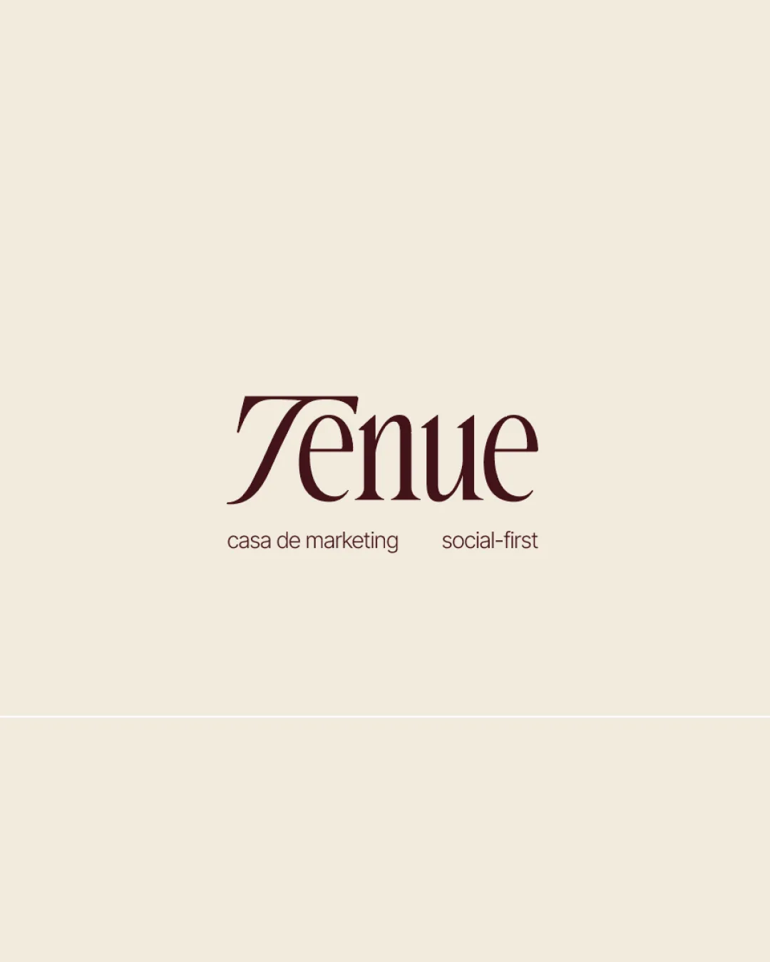
Tenue
casa de marketing    social-first logo review
3.5/5
Logo score

Tenue casa de marketing social-first

Strong, professional serif wordmark for marketing use but needs adjustments for scalability and tagline cohesion.

Wordmark Elegant Serif Wordmark With Tagline Marketing/communications
4/5
Legibility
3/5
Originality
4/5
Balance
3/5
Scale
Your next steps

What to fix first

Focus on the changes that matter. Keep what makes the logo work.

1

wordmark (horizontal band 1)

Test simplified or bolder variant for small applications.

Visible issue High priority Medium effort
Area to inspectApproximate location

Fine serifs and thin strokes in the main 'Tenue' wordmark may lose clarity at very small sizes or in low-resolution uses.

See the category review


2

tagline (horizontal band 2)

Slightly reduce horizontal space or test visual device to link phrases.

Optional refinement Medium priority Low effort
Area to inspectApproximate location

Considerable spacing between 'casa de marketing' and 'social-first' tagline elements creates separation that may feel slightly disconnected.

See the category review
Detailed review

Logo performance breakdown

4/5

Brief & logo match

Logo style and content align well with a refined marketing agency, but scaling and small-text uses should be refined.

4/5

Legibility

  • Readable, elegant typographic style.
  • Clear tagline text.
3/5

Originality

  • Distinctive serif form of 'T'.
4/5

Color harmony

  • Warm palette provides good contrast and sophistication.
Beige#F4ECE1
Dark Brown#4B2623

Estimated colors. Use the original design file for exact values.

Create a full color palette using these colors

Create new palette
4/5

Balance alignment

  • Cohesive column arrangement.
  • Well-placed tagline beneath wordmark.
  • Considerable spacing between 'casa de marketing' and 'social-first' tagline elements creates separation that may feel slightly disconnected.

    Optional refinement tagline (horizontal band 2)

    Try: Slightly reduce horizontal space or test visual device to link phrases.

    Area to inspectApproximate location
Uploaded logoAlignment guide overlay

Inspect spacing with the guide. Optical balance may differ from geometric centering.

3/5

Scalability

  • Minimal design aids some adaptability.
  • Fine serifs and thin strokes in the main 'Tenue' wordmark may lose clarity at very small sizes or in low-resolution uses.

    Visible issue wordmark (horizontal band 1)

    Try: Test simplified or bolder variant for small applications.

    Area to inspectApproximate location
5/5

Misinterpretations

  • No apparent double meanings or unintended readings.

Black & white

Does the shape still work without color?

These tests are available only for logos uploaded in vector (SVG) format.

Background contrast

Find the surfaces where your logo stays clear.

These tests are available only for logos uploaded in vector (SVG) format.

Blur & silhouette

A 3px blur softens fine details so you can check whether the overall shape stays recognizable. If key gaps close or elements merge, the logo may rely too heavily on detail.

These tests are available only for logos uploaded in vector (SVG) format.

Try your own review

Wondering how your logo performs?

Get a clear logo score, key risks, and priority fix ideas before your client or audience sees it.

Review my logo