Wondering how your logo performs? 🧐
Get professional logo reviews in seconds and catch design issues in time.
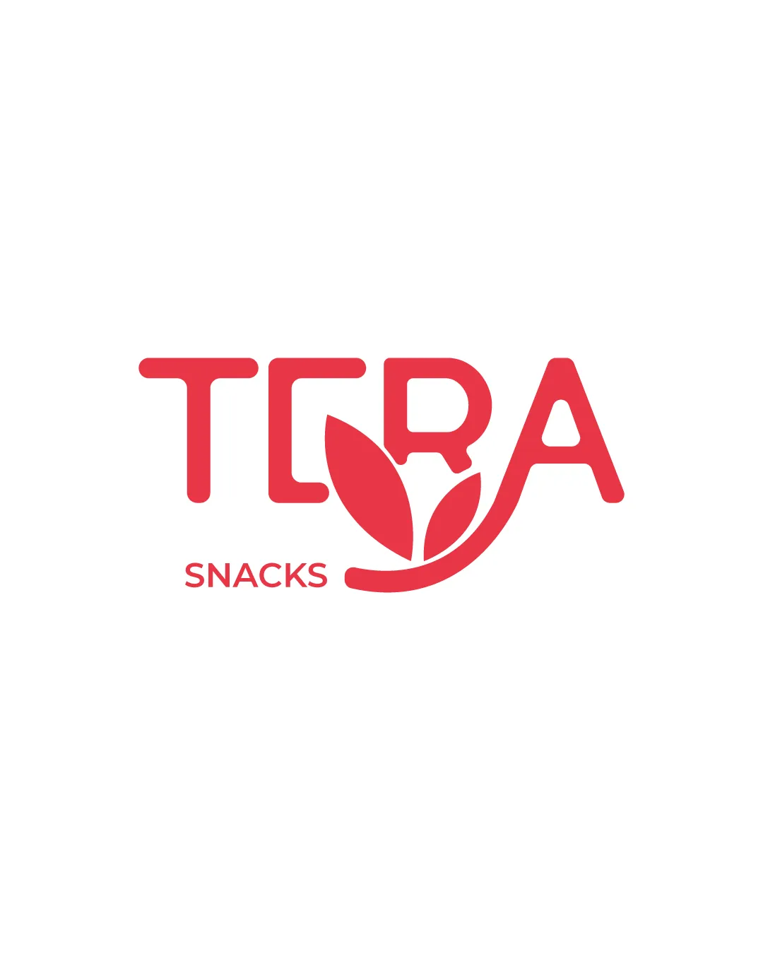
Try it Now!Logo review of TERA SNACKS
 Logo analysis by AI
Logo type:
Style:
Detected symbol:
Negative space:
Detected text:
Business industry:
Review requested by Nivine
**If AI can recognize or misinterpret it, so can people.
Structured logo review
Legibility
![]() Primary text 'TERA' is clear and easy to read.
Primary text 'TERA' is clear and easy to read.![]() 'SNACKS' is distinguishable in a smaller font below.
'SNACKS' is distinguishable in a smaller font below.
![]() Leaf shapes replacing part of the R may cause a slight pause in word recognition. The underline flourish on A may confuse viewers at small sizes.
Leaf shapes replacing part of the R may cause a slight pause in word recognition. The underline flourish on A may confuse viewers at small sizes.
Scalability versatility
![]() Bold shapes and single color enhance adaptability on large formats, packaging, and web headers.
Bold shapes and single color enhance adaptability on large formats, packaging, and web headers.
![]() Detail complexity in the leaf integration risks losing clarity in small usages like business cards, app icons, or embroidery.
Detail complexity in the leaf integration risks losing clarity in small usages like business cards, app icons, or embroidery.
200x250 px
100×125 px
50×62 px
Balance alignment
![]() Text and symbol integration feels visually organized.
Text and symbol integration feels visually organized.![]() 'SNACKS' is aligned well below the main logo.
'SNACKS' is aligned well below the main logo.
![]() Swoosh underline creates a slight leftward weight and visual imbalance compared to the otherwise geometric text.
Swoosh underline creates a slight leftward weight and visual imbalance compared to the otherwise geometric text.

Originality
![]() Leaf-symbol integration is nicely executed for a food/healthy snack brand.
Leaf-symbol integration is nicely executed for a food/healthy snack brand.![]() Combination of botanical imagery with letterforms shows an attempt at uniqueness.
Combination of botanical imagery with letterforms shows an attempt at uniqueness.
![]() Leaf/swoosh integration is common in the health food sector, reducing true originality.
Leaf/swoosh integration is common in the health food sector, reducing true originality.
Logomark wordmark fit
![]() The leaves and swoosh feel thematically integrated into the letterforms.
The leaves and swoosh feel thematically integrated into the letterforms.![]() No major style mismatch between the type and the foliage graphic.
No major style mismatch between the type and the foliage graphic.
![]() Swoosh element under A is slightly disconnected versus the geometric simplicity elsewhere.
Swoosh element under A is slightly disconnected versus the geometric simplicity elsewhere.
Aesthetic look
![]() Clean, approachable, and visually cohesive.
Clean, approachable, and visually cohesive.![]() Single bold color avoids an overdecorated feel and supports current trends.
Single bold color avoids an overdecorated feel and supports current trends.
![]() Not pushing aesthetic boundaries—could be stronger with more creative exploration.
Not pushing aesthetic boundaries—could be stronger with more creative exploration.
Dual meaning and misinterpretations
![]() No inappropriate or confusing shapes are present. All elements reinforce the natural/snack theme clearly.
No inappropriate or confusing shapes are present. All elements reinforce the natural/snack theme clearly.
Color harmony
![]() Simple two-tone palette maximizes brand recall and keeps the mark elegant.
Simple two-tone palette maximizes brand recall and keeps the mark elegant.![]() Red conveys appetite and energy, fitting for food industry.
Red conveys appetite and energy, fitting for food industry.
Deep Red
#E84B53
White
#FFFFFF