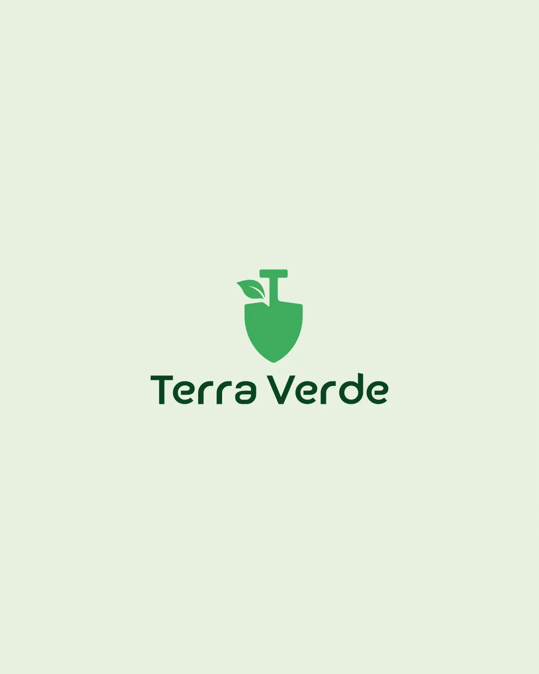
Terra Verde logo review
4.4 / 5
Logo score
Logo review of

Terra Verde

Review the detailed scores below to see what is working and what should be refined first.

Objective AI feedback. Your creative decision.

Combination Mark Minimalist, Flat Agriculture
5/5
Legibility
3/5
Originality
5/5
Misread
4/5
Balance
4/5
Scale
Detailed review

Logo performance breakdown

5/5

Legibility

Checkmark icon Font is modern, clear, and easy to read at all sizes.
Checkmark icon Good contrast between text and background ensures accessibility.
3/5

Originality

Checkmark icon The shovel-leaf hybrid attempts a relevant tie-in to eco/agriculture themes.

Warning icon Shovel and leaf are very commonly used symbols in the agriculture/eco sector, leading to a fairly generic impression.
Warning icon There is no abstract or unique element that would make this unmistakably distinct.

5/5

Color harmony

Checkmark icon Palette limited to complementary greens and a soft neutral, offering visual coherence.
Checkmark icon Suits the natural and agricultural theme perfectly.

Apple
#53B769

Evergreen
#214D32

Spring Wood
#EFF7E2

4/5

Balance alignment

Checkmark icon The logomark is perfectly centered above the wordmark, providing a solid focal point.
Checkmark icon Overall proportion between elements is visually balanced.

Warning icon Slight visual top-heaviness from the combined shovel and leaf above the wordmark.

logo 200x250 pixels scalability test alignment grid overlay
4/5

Scalability

Checkmark icon Minimal detail means it will scale well to small sizes and embroidery.
Checkmark icon Design is strong for digital and print mediums such as product packaging and business cards.

Warning icon The thin stem of the leaf could get lost at icon/favicon sizes.

logo 200x250 pixels scalability test

200x250 px

logo 100x125 pixels scalability test

100×125 px

logo 50x62 pixels scalability test

50×62 px

5/5

Misinterpretations

Checkmark icon No inappropriate dual meanings detected, icon is clear in intent.

5 / 5

Symbol & text fit

Checkmark icon Stylistic alignment between logomark and wordmark; both are minimalist and geometric.
Checkmark icon Sizes match harmoniously without either overwhelming the other.

Try your own review

Wondering how your logo performs?

Get a clear logo score, key risks, and priority fix ideas before your client or audience sees it.

Review my logo