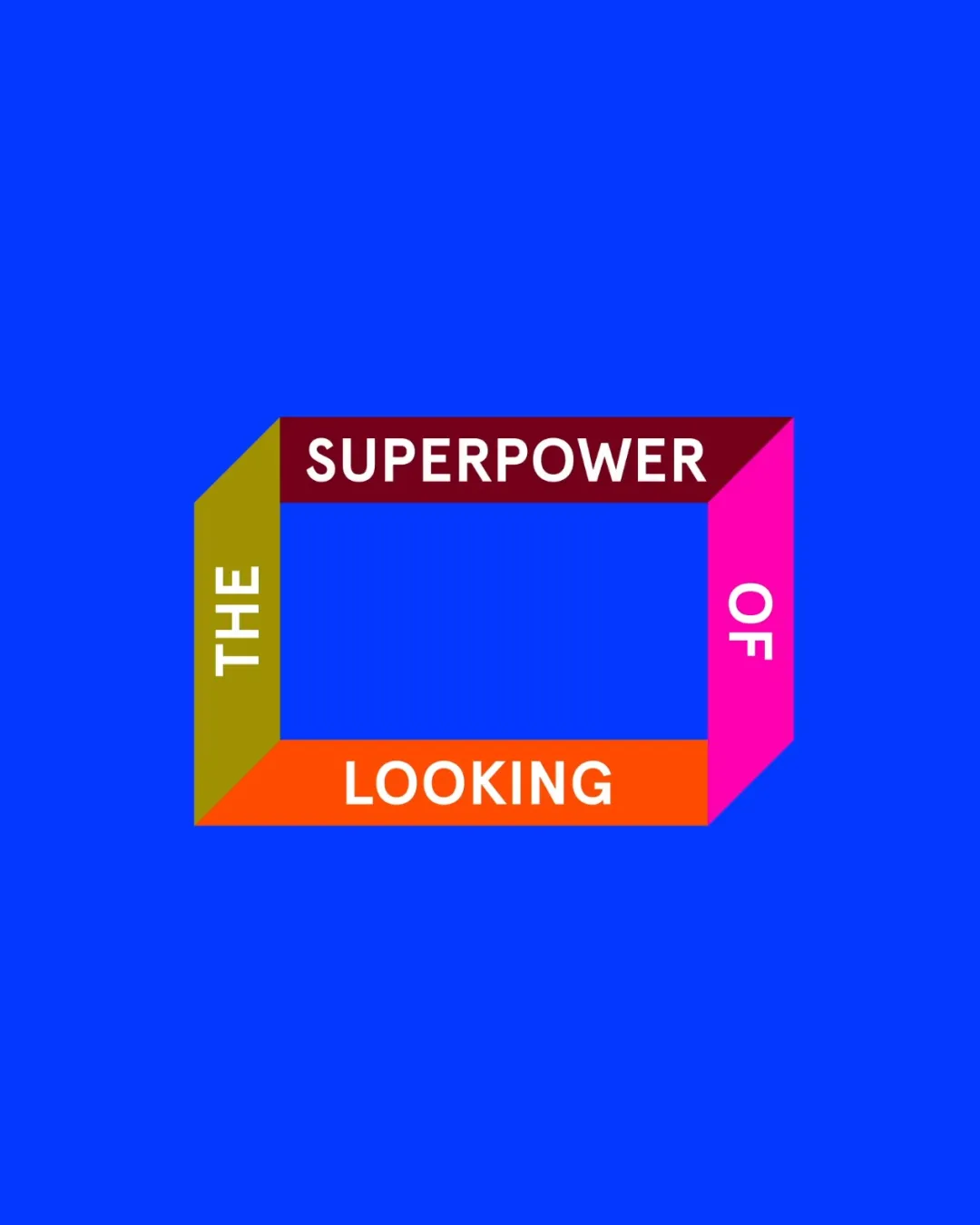
THE SUPERPOWER OF LOOKING logo review
3.0 / 5
Logo score
Logo review of

The Superpower Of Looking

Review the detailed scores below to see what is working and what should be refined first.

Objective AI feedback. Your creative decision.

Wordmark And Shape Modern Creative Or Visual Arts
3/5
Legibility
4/5
Originality
3/5
Balance
2/5
Scale
Detailed review

Logo performance breakdown

3/5

Legibility

Checkmark icon Text is clear and readable up close.

Warning icon The layout may confuse viewers, causing readability issues from a distance.
4/5

Originality

Checkmark icon Unique use of perspective and shape to convey content.

Warning icon The approach could be considered abstract and complex for some audiences.

2/5

Color harmony

Checkmark icon Colors catch attention easily.

Warning icon The combination of colors lacks harmony and may appear visually jarring.

Color may be holding this logo back. Build a stronger strategic palette before updating the logo.

Build brand colors
3/5

Balance alignment

Checkmark icon The rectangular shape provides a balanced structure.

Warning icon The text alignment may feel awkward due to the 3D effect.

logo 200x250 pixels scalability test alignment grid overlay
2/5

Scalability

Checkmark icon The geometric nature of the logo adds a unique touch.

Warning icon The thin colored lines may not scale well on small surfaces.

logo 200x250 pixels scalability test

200x250 px

logo 100x125 pixels scalability test

100×125 px

logo 50x62 pixels scalability test

50×62 px

Try your own review

Wondering how your logo performs?

Get a clear logo score, key risks, and priority fix ideas before your client or audience sees it.

Review my logo