View review
Thoughtly
Review the detailed scores below to see what is working and what should be refined first.
Objective AI feedback. Your creative decision.
Logo performance breakdown
Legibility
Simple, clean sans-serif font ensures all letters are crystal clear.
Color gradient maintains enough contrast for easy reading.
Originality
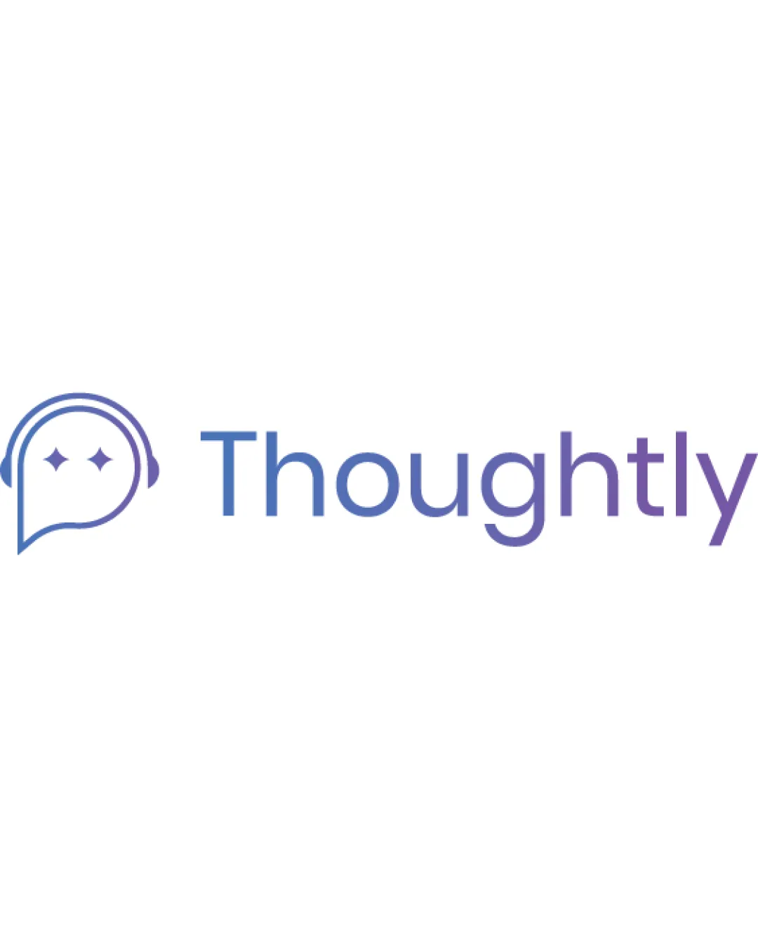
Clever use of a speech bubble combined with a face and headphones ties conceptually to tech/communication themes.
Diamond shapes as 'eyes' add a unique touch.
Elements like speech bubbles and headphones are somewhat common in tech and communication branding, though the face aspect adds distinction.
Color harmony
Well-executed blue-to-purple gradient creates depth without overwhelming.
Palette is consistent and calming, appropriate for tech/AI fields.
Blue
#5876C2
Purple
#8F67CA
White
#FFFFFF
Balance alignment
Good vertical alignment between symbol and wordmark.
Spacing between the icon and text feels logical and tidy.
The icon feels slightly lighter than the wordmark—could benefit from a bolder outline to achieve perfect weight distribution.
Scalability
Minimal line art in the symbol will scale decently for large applications like web banners and printed materials.
Gradient is visually appealing in large digital formats.
Fine lines in the headphone and diamond shapes may become indistinct or break up on embroidery, small favicons, or business cards.
Gradient application in the wordmark can create issues in grayscale or low-res reproduction.
200x250 px
100×125 px
50×62 px
Misinterpretations
No inappropriate or ambiguous visual interpretations detected.
Concept is clear and on-brand.
Symbol & text fit
The minimal, linear style of the symbol matches the clean sans-serif type in the wordmark.
Slight mismatch in visual weight between icon and wordmark; the logomark could carry more presence.
Wondering how your logo performs?
Get a clear logo score, key risks, and priority fix ideas before your client or audience sees it.




