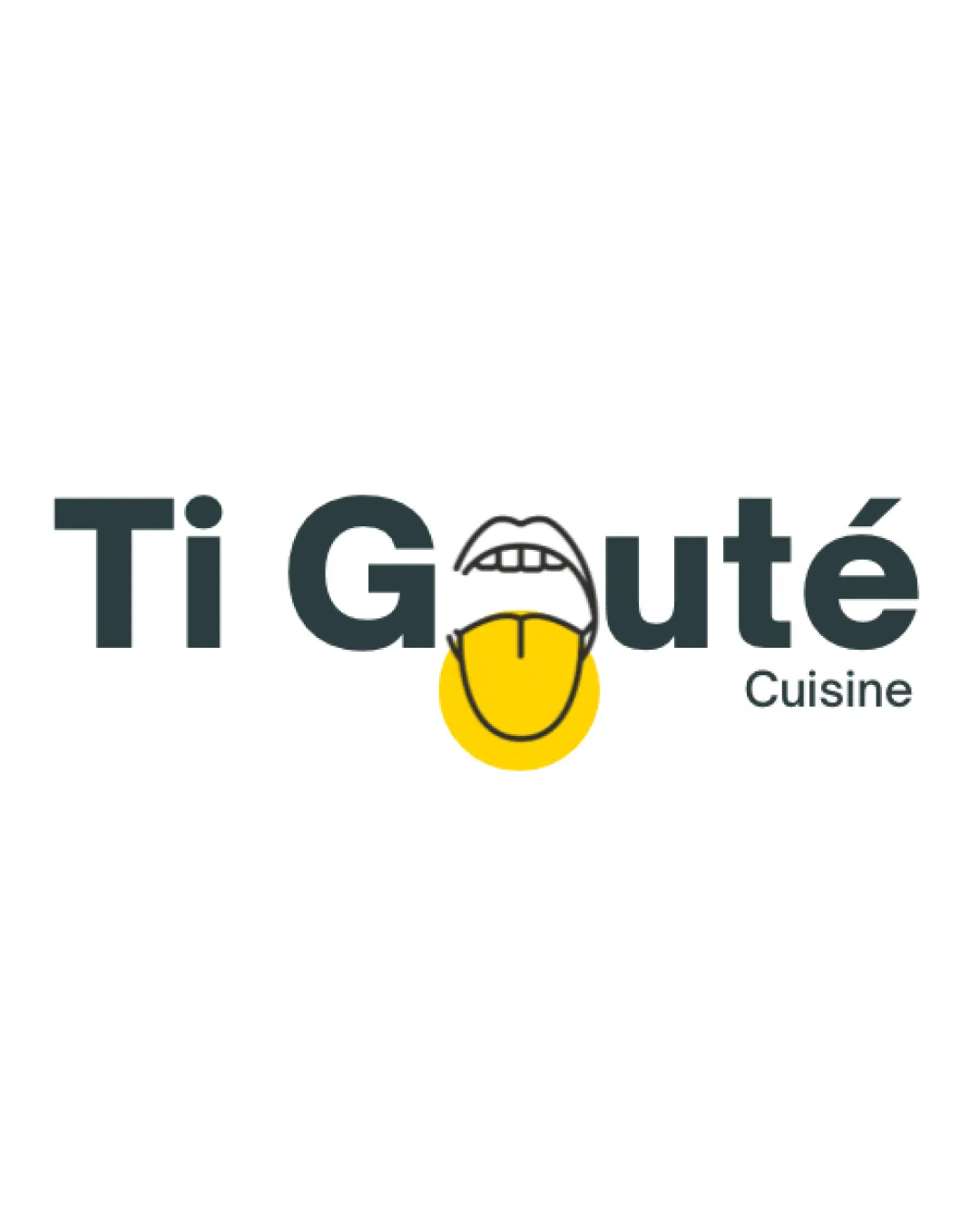
Ti Goûté Cuisine logo review
4/5
Logo score
Logo review of

Ti Goûté Cuisine

Distinctive, playful restaurant logo that links name and concept, needing only minor technical adjustments for versatility.

Combination Playful, Modern Wordmark With Integrated Pictorial Element Restaurant/food
4/5
Legibility
4/5
Originality
5/5
Misread
3/5
Balance
3/5
Scale
Your next steps

What to fix first

Focus on the changes that matter. Keep what makes the logo work.

1

mouth and tongue 'o' illustration

Slightly refine the line weight and proportions of the illustration to better harmonize with letterforms.

Optional refinement Medium priority Medium effort
Area to inspectApproximate location

The mouth and tongue illustration creates a playful focus, but the outline is slightly heavy and disproportionate next to the bold sans-serif letters.

How to check

Review line consistency and integration with adjacent letters.

See the category review
2

mouth and tongue 'o' illustration

Test mark at reduced sizes and simplify details if necessary.

Worth testing Medium priority Low effort
Area to inspectApproximate location

Thin lines in the mouth detail and tongue split may merge or blur at small sizes.

How to check

Print and render logo at intended small use sizes to ensure key features remain clear.

See the category review
Detailed review

Logo performance breakdown

4/5

Brief & logo match

Based on an inferred industry
Compared with

Brand appears to represent a casual or modern food/dining business; logo uses a mouth/tongue motif in 'Goûté'.

Strong food/taste connection and playful tone suit a modern dining context, with minor caveats on illustration balance.

  • Food/dining Reference

    The mouth and tongue motif strongly relate to taste and cuisine, echoing the brand name and food service.

  • Playfulness

    The lively illustration adds welcoming character, fitting casual or family dining but possibly less for fine dining.

4/5

Legibility

  • Clear main text
  • Distinct diacritic and secondary 'Cuisine' text
4/5

Originality

  • Creative integration of pictorial mark into text
4/5

Color harmony

  • Warm yellow accent draws attention and suggests food
DarkGray#2E3536
Yellow#FFCF28

Estimated colors. Use the original design file for exact values.

Create a full color palette using these colors

Create new palette
3/5

Balance alignment

  • Letterforms are generally well-spaced
  • The mouth and tongue illustration creates a playful focus, but the outline is slightly heavy and disproportionate next to the bold sans-serif letters.

    Optional refinement mouth and tongue 'o' illustration

    Try: Slightly refine the line weight and proportions of the illustration to better harmonize with letterforms.

    Check: Review line consistency and integration with adjacent letters.
    Area to inspectApproximate location
Uploaded logoAlignment guide overlay

Inspect spacing with the guide. Optical balance may differ from geometric centering.

3/5

Scalability

  • Simple palette aids reproduction
  • Thin lines in the mouth detail and tongue split may merge or blur at small sizes.

    Worth testing mouth and tongue 'o' illustration

    Try: Test mark at reduced sizes and simplify details if necessary.

    Check: Print and render logo at intended small use sizes to ensure key features remain clear.

    Area to inspectApproximate location
Uploaded logo at 200 pixels wide
200 × 250 px
Uploaded logo at 100 pixels wide
100 × 125 px
Uploaded logo at 50 pixels wide
50 × 63 px

Compare the detail at different sizes. Labels show the full image dimensions.

5/5

Misinterpretations

  • No ambiguous or inappropriate secondary readings
4/5

Symbol & text fit

  • Symbol directly enhances the brand name

Black & white

Does the shape still work without color?

These tests are available only for logos uploaded in vector (SVG) format.

Background contrast

Find the surfaces where your logo stays clear.

These tests are available only for logos uploaded in vector (SVG) format.

Blur & silhouette

A 3px blur softens fine details so you can check whether the overall shape stays recognizable. If key gaps close or elements merge, the logo may rely too heavily on detail.

These tests are available only for logos uploaded in vector (SVG) format.

Try your own review

Wondering how your logo performs?

Get a clear logo score, key risks, and priority fix ideas before your client or audience sees it.

Review my logo