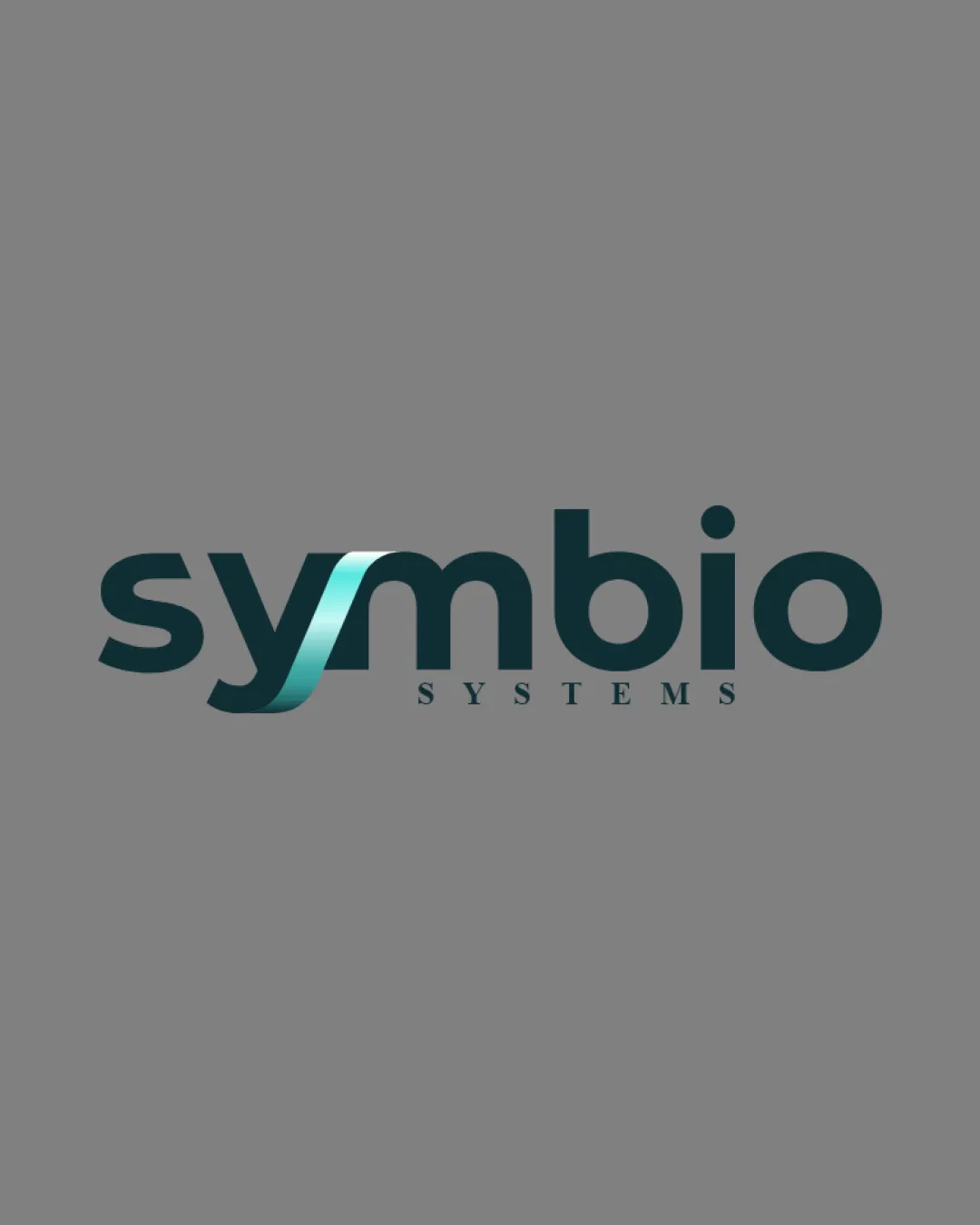
symbio SYSTEMS logo review
4/5
Logo score
Logo review of

Symbio Systems

Distinctive, modern wordmark with a cleverly integrated visual motif; functional for most uses but needs small-size evaluation.

Wordmark Modern Sans-serif With Stylized Letter Integration Technology
4/5
Legibility
4/5
Originality
5/5
Misread
4/5
Balance
3/5
Scale
Your next steps

What to fix first

Focus on the changes that matter. Keep what makes the logo work.

1

wordmark

Test logo at reduced sizes and in one-color reproduction for integrity.

Worth testing High priority Medium effort
Area to inspectApproximate location

The gradient and thin highlights on the ribbon effect in 'y' may lose clarity at small sizes or on poor-quality printing.

How to check

Check that the ribbon effect remains distinct when scaled down or flattened.
See the category review
2

wordmark

Slightly adjust thickness or gradient to balance the wordmark visually.

Optional refinement Medium priority Low effort
Area to inspectApproximate location

There is a subtle optical weight imbalance with the ribbon 'y' appearing heavier than the other letters.

How to check

Verify weight harmony across all letters, especially between 's', 'y', and 'm'.

See the category review
Detailed review

Logo performance breakdown

4/5

Brief & logo match

Based on your brief
Compared with

AI implementation and business workflow integration; modern, enabling brand.

Logo expresses integration and modernity well, but fine details need stress testing for broad use.

  • AI/business Integration

    The interconnected ribbon effect directly evokes integration and workflow, echoing the brand's enabling mission.

  • Modern Tech Appeal

    Clean sans-serif typography with gradient colors aligns with technology sector visual norms.

4/5

Legibility

  • Readability is strong at typical sizes.
  • Tagline remains clear with sufficient contrast.
  • At very small sizes, the stylized portion of the 'y' could be confused for a separate element or letter.

    Optional refinement wordmark

    Try: Refine the transition or test for micro-size clarity.

    Check: Ensure all letters remain legible at favicon and business card sizes.

4/5

Originality

  • Distinctive integration of ribbon into 'y' stands out.
  • Modern feel fitting tech sector.
4/5

Color harmony

  • Gradient teal provides modern, tech-friendly appeal.
Deep Teal#556869
Teal#79CACB
Grey#969696

Estimated colors. Use the original design file for exact values.

Create a full color palette using these colors

Create new palette
4/5

Balance alignment

  • Wordmark is mostly harmonious with a dynamic ribbon emphasis.
  • There is a subtle optical weight imbalance with the ribbon 'y' appearing heavier than the other letters.

    Optional refinement wordmark

    Try: Slightly adjust thickness or gradient to balance the wordmark visually.

    Check: Verify weight harmony across all letters, especially between 's', 'y', and 'm'.

    Area to inspectApproximate location
Uploaded logoAlignment guide overlay

Inspect spacing with the guide. Optical balance may differ from geometric centering.

3/5

Scalability

  • Main letterforms are bold and simple.
  • The gradient and thin highlights on the ribbon effect in 'y' may lose clarity at small sizes or on poor-quality printing.

    Worth testing wordmark

    Try: Test logo at reduced sizes and in one-color reproduction for integrity.

    Check: Check that the ribbon effect remains distinct when scaled down or flattened.

    Area to inspectApproximate location
Uploaded logo at 200 pixels wide
200 × 250 px
Uploaded logo at 100 pixels wide
100 × 125 px
Uploaded logo at 50 pixels wide
50 × 63 px

Compare the detail at different sizes. Labels show the full image dimensions.

5/5

Misinterpretations

  • No unintended readings or ambiguities.

Black & white

Does the shape still work without color?

Preparing artwork...

Background contrast

Find the surfaces where your logo stays clear.

Compare the mark and lettering on each surface.

Blur & silhouette

A 3px blur softens fine details so you can check whether the overall shape stays recognizable. If key gaps close or elements merge, the logo may rely too heavily on detail.

Original
3px blur

Look for clear separation between shapes and a distinctive outline.

Try your own review

Wondering how your logo performs?

Get a clear logo score, key risks, and priority fix ideas before your client or audience sees it.

Review my logo