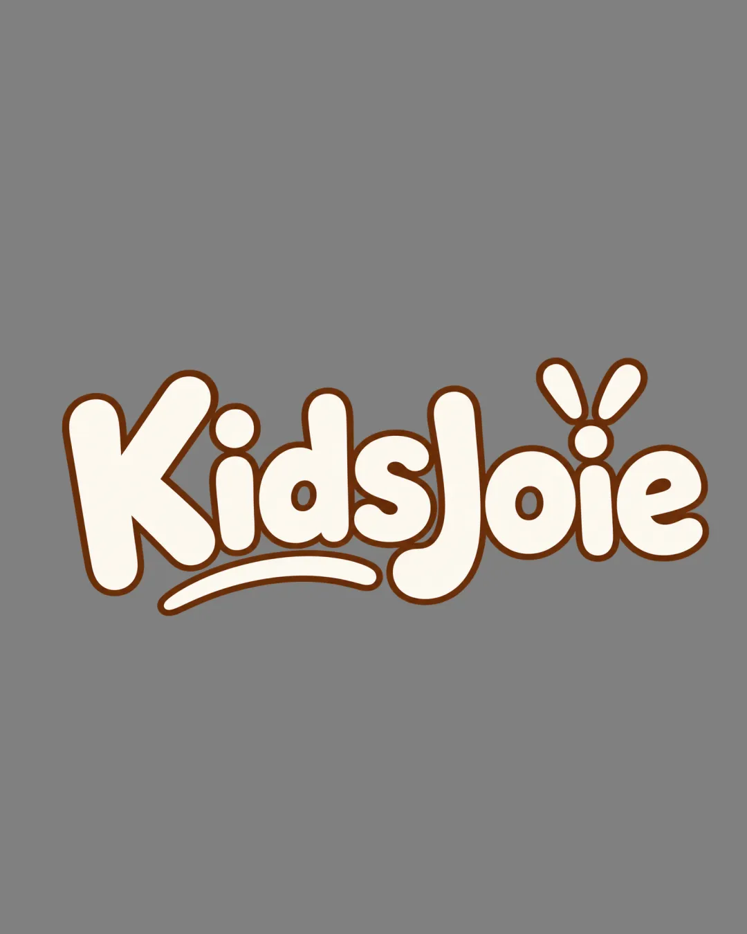
KidsJoie logo review
4/5
Logo score Wordmark category

KidsJoie

creative247716 Essential logo review

A charming and practical wordmark with childlike appeal, benefiting from minor balance refinements and greater distinction.

Wordmark Rounded Playful Sans-serif Kids Food/drink
5/5
Legibility
3.5/5
Originality
4/5
Balance
4/5
Scale
Your next steps

What to fix first

Focus on the changes that matter. Keep what makes the logo work.

1

wordmark

Integrate or visually anchor the underline more closely with the main letters.

Medium priority Optional refinement Low effort

The underline beneath 'Kids' is visually disconnected from the rest of the wordmark, creating a slight imbalance.

See the category review

2

wordmark

Consider more distinctive or thematic visual elements to further strengthen brand uniqueness.

Medium priority Optional refinement Medium effort

While the playful splash over 'i' adds some character, the core wordmark construction is still familiar for kids' products.

How to check

Assess if the logo is clearly distinguished in a competitive shelf context.

See the category review
Detailed review

Logo performance breakdown

4/5

Brief & logo match

Cheerful, energetic style and appetizing palette clearly suit a kids' nutritional drink brand.

5/5

Legibility

  • Very clear, rounded letterforms with strong readability.
3.5/5

Originality

  • Splash motif offers some originality.
  • While the playful splash over 'i' adds some character, the core wordmark construction is still familiar for kids' products.

    Optional refinement wordmark

    Try: Consider more distinctive or thematic visual elements to further strengthen brand uniqueness.

    Check: Assess if the logo is clearly distinguished in a competitive shelf context.

4/5

Color harmony

  • Warm brown outline and cream fill support an appetizing, kid-friendly appeal.
Beige#EFE1C6
Brown#60391B
Gray#888888

Estimated colors. Use the original design file for exact values.

Create a full color palette using these colors

Create new palette
4/5

Balance alignment

  • Weight and spacing are visually consistent.
  • The underline beneath 'Kids' is visually disconnected from the rest of the wordmark, creating a slight imbalance.

    Optional refinement wordmark

    Try: Integrate or visually anchor the underline more closely with the main letters.

Uploaded logoAlignment guide overlay

Inspect spacing with the guide. Optical balance may differ from geometric centering.

4/5

Scalability

  • Simple, bold shapes ensure good visibility at small sizes.
5/5

Misinterpretations

  • No confusing or unintended readings.
Try your own review

Wondering how your logo performs?

Get a clear logo score, key risks, and priority fix ideas before your client or audience sees it.

Review my logo