Tn
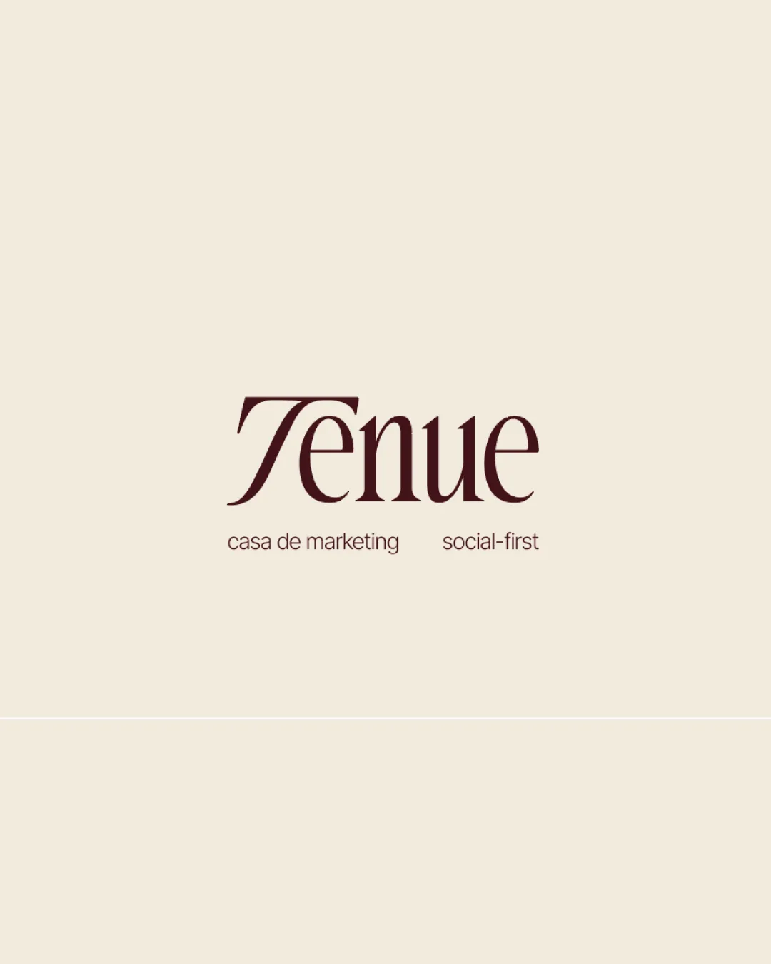
Tenue
casa de marketing   social-first logo review
3.7/5
Logo score
Logo review of

Tn Tenue Casa De Marketing Social First

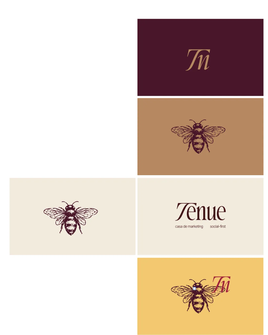
This logo suite delivers elegance and distinction with its vintage bee and sophisticated typography but needs minor clarity and versatility improvements before rollout.

Combination Vintage, Elegant, Illustrative
3.5/5
Legibility
4/5
Originality
5/5
Misread
4/5
Balance
3/5
Scale
Your next steps

What to fix first

Focus on the changes that matter. Keep what makes the logo work.

1

Wordmark version

Consider modestly adjusting the 'T' to increase instant recognizability without losing style.

Visible issue High priority Low effort
Area to inspectApproximate location

The 'T' in 'Tenue' has a nonstandard form that may briefly slow recognition or reading for new viewers.

How to check

Test with viewers unfamiliar with the brand to ensure the first letter is identified quickly.

See the category review
2

Bee illustration all versions

Develop a simplified bee variant for use at small scales or in single-color print.

Worth testing High priority Medium effort
Area to inspectApproximate location

The detailed bee may lose clarity and fine lines at small sizes or low-quality reproduction.

How to check

Print or export at small size and assess if essential features hold up.

See the category review
Detailed review

Logo performance breakdown

Not scored

Brief & logo match

More context needed

There isn't enough brand context to assess the match.

3.5/5

Legibility

  • Readable, stylish serif wordmark.
  • Monogram is decipherable but unusual.
  • The 'T' in 'Tenue' has a nonstandard form that may briefly slow recognition or reading for new viewers.

    Visible issue Wordmark version

    Try: Consider modestly adjusting the 'T' to increase instant recognizability without losing style.

    Check: Test with viewers unfamiliar with the brand to ensure the first letter is identified quickly.

    Area to inspectApproximate location
4/5

Originality

  • Vintage bee illustration adds distinctive flair.
  • Elegant typography and monogram elevate the brand image.
4/5

Color harmony

  • Rich, harmonious earthy palette.
  • Contrast enhances premium vibe.
Dark Maroon#3B1522
Tan#B58761
Cream#F2E7D6
Gold#FFD46C
Burgundy#AB2E4C

Estimated colors. Use the original design file for exact values.

Create a full color palette using these colors

Create new palette
4/5

Balance alignment

  • Elegant weight and spacing in primary wordmark.
  • Bee is well-centered in solo uses.
Uploaded logoAlignment guide overlay

Inspect spacing with the guide. Optical balance may differ from geometric centering.

3/5

Scalability

  • Detailed bee artwork gives strong character.
  • The detailed bee may lose clarity and fine lines at small sizes or low-quality reproduction.

    Worth testing Bee illustration all versions

    Try: Develop a simplified bee variant for use at small scales or in single-color print.

    Check: Print or export at small size and assess if essential features hold up.

    Area to inspectApproximate location
Uploaded logo at 200 pixels wide
200 × 250 px
Uploaded logo at 100 pixels wide
100 × 125 px
Uploaded logo at 50 pixels wide
50 × 63 px

Compare the detail at different sizes. Labels show the full image dimensions.

5/5

Misinterpretations

  • No obvious negative or unintended readings.
3/5

Symbol & text fit

  • Good relationship in most lockups.
  • In the combined bee + 'Tn' lockup, the overlay creates slight crowding and reduces each element's individual impact.

    Optional refinement Yellow version with bee + 'Tn'

    Try: Adjust placement or interplay for better breathing room and clearer hierarchy.

    Check: Check separation and focus when viewed quickly or at small scale.

Black & white

Does the shape still work without color?

These tests are available only for logos uploaded in vector (SVG) format.

Background contrast

Find the surfaces where your logo stays clear.

These tests are available only for logos uploaded in vector (SVG) format.

Blur & silhouette

A 3px blur softens fine details so you can check whether the overall shape stays recognizable. If key gaps close or elements merge, the logo may rely too heavily on detail.

These tests are available only for logos uploaded in vector (SVG) format.

Try your own review

Wondering how your logo performs?

Get a clear logo score, key risks, and priority fix ideas before your client or audience sees it.

Review my logo