What to preserve
Integrates the town name with an iconic building silhouette, creating a local and recognizable connection, while maintaining a clean, modern look.
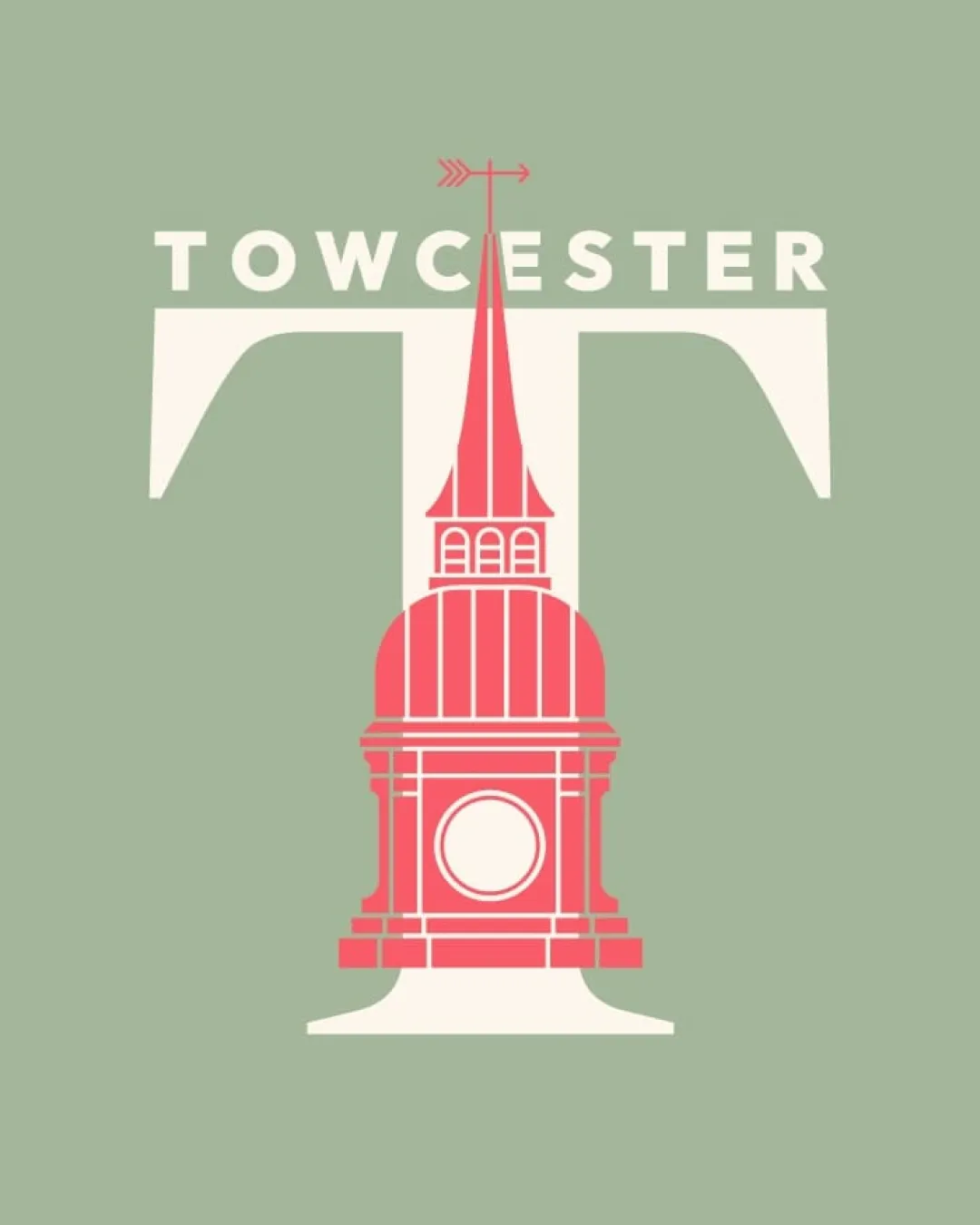
A visually distinctive local-heritage logo that effectively combines lettering and symbolic architecture, well-suited for most uses but requires a responsive or simplified version for small or constrained applications.
Focus on the changes that matter. Keep what makes the logo work.
Integrates the town name with an iconic building silhouette, creating a local and recognizable connection, while maintaining a clean, modern look.
Current detail level may not survive reductions and lower-quality printing.
Improves logo versatility and clarity in all use cases
Strong, memorable link to town identity
Estimated colors. Use the original design file for exact values.
Create a full color palette using these colors
Create new palette
Inspect spacing with the guide. Optical balance may differ from geometric centering.
Get a clear logo score, key risks, and priority fix ideas before your client or audience sees it.
More credits needed
Add credits to continue without losing your work.
Then $7/month. Cancel anytime.
Essential logo review with AI
Estimated progress