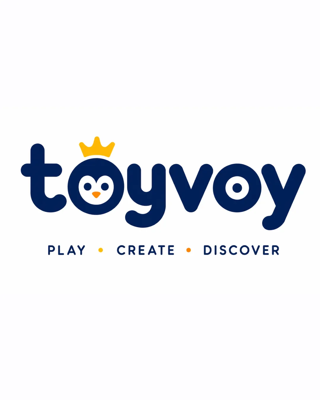
toyvoy
PLAY • CREATE • DISCOVER logo review
4.5/5
Logo score Combination mark category

toyvoy PLAY • CREATE • DISCOVER

creative142116 Essential logo review

Distinctive, premium, and playful logo that stands out in the toy sector. Fits the brief and industry with minor scalability tweaks suggested.

Combination Mark Playful, Rounded, Friendly Toys
4.5/5
Legibility
4.5/5
Originality
4/5
Balance
4/5
Scale
Your next steps

What to fix first

Focus on the changes that matter. Keep what makes the logo work.

What to preserve

The logo creatively integrates a crowned penguin face inside the 'o' of the wordmark, blending playful and premium traits to appeal to both children and adults interested in toys and cars.
1

Test the penguin face icon at very small sizes for clarity and adjust details if needed.

High priority Medium effort

Minor fine details may blur or merge at small scale.

Ensures key mark remains recognizable across all uses

2

Consider minor balancing adjustment if the crown/penguin mark feels visually heavier on print collateral.

Medium priority Low effort

Mark is left-weighted but generally balanced.

Improves optical centering in all brand uses

Detailed review

Logo performance breakdown

Not scored

Brief & logo match

Logo balances premium quality (crown, palette) with playful penguin for universal appeal

4.5/5

Legibility

  • Wordmark is highly legible, playful style without losing clarity
  • Tagline text is clean and readable
  • Minor risk of 'o' being interpreted as only a pictorial element
4.5/5

Originality

  • Crowned penguin inside 'o' is distinctive and memorable
  • Concept is playful yet unique among toy brands
  • Rounded style is common in the sector, but mark stands out
4.5/5

Color harmony

  • Navy and yellow palette is vibrant and premium
  • Good contrast enhances readability and appeal
  • Limitation on flexibility if only navy/gold used
Navy#16295A
Yellow#FCB715
White#FFFFFF
Orange#FF8000

Estimated colors. Use the original design file for exact values.

Create a full color palette using these colors

Create new palette

4/5

Balance alignment

  • Well-aligned, even spacing and balanced type
  • Integrated crown and penguin do not disrupt flow
  • Slight visual weight toward the left due to mark size
Uploaded logoAlignment guide overlay

Inspect spacing with the guide. Optical balance may differ from geometric centering.

4/5

Scalability

  • Simple, bold forms work well at various sizes
  • Minimal details ensure clarity in small applications
  • Penguin face may lose fine details at very small sizes
5/5

Misinterpretations

  • No confusing or unintended readings
  • Friendly expression and symbol clarity
5/5

Symbol & text fit

  • Penguin face is well-integrated within the wordmark
  • Crown reinforces premium positioning
Try your own review

Wondering how your logo performs?

Get a clear logo score, key risks, and priority fix ideas before your client or audience sees it.

Review my logo