 View review
Logo score
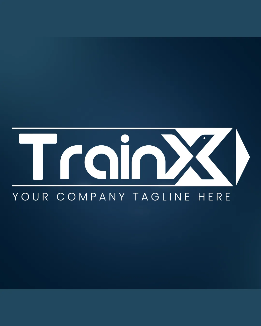
Logo review ofTrainx
Review the detailed scores below to see what is working and what should be refined first.
Legibility
Originality
Misread
Balance
Scale
Detailed review
Logo performance breakdown
Legibility
![]() Main word 'TrainX' is readable.
Main word 'TrainX' is readable.![]() Font style is clean and contemporary.
Font style is clean and contemporary.![]() Spacing between letters is generally adequate.
Spacing between letters is generally adequate.
![]() The stylized X with the arrow and dot might cause confusion if viewed quickly or at a small scale.
The stylized X with the arrow and dot might cause confusion if viewed quickly or at a small scale.![]() Small dot inside the X could be mistaken for a design error by some viewers.
Small dot inside the X could be mistaken for a design error by some viewers.
Originality
![]() Integration of arrow into 'X' offers a purpose-driven, industry-related message.
Integration of arrow into 'X' offers a purpose-driven, industry-related message.![]() Negative space is moderately well utilized.
Negative space is moderately well utilized.
![]() Arrow-in-X is a common motif in transport and tech sectors, therefore not highly distinctive.
Arrow-in-X is a common motif in transport and tech sectors, therefore not highly distinctive.![]() Overall letterforms are fairly standard apart from the arrow treatment.
Overall letterforms are fairly standard apart from the arrow treatment.
Color harmony
![]() White on deep blue is a classic, high-contrast combination.
White on deep blue is a classic, high-contrast combination.![]() Palette is restrained and professional.
Palette is restrained and professional.
![]() Large areas of white may appear stark, especially on a dark or colored background. Consider subtle accent hues for warmth or distinction.
Large areas of white may appear stark, especially on a dark or colored background. Consider subtle accent hues for warmth or distinction.
White
#FFFFFF
Catalina Blue
#19344C
Rich Black
#0E1C25
Your palette is close. Explore sharper color combinations with Colorfly.design before updating the logo.
Explore palettesBalance alignment
![]() Text and arrow are visually aligned horizontally.
Text and arrow are visually aligned horizontally.![]() Symmetric composition with clear flow.
Symmetric composition with clear flow.
![]() Right-heavy due to large 'X' and arrow shapes, making the left side feel lighter.
Right-heavy due to large 'X' and arrow shapes, making the left side feel lighter.![]() Horizontal lines above and below the text may distract or create a boxed-in effect, challenging vertical symmetry.
Horizontal lines above and below the text may distract or create a boxed-in effect, challenging vertical symmetry.

Scalability
![]() Simple geometric elements allow the logo to scale fairly well.
Simple geometric elements allow the logo to scale fairly well.![]() Logo would work on billboards, vehicle wraps, and signage.
Logo would work on billboards, vehicle wraps, and signage.
![]() Thin strokes in 'Train' and tagline may get lost at small sizes.
Thin strokes in 'Train' and tagline may get lost at small sizes.![]() Tagline will not be readable on small applications like mobile icons or favicons.
Tagline will not be readable on small applications like mobile icons or favicons.![]() Complexity in the 'X' symbol detail may blur at small scales.
Complexity in the 'X' symbol detail may blur at small scales.
200x250 px
100×125 px
50×62 px
Misinterpretations
![]() No inappropriate or unintended interpretations detected.
No inappropriate or unintended interpretations detected.
Symbol & text fit
![]() The arrow-logomark integrates smoothly with the wordmark.
The arrow-logomark integrates smoothly with the wordmark.
![]() Both elements share a similar geometric style.
Both elements share a similar geometric style.
![]() Arrowhead's scale relative to the remaining text makes the end of the logo overly dominant.
Arrowhead's scale relative to the remaining text makes the end of the logo overly dominant.
![]() Contrast between the thicknesses may disrupt overall cohesion.
Contrast between the thicknesses may disrupt overall cohesion.
Try your own review
Review my logo
Wondering how your logo performs?
Get a clear logo score, key risks, and priority fix ideas before your client or audience sees it.
Keep exploring


