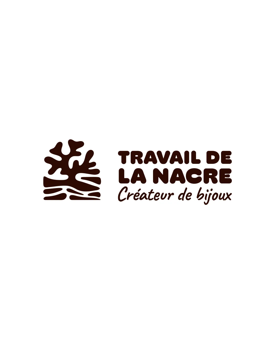
TRAVAIL DE LA NACRE Créateur de bijoux logo review
4.3 / 5
Logo score
Logo review of

Travail De La Nacre Créateur De Bijoux

Logo is client-ready, visually distinctive, and balanced—only minor adjustments recommended for optimal use

Combination Mark Organic Bold Minimal Jewelry
5/5
Legibility
4/5
Originality
5/5
Misread
4/5
Balance
4/5
Scale
Action plan

What to fix first

The most important fixes to handle before polishing the full presentation.

1

Slightly increase weight or presence of the script 'Créateur de bijoux' subline for better balance with the bold main text

Medium priority

The script subline is a bit visually light compared to the strong headline

Impact: Creates Stronger Hierarchy And Improved Visual Balance · Effort: Low

Detailed review

Logo performance breakdown

5/5

Legibility

Checkmark icon Main text is highly readable with strong contrast
Checkmark icon Secondary cursive text remains clear against background

4/5

Originality

Checkmark icon Organic symbol is distinctive and custom-drawn
Checkmark icon Typography pairing is unique

Warning icon Abstract coral/tree shapes are fairly common in organic branding

4/5

Color harmony

Checkmark icon Deep brown is appropriate for natural/craft/luxury associations
Checkmark icon Limited palette ensures clarity and brand recognition

Warning icon Brown may print differently on various substrates; could benefit from a secondary palette

Brown
#2C1108

White
#FFFFFF

Your palette is close. Explore sharper color combinations with Colorfly.design before updating the logo.

Explore palettes
4/5

Balance alignment

Checkmark icon Good horizontal alignment between symbol and text
Checkmark icon Text blocks and symbol visually balanced

Warning icon The lower cursive line is slightly light in weight compared to bold text above

logo 200x250 pixels scalability test alignment grid overlay
4/5

Scalability

Checkmark icon Bold strokes scale well and retain clarity
Checkmark icon Solid single color for easy reproduction

Warning icon Organic mark could lose some subtlety at very small sizes due to smaller inner gaps

logo 200x250 pixels scalability test

200x250 px

logo 100x125 pixels scalability test

100×125 px

logo 50x62 pixels scalability test

50×62 px

5/5

Misinterpretations

Checkmark icon No inappropriate or confusing misread detected

5 / 5

Logo structure & brief match

Checkmark icon Mark and wordmark style are harmonious in weight and theme

Checkmark icon Industry: Uses organic aquatic elements and elegant text, appropriate for a jewelry or craft-related field

Try your own review

Wondering how your logo performs?

Get a clear logo score, key risks, and priority fix ideas before your client or audience sees it.

Review my logo