 View review
Logo score
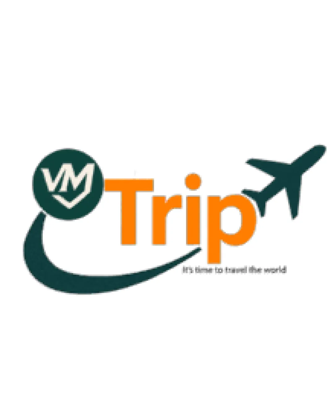
Logo review ofTrip
Review the detailed scores below to see what is working and what should be refined first.
Legibility
Originality
Misread
Balance
Scale
Detailed review
Logo performance breakdown
Legibility
![]() Main word 'Trip' is clear and readable due to bold, simple sans-serif typography.
Main word 'Trip' is clear and readable due to bold, simple sans-serif typography.![]() Contrast between orange text and white background increases visibility.
Contrast between orange text and white background increases visibility.
![]() Subtext 'It's time to travel the world' is extremely small and hard to read, especially at smaller sizes.
Subtext 'It's time to travel the world' is extremely small and hard to read, especially at smaller sizes.![]() The 'VM' is somewhat stylized which could cause quick-read confusion.
The 'VM' is somewhat stylized which could cause quick-read confusion.
Originality
![]() Inclusion of a custom 'VM' monogram brings some uniqueness.
Inclusion of a custom 'VM' monogram brings some uniqueness.
![]() Using an airplane and motion trail is extremely common in travel logos and lacks unique concept.
Using an airplane and motion trail is extremely common in travel logos and lacks unique concept.![]() The overall layout and iconography feel generic for the travel industry.
The overall layout and iconography feel generic for the travel industry.
Color harmony
![]() Palette limited mainly to one accent color (orange) and deep cyan for contrast.
Palette limited mainly to one accent color (orange) and deep cyan for contrast.![]() Colors feel approachable and industry-appropriate.
Colors feel approachable and industry-appropriate.
![]() Cyan/dark teal feels heavy compared to bright orange, which can feel slightly imbalanced overall.
Cyan/dark teal feels heavy compared to bright orange, which can feel slightly imbalanced overall.![]() Gradient or shading is subtle but may complicate monochrome uses.
Gradient or shading is subtle but may complicate monochrome uses.
Orange
#FF9800
Cyprus
#153734
White
#FFFFFF
Your palette is close. Explore sharper color combinations with Colorfly.design before updating the logo.
Explore palettesBalance alignment
![]() Curved path creates direction and motion towards the logotype.
Curved path creates direction and motion towards the logotype.![]() Elements feel loosely connected through placement.
Elements feel loosely connected through placement.
![]() Left-heavy logo due to large circle and path; the 'Trip' word and airplane don't fully counterbalance this.
Left-heavy logo due to large circle and path; the 'Trip' word and airplane don't fully counterbalance this.![]() Curved trail and symbol don’t align perfectly with logotype baseline, creating mild visual tension.
Curved trail and symbol don’t align perfectly with logotype baseline, creating mild visual tension.

Scalability
![]() Logo is generally simple enough for use on billboards, websites, and product packaging.
Logo is generally simple enough for use on billboards, websites, and product packaging.![]() Icon and text separation enables horizontal and vertical lockups.
Icon and text separation enables horizontal and vertical lockups.
![]() Thin tagline will not be legible on small applications like business cards or mobile favicons.
Thin tagline will not be legible on small applications like business cards or mobile favicons.![]() Airplane and path detail may appear cluttered on very small scale items like pens or app icons.
Airplane and path detail may appear cluttered on very small scale items like pens or app icons.
200x250 px
100×125 px
50×62 px
Misinterpretations
![]() No inappropriate or confusing symbolic implications.
No inappropriate or confusing symbolic implications.
Symbol & text fit
![]() Reasonable integration of icon and wordmark with shared color usage.
Reasonable integration of icon and wordmark with shared color usage.
![]() Both elements are easily separable for branding needs.
Both elements are easily separable for branding needs.
![]() Style between the thick, geometric logotype and hand-drawn monogram lacks strong coherence.
Style between the thick, geometric logotype and hand-drawn monogram lacks strong coherence.
![]() Monogram's style in the circle does not harmonize fully with the text and icon illustration.
Monogram's style in the circle does not harmonize fully with the text and icon illustration.
Try your own review
Review my logo
Wondering how your logo performs?
Get a clear logo score, key risks, and priority fix ideas before your client or audience sees it.
Keep exploring


