Wondering how your logo performs? 🧐
Get professional logo reviews in seconds and catch design issues in time.
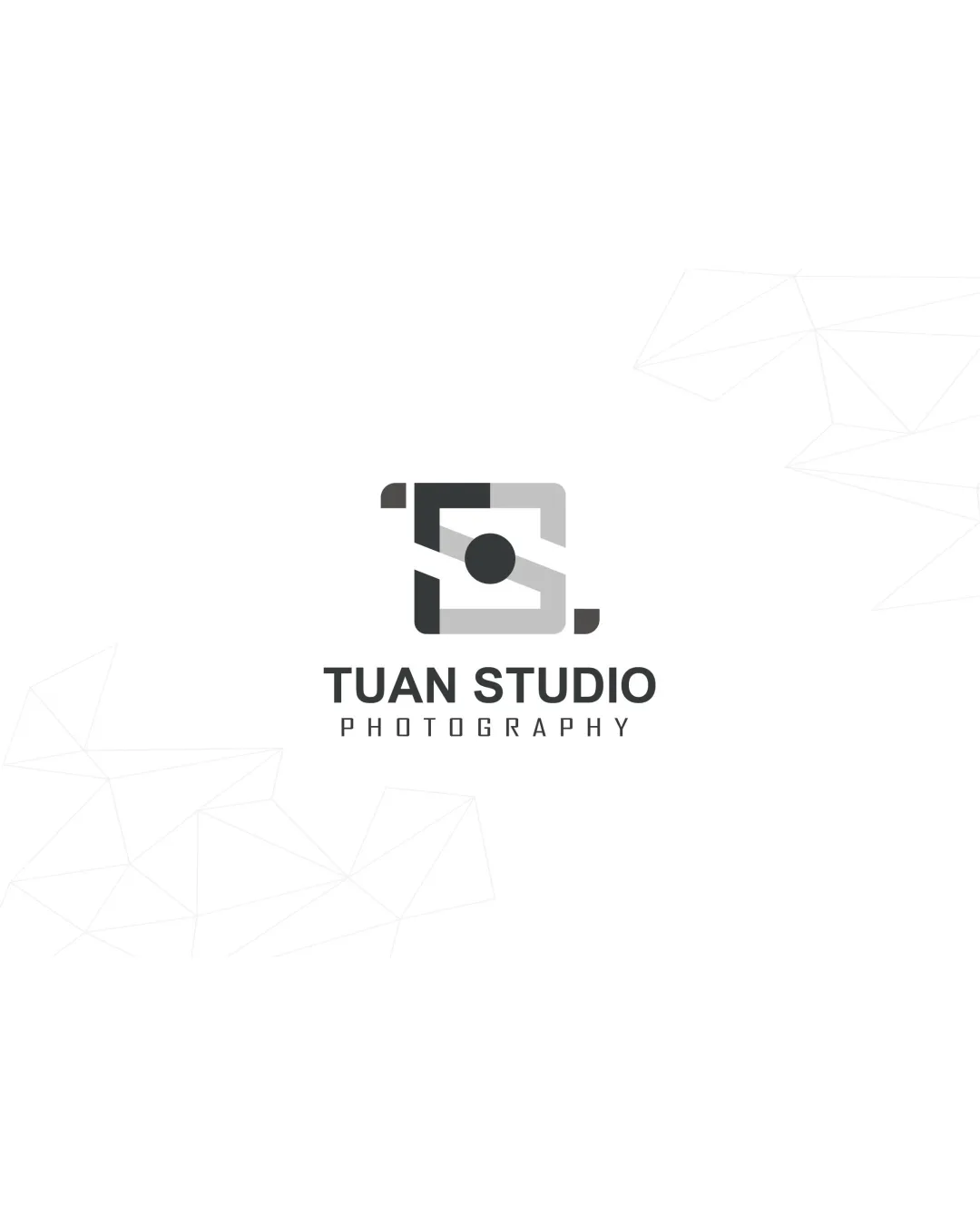
Try it Now!Logo review of TUAN STUDIO PHOTOGRAPHY
 Logo analysis by AI
Logo type:
Style:
Detected symbol:
Negative space:
Detected text:
Business industry:
Review requested by Proqua123
**If AI can recognize or misinterpret it, so can people.
Structured logo review
Legibility
![]() Text is clear and easily readable.
Text is clear and easily readable.![]() Good choice of sans-serif fonts for modern appeal.
Good choice of sans-serif fonts for modern appeal.
Scalability versatility
![]() Simple geometric shapes lend themselves well to scaling.
Simple geometric shapes lend themselves well to scaling.![]() Should work clearly on business cards and digital media.
Should work clearly on business cards and digital media.
![]() Smaller applications may reduce the visual clarity of the camera/‘S’ mark.
Smaller applications may reduce the visual clarity of the camera/‘S’ mark.![]() Thin negative space may get lost at favicon or embroidery scales.
Thin negative space may get lost at favicon or embroidery scales.
200x250 px
100×125 px
50×62 px
Balance alignment
![]() Logomark is centered above wordmark, maintaining good structure.
Logomark is centered above wordmark, maintaining good structure.![]() Visual weight is well distributed between text and symbol.
Visual weight is well distributed between text and symbol.
![]() Subtle asymmetry in the logomark may distract keen viewers.
Subtle asymmetry in the logomark may distract keen viewers.

Originality
![]() Camera and aperture idea is integrated with an abstract S, providing some creativity.
Camera and aperture idea is integrated with an abstract S, providing some creativity.![]() Simple central dot as lens is a nice touch.
Simple central dot as lens is a nice touch.
![]() Camera icons are very common in photography branding.
Camera icons are very common in photography branding.![]() Execution is minimal but lacks a distinctive twist to set it apart strongly from competition.
Execution is minimal but lacks a distinctive twist to set it apart strongly from competition.
Logomark wordmark fit
![]() Font and symbol style both match with modern, geometric aesthetics.
Font and symbol style both match with modern, geometric aesthetics.![]() Size proportion between logomark and wordmark is well balanced.
Size proportion between logomark and wordmark is well balanced.
Aesthetic look
![]() Clean and visually appealing.
Clean and visually appealing.![]() Minimal color scheme enhances professional appearance.
Minimal color scheme enhances professional appearance.
![]() Logo risks blending in with many similar modern photography brands.
Logo risks blending in with many similar modern photography brands.
Dual meaning and misinterpretations
![]() No inappropriate or confusing imagery detected.
No inappropriate or confusing imagery detected.
Color harmony
![]() Limited, harmonious grayscale palette maintains professional look.
Limited, harmonious grayscale palette maintains professional look.![]() Strong contrast between text and background.
Strong contrast between text and background.
black
#232323
light gray
#B2B2B2
white
#FFFFFF