View review
Turistando Angola
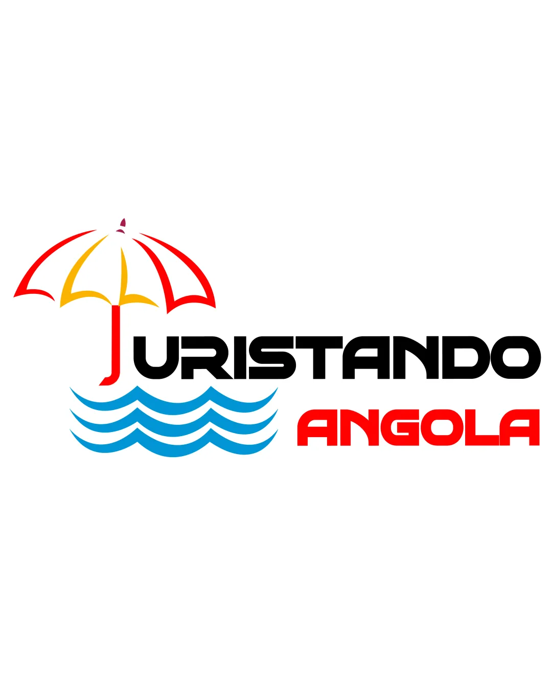
A well-executed, industry-appropriate combination mark delivering a clear tourism message with a modern, lively look. Small refinements will elevate clarity and versatility further.
Objective AI feedback. Your creative decision.
What to fix first
The most important fixes to handle before polishing the full presentation.
Explore minor adjustments to clarify the integration of the umbrella handle and 'T' to maximize instant readability for all viewers.
High priorityReadability is a core requirement, and this refinement is quick but impactful.
Impact: Improves Instant Recognition And Avoids Confusion, Especially At Smaller Sizes. · Effort: Low
Test logo at reduced sizes and simplify umbrella and wave lines if needed for clarity in small applications.
Medium priorityVersatility is key for tourism brands, especially across digital and print formats.
Impact: Increases Practical Versatility And Protects Brand Clarity Everywhere. · Effort: Medium
Logo performance breakdown
Legibility
Wordmark is bold and highly readable
Contrasting color on 'ANGOLA' draws attention
Slight risk of confusion with 'J' and 'T' due to umbrella integration
Originality
Integrated umbrella pole is a smart twist
Umbrella and wave elements are common travel/tourism motifs
Color harmony
Vivid palette suggests sun, sea, and energy; colors are well balanced
Use of three different colors (plus black) could be simplified for more unity
Red
#FF0000
Yellow
#FFD700
Black
#000000
DeepSkyBlue
#00BFFF
Your palette is close. Refine the color roles and combinations before updating the logo.
Build brand colorsBalance alignment
Good separation of symbol and text
Consistent visual weight across elements
Wave element may compete with wordmark alignment
Scalability
Clean shapes and bold lines support scalability
Minimal fine detail
Umbrella lines may thin out at very small sizes
200x250 px
100×125 px
50×62 px
Misinterpretations
No obvious unintended readings
Logo structure & brief match
Umbrella integrates into wordmark via 'T', connecting symbol and text
Symbol slightly overshadows the text for small print
Clarity And Readability: Very good – main text stands out and the concept is apparent at a glance.
Tourism, Discovery, And Adventure: Strong – umbrella, waves, and lively colors all support a sense of tourism and leisure.
Angolan Culture/national Pride: Average – no direct Angolan cultural reference beyond red/yellow reminiscent of the national flag, though the approach is positive and inviting.
Modern, Memorable, And Versatile: Modern and memorable – but further simplification may help for small-format and broader versatility.
Wondering how your logo performs?
Get a clear logo score, key risks, and priority fix ideas before your client or audience sees it.