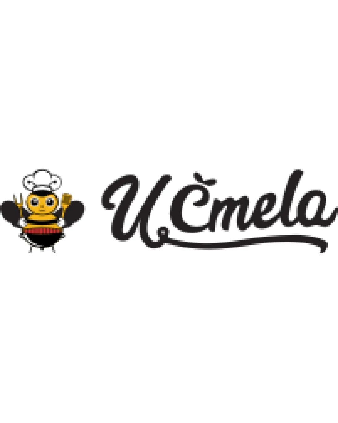
U Čmela logo review
3.3/5
Logo score Combination mark category

U Čmela

nekromantik Essential logo review

Review the detailed scores below to see what is working and what should be refined first.

Symbols recognized:
cartoon bee with chef hat, holding a fork and spoon
Legible text:
U Čmela
Combination Mark Playful, Illustrative, Hand-lettered Script Restaurant
4/5
Legibility
3/5
Originality
3/5
Balance
2/5
Scale
Detailed review

Logo performance breakdown

2/5

Scalability

  • Color contrast allows logo to stand out on light backgrounds.
  • Script portion could function independently for some applications.
  • Bee illustration contains excessive detail, which will not reproduce well at small sizes (e.g., embroidery, favicon).
  • Thin lines and small elements in the bee may disappear or blur when scaled down.
  • Complexity and multiple colors hinder usage in single-color variants or small restaurant items like coasters or cutlery.

2/5

Symbol & text fit

  • Both elements are playful, aiming for a family-friendly vibe.
  • Cartoonish bee and elegant script feel stylistically mismatched.
  • Bee’s illustrative style is more casual than the hand-lettered script, creating a disconnect.
  • Sizing imbalance; the bee dominates, drawing more attention than the brand name.
3/5

Originality

  • Custom cartoon bee illustration; chef hat and utensils add specific thematic relevance.
  • Unique script treatment of the name.
  • Bee mascots are common in food and restaurant branding; concept is not unique.
  • Symbol and text combination lacks a strong creative connection—the bee feels pasted next to the script without integration.
3/5

Balance alignment

  • Overall left-to-right composition is well distributed.
  • Bee creates a distinct starting point for the brand name.
  • Visual weight of bee character is stronger than the script, making the left side heavy.
  • Transition from playful bee to elegant script lacks cohesion, resulting in mild imbalance.
Uploaded logoAlignment guide overlay

Inspect spacing with the guide. Optical balance may differ from geometric centering.

4/5

Legibility

  • Script font is generally readable despite flourishes.
  • Text contrast against white background ensures visibility.
  • Decorative swash on the script could cause minor issues at very small sizes.
  • The diacritical mark over the 'C' blends easily into the character at small scales.
4/5

Color harmony

  • Classic black/gold/white palette appropriate for a bee mascot.
  • Accent red in bee’s drum for slight visual interest without disrupting harmony.
  • Potential risk for color variation printing, especially for small applications.
  • Multiple colors complicate monochrome adaptation.
Gold#FFD700
Black#000000
White#FFFFFF
Red#FF2E2E

Estimated colors. Use the original design file for exact values.

Create a full color palette using these colors

Create new palette
5/5

Misinterpretations

  • No accidental inappropriate or confusing secondary shapes detected.
Try your own review

Wondering how your logo performs?

Get a clear logo score, key risks, and priority fix ideas before your client or audience sees it.

Review my logo