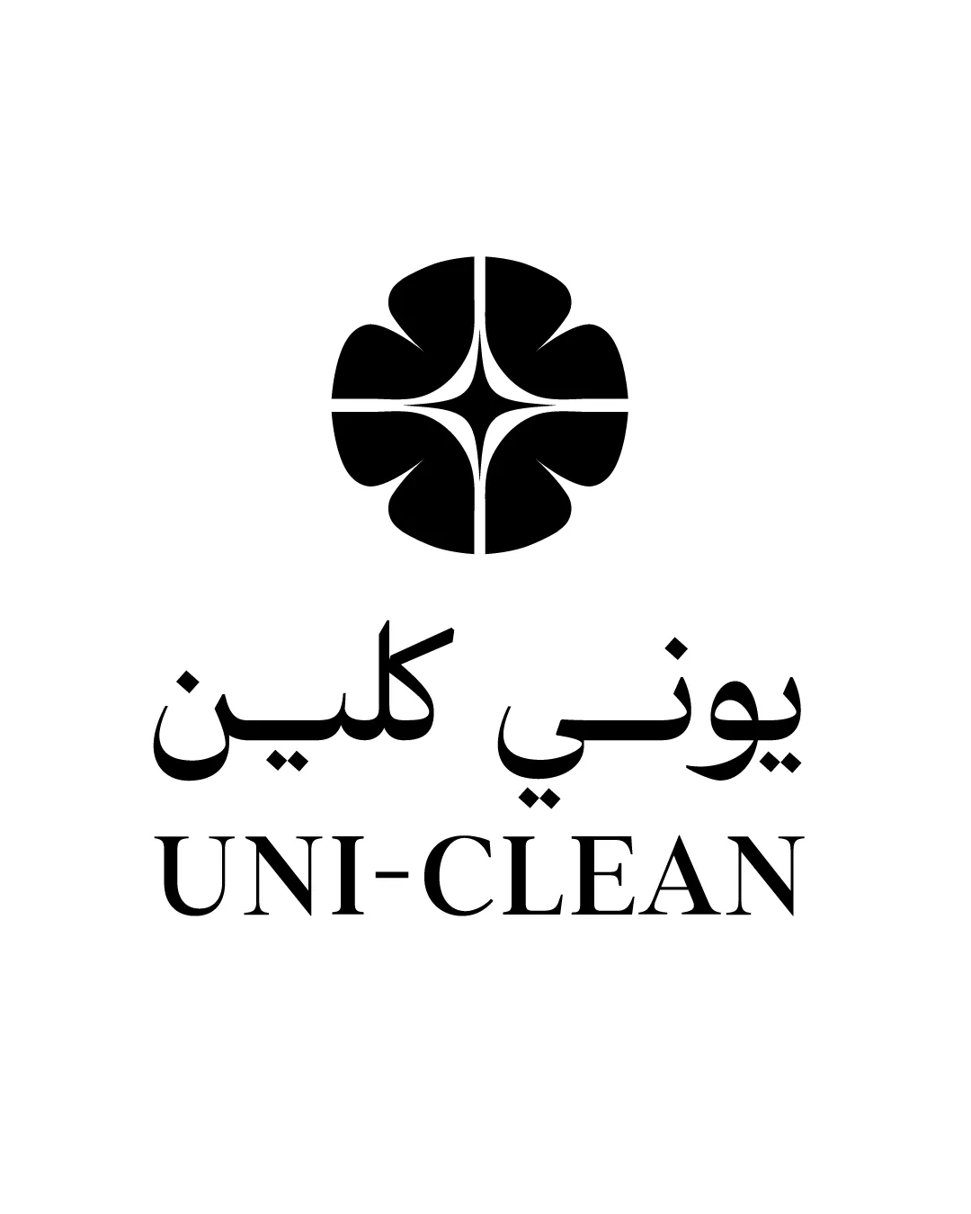
يوني كلين UNI-CLEAN logo review
4.4 / 5
Logo score

Logo review ofيوني كلين Uni Clean

Solid, professional bilingual concept; minor refinements for clarity and brand distinction suggested.

Combination Mark Minimalist Geometric Cleaning
5/5
Legibility
3/5
Originality
5/5
Misread
5/5
Balance
4/5
Scale
Review next
Action plan

What to fix first

The most important fixes to handle before polishing the full presentation.

1

Test center star clarity at very small sizes and simplify if needed.

Medium priority

Center detail could blur on small items like pens or icons.

Impact: Ensures Mark Legibility Across Applications. · Effort: Low

2

Consider introducing a distinguishing accent color or subtle gradient for uniqueness.

Low priority

Monochrome is versatile but does not stand out visually.

Impact: Could Help Brand Recognition And Differentiation. · Effort: Medium

Detailed review

Logo performance breakdown

5/5

Legibility

Checkmark icon Both Arabic and Latin text are highly legible and well spaced

3/5

Originality

Checkmark icon Abstract mark is custom and not a generic stock icon

Warning icon Geometric flower/star is somewhat common in cleaning and service sectors

4/5

Color harmony

Checkmark icon Simple monochrome scheme feels professional and versatile

Warning icon Lacks distinctiveness or brand-specific color identity

Black
#000000

White
#FFFFFF

Your palette is close. Explore sharper color combinations with Colorfly.design before updating the logo.

Explore palettes
5/5

Balance alignment

Checkmark icon Elements are well centered and vertically aligned
Checkmark icon Good spacing between symbol and text

logo 200x250 pixels scalability test alignment grid overlay
4/5

Scalability

Checkmark icon Simple, bold shapes ensure clarity at small sizes
Checkmark icon High contrast for good reproduction

Warning icon Center star detail could blur at extremely small sizes

logo 200x250 pixels scalability test

200x250 px

logo 100x125 pixels scalability test

100×125 px

logo 50x62 pixels scalability test

50×62 px

5/5

Misinterpretations

Checkmark icon No inappropriate or confusing shapes detected

5 / 5

Logo structure & brief match

Checkmark icon Harmonious integration of symbol, Arabic, and Latin text

Checkmark icon Industry/Market: Abstract cleanliness and star icon effectively communicate cleaning service; bi-lingual text fits Saudi market.

Try your own review

Wondering how your logo performs?

Get a clear logo score, key risks, and priority fix ideas before your client or audience sees it.

Review my logo