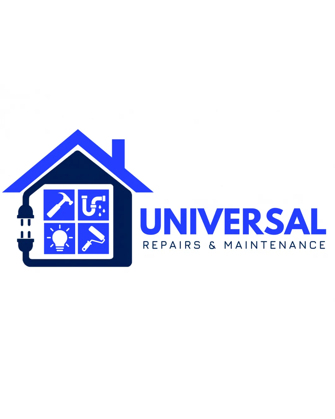
UNIVERSAL REPAIRS & MAINTENANCE logo review
3.3/5
Logo score

UNIVERSAL REPAIRS & MAINTENANCE

Functional and directly communicates services, but lacks originality and ultra-flexibility needed for premium branding.

Combination Mark Modern Service, Illustrative Mark Maintenance Services
4/5
Legibility
2.5/5
Originality
4/5
Balance
3.5/5
Scale
Your next steps

What to fix first

Focus on the changes that matter. Keep what makes the logo work.

1

Simplify internal house icons for clarity at small sizes

High priority Medium effort

Icons risk losing detail when reduced, making the mark less effective.

Improves scalability and recognition across applications
2

Refine color contrast and consider a memorable color accent

Medium priority Low effort

Current palette is functional but undistinctive for competitive branding.

Improves distinctiveness and visual appeal

Detailed review

Logo performance breakdown

Not scored

Brief & logo match

Icons clearly convey repair and maintenance variety; house and plug reinforce home and electrical services.

4/5

Legibility

  • Wordmark is bold, uppercase, and readable
  • Tagline is clear at moderate sizes
  • Tagline at small sizes may lose clarity
2.5/5

Originality

  • Custom combination of relevant elements
  • House-with-tools and segmented-service iconography is very common in this sector
4/5

Color harmony

  • Harmonious blue palette, industry-appropriate
  • Palette lacks vibrancy; feels somewhat generic
Blue#1740FF
Navy#13204B
White#FFFFFF

Estimated colors. Use the original design file for exact values.

Create a full color palette using these colors

Create new palette

4/5

Balance alignment

  • Good alignment between mark and wordmark
  • Visual balance between icon-heavy symbol and simple text
  • Mark is visually heavier than the wordmark, slight rightward imbalance
Uploaded logoAlignment guide overlay

Inspect spacing with the guide. Optical balance may differ from geometric centering.

3.5/5

Scalability

  • Main elements are clear at standard sizes
  • Service icons inside the house could become indistinct at small sizes; detailed mark may not scale down cleanly
5/5

Misinterpretations

  • No plausible misinterpretation, clear symbolism
4/5

Symbol & text fit

  • Wordmark and icon match in style and color palette
Try your own review

Wondering how your logo performs?

Get a clear logo score, key risks, and priority fix ideas before your client or audience sees it.

Review my logo



