UPTRND logo review
4/5
Logo score
Logo review of

Uptrnd

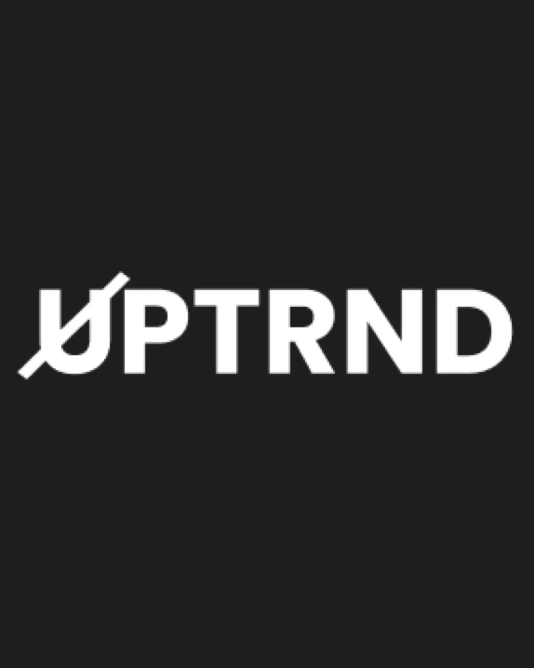
A distinct, conceptually aligned wordmark that communicates upward movement for the trading apparel niche, though the 'U' could be further clarified for instant recognition.

Wordmark Modern Bold Sans-serif With A Stylized Initial Apparel (finance Niche)
4/5
Legibility
4/5
Originality
4/5
Misread
3.5/5
Balance
4/5
Scale
Your next steps

What to fix first

Focus on the changes that matter. Keep what makes the logo work.

1

wordmark

Refine the 'U' to ensure it more clearly communicates upward movement without resembling 'Ø'.

Visible issue High priority Medium effort
Area to inspectApproximate location

The stylized 'U' is visually distinct but may be mistaken for the symbol 'Ø' at a glance, slightly reducing immediate brand recall.

How to check

Test quick recognition of the initial letter and association with an uptrend among target audience.


See the category review
2

wordmark

Slightly adjust letter spacing or modify the 'U' thickness for more even wordmark balance.

Optional refinement Medium priority Low effort
Area to inspectApproximate location

Minor optical weight difference between the modified 'U' and the rest of the bold wordmark, causing slight imbalance.

How to check

Review horizontal alignment and perceived weight in print and digital applications.

See the category review
Detailed review

Logo performance breakdown

4/5

Brief & logo match

Based on your brief
Compared with

Apparel brand targeting day traders and stock enthusiasts.

Design visually aligns with stock/trading themes and apparel application, though the stylized 'U' could be more intuitively linked to 'uptrend'.

  • Day Trader And Stock Market Relevance

    The arrow-like diagonal in 'U' visually cues upward market movement, syncing with stock and trading interests.

  • Apparel Industry Adaptability

    Bold, simple wordmark is well-suited for fashion and print on various garments, retaining legibility and punch.

4/5

Legibility

  • Clear, bold sans-serif letters.
  • Wordmark is readable at various sizes.
4/5

Originality

  • Dynamic 'U' modification references uptrends.
  • Modern, purposeful construction.
  • The stylized 'U' is visually distinct but may be mistaken for the symbol 'Ø' at a glance, slightly reducing immediate brand recall.

    Visible issue wordmark

    Try: Refine the 'U' to ensure it more clearly communicates upward movement without resembling 'Ø'.

    Check: Test quick recognition of the initial letter and association with an uptrend among target audience.
    Area to inspectApproximate location
3.5/5

Balance alignment

  • Strong alignment and consistent cap height.
  • Minor optical weight difference between the modified 'U' and the rest of the bold wordmark, causing slight imbalance.

    Optional refinement wordmark

    Try: Slightly adjust letter spacing or modify the 'U' thickness for more even wordmark balance.

    Check: Review horizontal alignment and perceived weight in print and digital applications.

    Area to inspectApproximate location
Uploaded logoAlignment guide overlay

Inspect spacing with the guide. Optical balance may differ from geometric centering.

4/5

Scalability

  • Monochrome palette suits many applications.
  • Simple forms ensure stress-free scaling.
Uploaded logo at 200 pixels wide
200 × 250 px
Uploaded logo at 100 pixels wide
100 × 125 px
Uploaded logo at 50 pixels wide
50 × 63 px

Compare the detail at different sizes. Labels show the full image dimensions.

4/5

Misinterpretations

  • No overt negative shapes or alternate readings.

Black & white

Does the shape still work without color?

These tests are available only for logos uploaded in vector (SVG) format.

Background contrast

Find the surfaces where your logo stays clear.

These tests are available only for logos uploaded in vector (SVG) format.

Blur & silhouette

A 3px blur softens fine details so you can check whether the overall shape stays recognizable. If key gaps close or elements merge, the logo may rely too heavily on detail.

These tests are available only for logos uploaded in vector (SVG) format.

Try your own review

Wondering how your logo performs?

Get a clear logo score, key risks, and priority fix ideas before your client or audience sees it.

Review my logo