 View review
Logo score
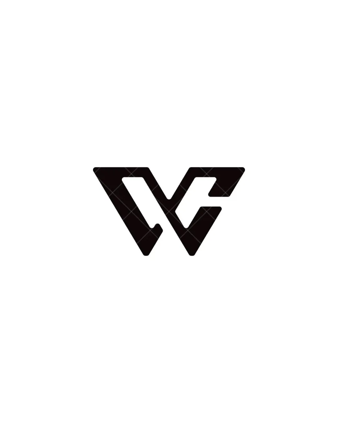
Logo review ofV, C
Review the detailed scores below to see what is working and what should be refined first.
Originality
Misread
Balance
Scale
Detailed review
Logo performance breakdown
Originality
![]() Integrated use of both letters shows some creativity.
Integrated use of both letters shows some creativity.![]() Distinctive geometric style gives a sharp, modern look.
Distinctive geometric style gives a sharp, modern look.
![]() Overall concept (geometric letter fusion) is somewhat common in tech-focused branding.
Overall concept (geometric letter fusion) is somewhat common in tech-focused branding.![]() Lacks a unique twist or negative space story to set it apart from similar monograms.
Lacks a unique twist or negative space story to set it apart from similar monograms.
Color harmony
![]() Monochrome palette is classic and highly functional.
Monochrome palette is classic and highly functional.![]() High contrast ensures adaptability on varied backgrounds.
High contrast ensures adaptability on varied backgrounds.
Black
#000000
White
#FFFFFF
Balance alignment
![]() Perfectly symmetrical and well-centered composition.
Perfectly symmetrical and well-centered composition.![]() Visual weight is evenly distributed across the mark for maximum harmony.
Visual weight is evenly distributed across the mark for maximum harmony.

Scalability
![]() Simple, bold lines ensure visibility at small sizes.
Simple, bold lines ensure visibility at small sizes.![]() High contrast guarantees strong presence on both light and dark backgrounds.
High contrast guarantees strong presence on both light and dark backgrounds.
![]() Extreme angularity may create visual confusion at very small sizes (e.g. tiny favicons, embroidery).
Extreme angularity may create visual confusion at very small sizes (e.g. tiny favicons, embroidery).![]() Fine internal gaps may fill in or fade with low-resolution print.
Fine internal gaps may fill in or fade with low-resolution print.
200x250 px
100×125 px
50×62 px
Misinterpretations
![]() No inappropriate or unintended shapes detected.
No inappropriate or unintended shapes detected.![]() The integration is professional and does not allude to anything unintentional.
The integration is professional and does not allude to anything unintentional.
Try your own review
Review my logo
Wondering how your logo performs?
Get a clear logo score, key risks, and priority fix ideas before your client or audience sees it.
Keep exploring


