View review
Logo score
Logo review of
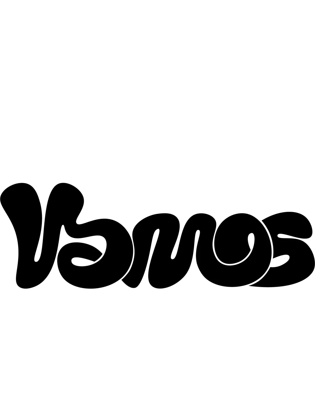
Vamos
Review the detailed scores below to see what is working and what should be refined first.
Objective AI feedback. Your creative decision.
Legibility
Originality
Misread
Balance
Scale
Detailed review
Logo performance breakdown
Legibility
 Distinctive custom letterforms create a unique presence.
 Letter shapes are overly abstract and thick, making 'VAMOS' difficult to read at first glance. Unusual curves and connections reduce quick legibility, especially at smaller sizes.
Originality
Highly unique, custom lettering with a retro-psychedelic flair. No use of generic symbols or off-the-shelf typefaces.
The extreme stylization slightly compromises functionality for creativity; the wordmark’s originality impacts practical legibility.
Color harmony
Single-color palette avoids confusion, provides strong contrast, and suits a range of applications.
Black
#000000
White
#FFFFFF
Balance alignment
Consistent baseline alignment across all letterforms ensures a unified foundation.
Letter spacing is inconsistent, and some letters (like the 'V' and 'O') overpower others visually. Weight distribution feels uneven, especially the overextended 'V' compared to the more compact 'S'.

Scalability
Simple single-color format aids scalability on some mediums such as large posters or clothing.
Extremely bold, merged letters can lose distinctiveness on smaller formats like business cards or mobile screens. May not embroider well on apparel due to intricate curves and merges.
200x250 px
100×125 px
50×62 px
Misinterpretations
No inappropriate shapes or accidental imagery detected in the current design.
Try your own review
Review my logo
Wondering how your logo performs?
Get a clear logo score, key risks, and priority fix ideas before your client or audience sees it.
Keep exploring