View review
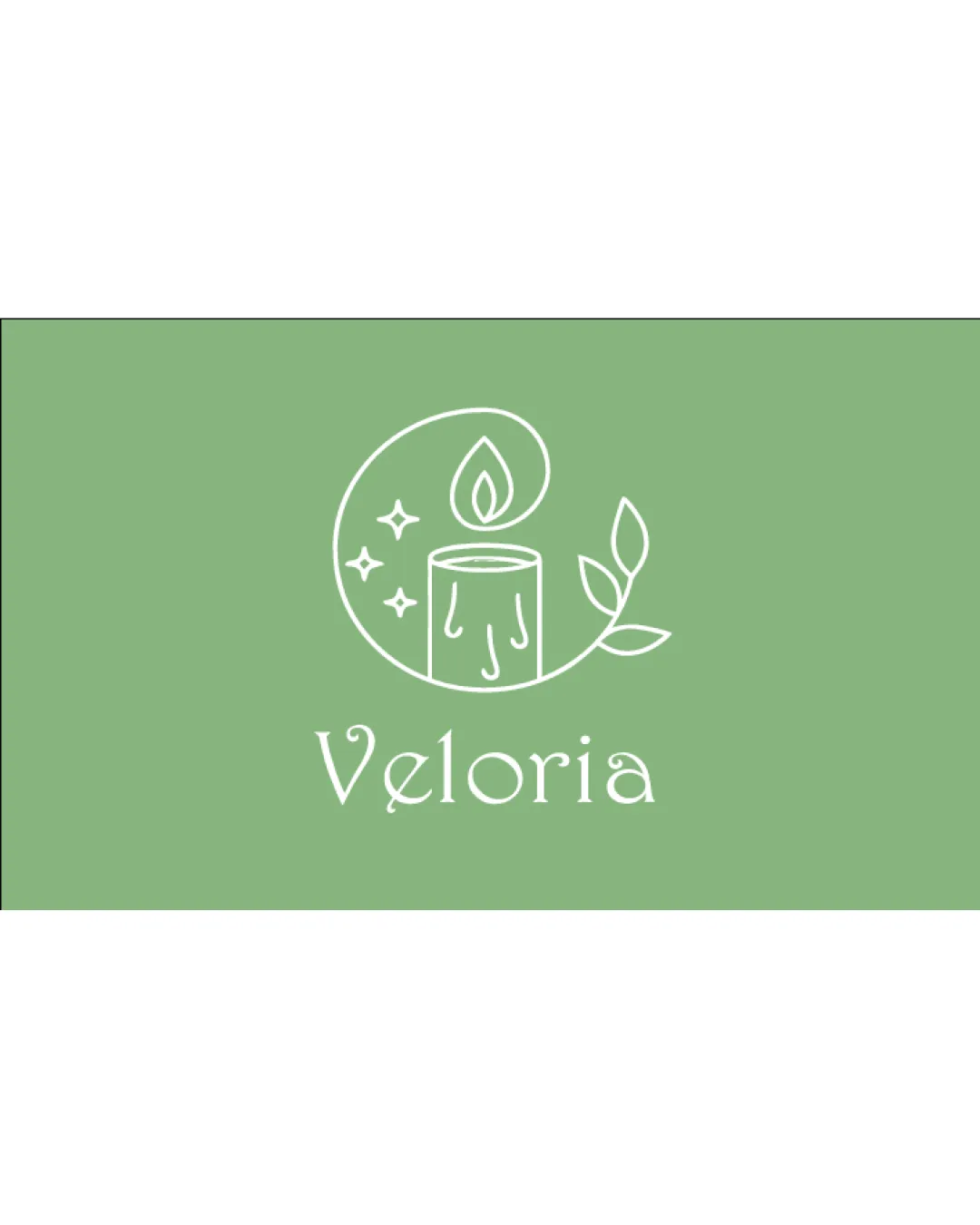
Veloria
Review the detailed scores below to see what is working and what should be refined first.
Objective AI feedback. Your creative decision.
Logo performance breakdown
Legibility
The word 'Veloria' is clear and easy to read. The stylized font integrates well with the logo's organic theme.
The capital 'V' has an unconventional swash which might cause slight confusion at smaller sizes or for very quick reading.
Originality
Combination of candle, organic elements, and stars has some personality. Slightly whimsical approach to a standard wellness/candle mark.
Candles, leaves, and sparkles are heavily overused motifs in the wellness and spa industry, making the logo appear somewhat generic. No highly unique detail or negative space innovation present.
Color harmony
Limited color palette is calming and on-brand for wellness. Good contrast between white icon/text and green background.
Logo would need verification to maintain clarity and appeal in monochrome or grayscale versions.
Green
#94B38A
White
#FFFFFF
Your palette is close. Refine the color roles and combinations before updating the logo.
Build brand colorsBalance alignment
The visual weight of the candle icon and the wordmark are mostly harmonious. Central alignment between symbol and text is appropriate for the clean style.
The logomark slightly leans right due to the leaf placement, causing a minor imbalance. The circular accent isn't perfectly symmetrical and can make the design feel a bit lopsided.
Scalability
Line-art style allows for preservation of form at medium and larger sizes. Logo would work well on labels, packaging, and web banners.
Thin lines may lose clarity and detail when scaled down to very small sizes, such as favicons, social media avatars, or embroidery. The intricate elements (stars, leaves, drips) can merge visually at small scales.
200x250 px
100×125 px
50×62 px
Misinterpretations
All elements are family-friendly and inoffensive. No hidden or inappropriate imagery detected.
Symbol & text fit
Both the logomark and wordmark share a delicate, organic visual style. Typeface choice complements the line style of the graphic.
Thickness of the lines in the wordmark could be subtly more harmonized to match the logomark for an even more unified appearance.
Wondering how your logo performs?
Get a clear logo score, key risks, and priority fix ideas before your client or audience sees it.