 View review
Logo score
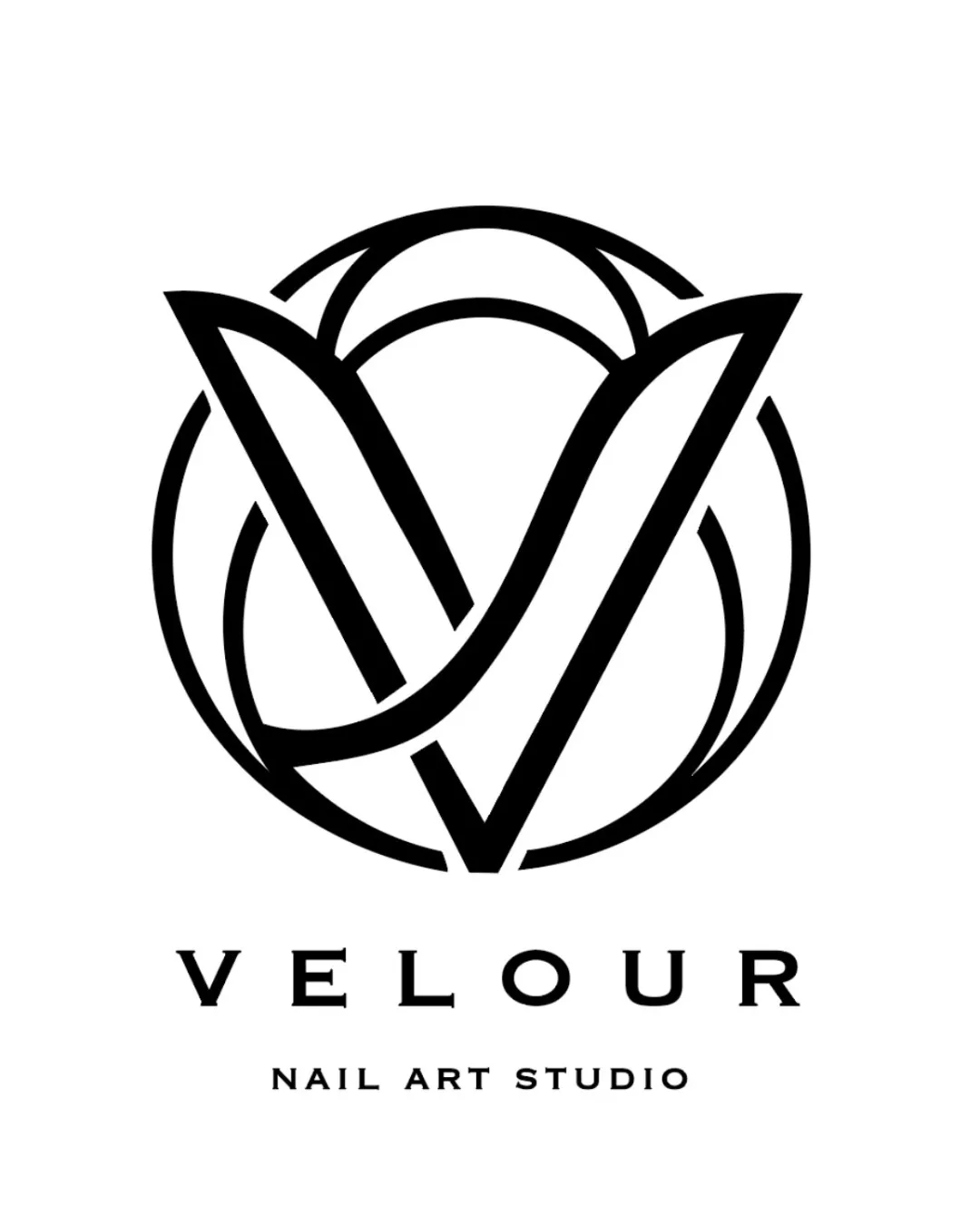
Logo review ofVelour, Nail Art Studio
Review the detailed scores below to see what is working and what should be refined first.
Legibility
Originality
Misread
Balance
Scale
Detailed review
Logo performance breakdown
Legibility
![]() Text 'VELOUR' is highly readable and set in an elegant, classic serif typeface.
Text 'VELOUR' is highly readable and set in an elegant, classic serif typeface.![]() 'NAIL ART STUDIO' is spaced well for clarity.
'NAIL ART STUDIO' is spaced well for clarity.
Originality
![]() Creative use of negative space with intertwined leaf/petal motifs and circular forms.
Creative use of negative space with intertwined leaf/petal motifs and circular forms.![]() Monogram 'V' is suggested, linking visually to the brand name.
Monogram 'V' is suggested, linking visually to the brand name.
![]() Circular flower/petal motif is relatively common in beauty/spa industry, slightly reducing distinctiveness.
Circular flower/petal motif is relatively common in beauty/spa industry, slightly reducing distinctiveness.
Color harmony
![]() Monochromatic palette is elegant and versatile.
Monochromatic palette is elegant and versatile.![]() High contrast ensures both mark and text stand out equally.
High contrast ensures both mark and text stand out equally.
Black
#000000
White
#FFFFFF
Balance alignment
![]() Strong symmetrical structure in the monogram.
Strong symmetrical structure in the monogram.![]() Excellent alignment between logomark and centered wordmark/descriptor.
Excellent alignment between logomark and centered wordmark/descriptor.![]() Visual weight is well-distributed, providing stability.
Visual weight is well-distributed, providing stability.

Scalability
![]() Bold, clean lines in the monogram will retain clarity at smaller sizes.
Bold, clean lines in the monogram will retain clarity at smaller sizes.![]() Design translates well across many mediums such as business cards, packaging, and digital assets.
Design translates well across many mediums such as business cards, packaging, and digital assets.![]() Logo works effectively in monochrome, increasing adaptability.
Logo works effectively in monochrome, increasing adaptability.
![]() Fine lines in overlapping parts of the monogram may become less distinct on very small scales (e.g., embroidery, favicons).
Fine lines in overlapping parts of the monogram may become less distinct on very small scales (e.g., embroidery, favicons).
200x250 px
100×125 px
50×62 px
Misinterpretations
![]() Abstract shapes evoke flowers/nails without any suggestive or inappropriate secondary meanings.
Abstract shapes evoke flowers/nails without any suggestive or inappropriate secondary meanings.
Symbol & text fit
![]() Typography pairs elegantly with the geometric mark.
Typography pairs elegantly with the geometric mark.
![]() The spacing and style cohesion between the logomark and wordmark are nearly flawless.
The spacing and style cohesion between the logomark and wordmark are nearly flawless.
Try your own review
Review my logo
Wondering how your logo performs?
Get a clear logo score, key risks, and priority fix ideas before your client or audience sees it.
Keep exploring


