Concept & direction
A traditional, heraldic-style stag in shield conveys strength and heritage, paired with an upmarket serif wordmark.
Spelling & grammar
No obvious issue foundAll text is readable and spelled correctly.
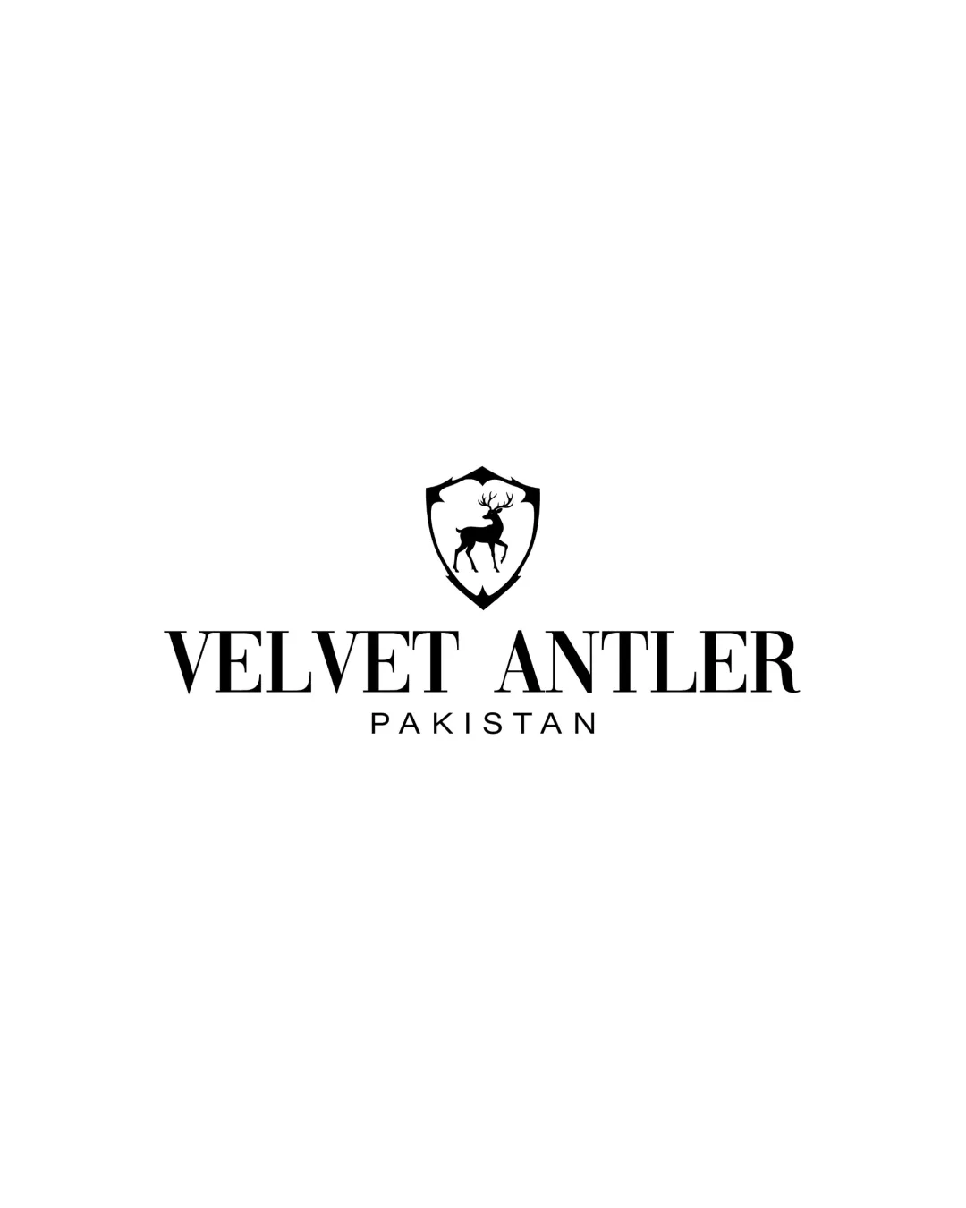
Competently executed but generic; needs a unique visual element to stand out professionally.
Focus on the changes that matter. Keep what makes the logo work.
A traditional, heraldic-style stag in shield conveys strength and heritage, paired with an upmarket serif wordmark.
All text is readable and spelled correctly.
Logo preview unavailable. The written feedback is still available on this card.
Standalone mark
The shielded stag is a conventional motif for heritage, luxury, or outdoor brands and lacks a unique twist.
Compare with logos in a similar space for visual distinctiveness.
Logo preview unavailable. The written feedback is still available on this card.
wordmark and Standalone mark
The shield mark appears small relative to the width of the wordmark, potentially minimizing its impact at smaller sizes.
See the category reviewMatches category signals well but does not show unique brand identity.
The shielded stag is a conventional motif for heritage, luxury, or outdoor brands and lacks a unique twist.
Try: Consider adding a distinctive detail or modernizing the illustration to stand out.
Check: Compare with logos in a similar space for visual distinctiveness.
Logo preview unavailable. The written feedback is still available on this card.
The shield mark appears small relative to the width of the wordmark, potentially minimizing its impact at smaller sizes.
Try: Slightly enlarge the shield or tighten the wordmark width for better proportion.
Logo preview unavailable. The written feedback is still available on this card.

Inspect spacing with the guide. Optical balance may differ from geometric centering.
Fine antler details in the stag symbol may be lost in small-size or low-resolution use.
Try: Test the mark at favicon and print scales, possibly simplify antlers.
Get a clear logo score, key risks, and priority fix ideas before your client or audience sees it.
More credits needed
Add credits to continue without losing your work.
Then $7/month. Cancel anytime.
Essential logo review with AI
Estimated progress