Wondering how your logo performs? 🧐
Get professional logo reviews in seconds and catch design issues in time.
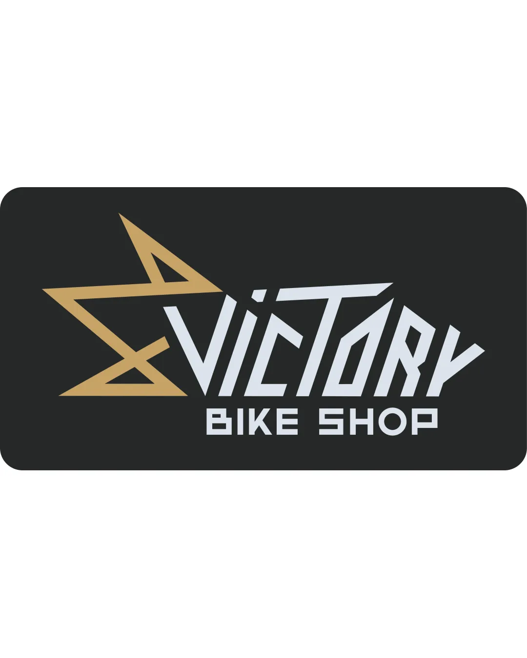
Try it Now!Logo review of VICTORY BIKE SHOP
 Logo analysis by AI
Logo type:
Style:
Detected symbol:
Detected text:
Business industry:
Review requested by JanPavlic
**If AI can recognize or misinterpret it, so can people.
Structured logo review
Legibility
![]() Primary text 'VICTORY' is generally readable and distinctive.
Primary text 'VICTORY' is generally readable and distinctive.![]() 'BIKE SHOP' is blocky and clear, with good spacing.
'BIKE SHOP' is blocky and clear, with good spacing.
![]() The sharp angular letterforms create some visual confusion, especially in the uppercase and overlapping elements.
The sharp angular letterforms create some visual confusion, especially in the uppercase and overlapping elements.![]() The 'V' and star mark can be ambiguous or difficult to distinguish instantly.
The 'V' and star mark can be ambiguous or difficult to distinguish instantly.
Scalability versatility
![]() Star symbol and bold typography can hold up at mid to large sizes such as storefronts and digital banners.
Star symbol and bold typography can hold up at mid to large sizes such as storefronts and digital banners.![]() Color contrast (gold/white on dark) remains strong across larger signage.
Color contrast (gold/white on dark) remains strong across larger signage.
![]() Text detail and thin diagonals in star may lose clarity when scaled down (e.g., favicon, social media avatars, embroidery on jerseys).
Text detail and thin diagonals in star may lose clarity when scaled down (e.g., favicon, social media avatars, embroidery on jerseys).![]() Complex geometry does not adapt well to single-color or very small formats.
Complex geometry does not adapt well to single-color or very small formats.
200x250 px
100×125 px
50×62 px
Balance alignment
![]() Overall layout is horizontally balanced with strong left-to-right flow.
Overall layout is horizontally balanced with strong left-to-right flow.![]() Baseline alignment of text sections is visually anchored.
Baseline alignment of text sections is visually anchored.
![]() Star symbol heavily weights the left side, making the flow feel lopsided.
Star symbol heavily weights the left side, making the flow feel lopsided.![]() 'VICTORY' leans towards the right with text of differing x-heights, diminishing harmony.
'VICTORY' leans towards the right with text of differing x-heights, diminishing harmony.

Originality
![]() Custom angular lettering for 'VICTORY' and geometric star make for a striking and distinct look.
Custom angular lettering for 'VICTORY' and geometric star make for a striking and distinct look.![]() Integration of the star mark as part of the initial 'V' is moderately creative for this industry.
Integration of the star mark as part of the initial 'V' is moderately creative for this industry.
![]() Star shapes and sharp custom type are somewhat common in sports/retail sectors, but the execution is bolder than most.
Star shapes and sharp custom type are somewhat common in sports/retail sectors, but the execution is bolder than most.![]() Lacks negative space play or an especially unique conceptual twist.
Lacks negative space play or an especially unique conceptual twist.
Logomark wordmark fit
![]() The star mark is tightly integrated with the first letter, forming a cohesive lockup.
The star mark is tightly integrated with the first letter, forming a cohesive lockup.![]() Both elements share sharp angular styling for visual unity.
Both elements share sharp angular styling for visual unity.
![]() Legibility of 'V' due to integration with the star may cause confusion, especially at a glance.
Legibility of 'V' due to integration with the star may cause confusion, especially at a glance.
Aesthetic look
![]() Visually bold and energetic aesthetic that matches an active, retail market.
Visually bold and energetic aesthetic that matches an active, retail market.![]() Sharp geometry gives a sense of speed and motion relevant for a bike shop.
Sharp geometry gives a sense of speed and motion relevant for a bike shop.
![]() Aesthetic is bold but can be harsh or fatiguing; some may perceive the lines as overly aggressive.
Aesthetic is bold but can be harsh or fatiguing; some may perceive the lines as overly aggressive.![]() Overlapping forms and angularity reduce clarity.
Overlapping forms and angularity reduce clarity.
Dual meaning and misinterpretations
![]() No inappropriate or ambiguous symbolism detected.
No inappropriate or ambiguous symbolism detected.![]() Star symbol is universally positive and motivational.
Star symbol is universally positive and motivational.
Color harmony
![]() Limited palette of gold, white, and black is both distinctive and harmonious.
Limited palette of gold, white, and black is both distinctive and harmonious.![]() Excellent contrast ensures strong visual impact.
Excellent contrast ensures strong visual impact.
Teak
#B7996E
Gainsboro
#D7DBDE
Shark
#222322