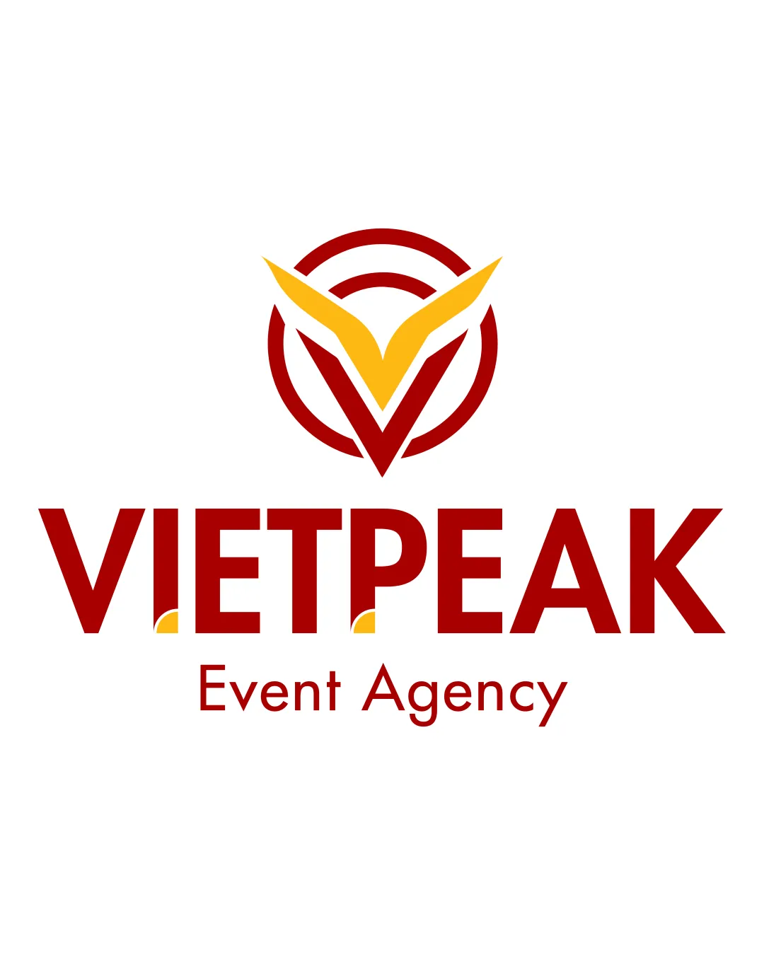
VIETPEAK Event Agency logo review
4/5
Logo score
Logo review of

Vietpeak Event Agency

Well-constructed combination mark with a memorable and relevant symbol, minor refinements will further polish its impact.

Combination Mark Modern Geometric Event Agency
4/5
Legibility
3.5/5
Originality
5/5
Misread
4/5
Balance
4/5
Scale
Action plan

What to fix first

The most important fixes to handle before polishing the full presentation.

1

Refine the small yellow triangles in the wordmark or reconsider their necessity.

Medium priority

Minor refinement yet noticeable polish.

Impact: Improves Cohesion And Reduces Visual Distraction. · Effort: Low

2

Explore a more integrated solution for the tagline's alignment or typographic weight.

Low priority

Current hierarchy works but visual linkage could be tighter.

Impact: Strengthens Overall Lockup Unity. · Effort: Low

Detailed review

Logo performance breakdown

4/5

Legibility

Checkmark icon 'VIETPEAK' is bold and clear; tagline is readable.

Warning icon Tiny yellow triangles at the base of 'E' and 'A' could cause minor distraction.

3.5/5

Originality

Checkmark icon Symbol uniquely combines the 'V' shape and a peak; not a generic look.

Warning icon Concentric circles and ascending motif are somewhat common in agency branding.

4/5

Color harmony

Checkmark icon Bold red and yellow are attention-grabbing, vibrant, and appropriate for events.

Warning icon High contrast is good, but could appear harsh on certain backgrounds.

Dark Red
#A50D0D

Yellow
#FFC72C

White
#FFFFFF

Your palette is close. Refine the color roles and combinations before updating the logo.

Build brand colors
4/5

Balance alignment

Checkmark icon Centered, well-proportioned mark and text; consistent spacing.

Warning icon Tagline feels slightly less integrated under the bold wordmark.

logo 200x250 pixels scalability test alignment grid overlay
4/5

Scalability

Checkmark icon Strong lines and good contrast allow for small-scale use.

Warning icon Small details in the tagline and yellow triangles may get lost at minimal sizes.

logo 200x250 pixels scalability test

200x250 px

logo 100x125 pixels scalability test

100×125 px

logo 50x62 pixels scalability test

50×62 px

5/5

Misinterpretations

Checkmark icon No confusing or unintended shapes detected.

4/5

Logo structure & brief match

Checkmark icon Mark and wordmark harmonize in style and weight; the 'V' allusion links both visually and conceptually.

Warning icon Minor disjoint between bold uppercase and lighter tagline style.

Checkmark icon Industry Relevance: Peak and dynamic forms match the event agency context well.

Try your own review

Wondering how your logo performs?

Get a clear logo score, key risks, and priority fix ideas before your client or audience sees it.

Review my logo